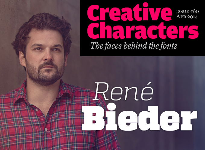
Photo © Sebastian Burgold
The number of successful type designers living and working in Berlin today is staggering. Some individual careers are no less impressive. Born and raised in Berlin, this month’s interviewee started up his own typefoundry the moment he submitted his first typeface to MyFonts in 2012 — and he’s been on an upward trajectory from there. Two of his font families made our 2012 and 2013 lists of Fonts of the Year. He hasn’t brought out a single family yet that has not done well. His designs are powerful, unadorned, straightforward, and well-made. Meet the energetic and purposeful René Bieder.
|
René, can you tell us something about your background? I am an art director, graphic designer and type designer from Berlin. My roots are in advertising and graphic design; that’s what I did before I discovered the field of type design. But let me dig a little deeper: When I decided to become a graphic designer 15 years ago, the dot-com bubble had just reached its climax. It was a more or less obvious choice to take the web design path; this was an area where a lot of things happened, especially in Germany, and it seemed to be a great alternative to traditional graphic design. Needless to say, the number of fonts used for the web was limited to a minimum. Working with a wide array of typefaces was a privilege of editorial and corporate design only. At that time I was soaking up everything design-related, not just focusing on web design, which became my first job in a digital agency in Berlin, but also traditional graphic design. I was new to the industry and I had such a strong urge to learn and try out new things that I worked day and night, paid or unpaid. A couple of years later two friends of mine participated in a pitch for the redesign of a Berlin startup. They needed a graphic designer, so I jumped onboard. The client wanted the whole program — from a logo to online banners. It was a great experience for me to take a step out of my daily business as a web designer and build a brand from ground up. We won the tender, and my friends took the opportunity to establish their own advertising agency, DOJO. I joined them a year later as an art director and designer. You can picture the situation — it was like most startups today, at least in Berlin. A dilapidated backyard studio, everybody sitting on folding chairs with their personal laptops they brought to work. We only had a handful of clients but, like most startups, we had the common goal of changing the world. In a few years we built up quite an impressive portfolio, ranging from a local magazine sold by homeless people, to the relaunch of the Universal Music Germany website. In spite of the fact that I was having a great time working with friends, I decided to leave the company for an international advertising agency, to experience working with multinational companies. From advertising and graphic design, how did you get into type design? As my work within the agency became centered around corporate design, which involved creating custom lettering or logos, my interest in designing fonts increased enormously. But I had no idea how to approach this, or how to use font editing software such as FontLab. So I fired up Adobe Illustrator and made my first drafts. Strictly modeled on a grid and therefore very geometric; some were extremely fat and only usable as display fonts, others were easier on the eye and more readable. When I had eventually finished drawing the individual letters, I “only” needed to transfer them into FontLab; needless to say, I had not thought about things like spacing and kerning at all yet. A colleague of mine happened to be in contact with Svet Simov of Fontfabric from Sofia. So I mailed my Illustrator file to Bulgaria. Svet put the glyphs into FontLab, and sent me back an OpenType font file. When I typed something in my own font for the very first time, I was so overwhelmed that it was instantly clear to me: I wanted more of this! Moreover, I wanted to design a whole family… sooner or later. And so after just ten months, I published my first font family on MyFonts — RB№3.1. Without Svet and my colleague Pavel who introduced me to him, my career as a type designer would probably have gone in a completely different direction. |
Campton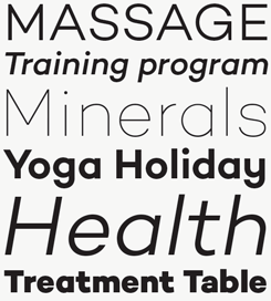
Campton is the latest of Bieder’s industrial-flavored, geometrically constructed sans-serifs — and is probably his most understated so far. This doesn’t mean it’s bland; rather, it aspires to the purity and neutrality of the great early Modernist typefaces while understanding that there is still plenty of room for the human touch. Campton offers a typographic color that is subtly different from existing font families, for projects ranging from editorial and corporate design via web and interaction design to products. Quadon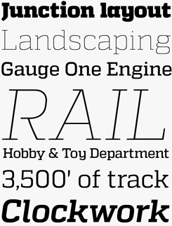
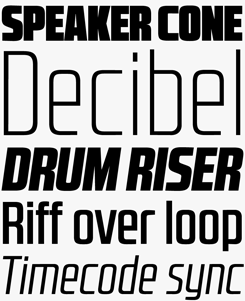
Quadon proposes a way to bridge the refinements of classic serif typography and the impact of the grotesques. The result is a clear, modern slab serif built on a squarish skeleton, whose open forms and large counters make for good readability in the smaller sizes and a punchy, arresting character in display settings. Across its nine weights and companion italics, and a useful selection of typographic features, Quadon offers plenty to the typographic designer who needs to accomplish a broad range of tasks. |
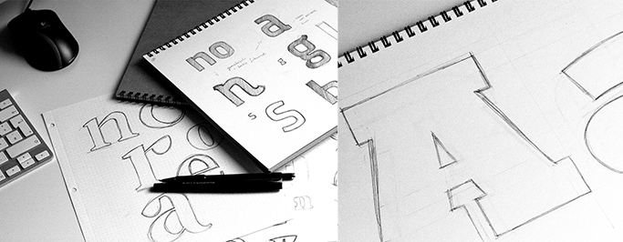
René Bieder’s pencil sketches.
|
Has the success on MyFonts surprised you? It came as a complete surprise! Originally, all I really wanted was to pursue my personal desire and simply make a font family of my own. After I had completed it, I was not even sure if I should offer it for sale. I had actually viewed the work on RB№3.1 rather as an exercise — hence the numerical name, which alludes to a workshop experiment. Yet I was curious as to how that thing I had produced over ten months would be received. Frankly, I never had high hopes. I was still at the very beginning of my learning process. I would have been totally happy with two or three buyers. When those first fonts became big hits, did you immediately decide to give up the agency work, and become an independent type designer? Of course, the reactions to Quadon and RB№2.1 were phenomenal — it was hard to believe that something that had started out as a side project could be so successful! It proved to me that I was on the right track, but my agency job was still my main focus. I loved working with international clients on large-scale projects. Having to meet (or surpass) a client’s expectations can be a big challenge. In a way, it’s the opposite of being an independent type designer, where you often get the freedom to do whatever you like. I guess it was the combination of the two that was interesting to me at that time. Speaking generally, I simply love designing. I know that sounds cheesy, but to start with a blank page and to see the result after months of hard work is very satisfying to me, no matter if it’s a type family, a corporate design, a campaign or a website. I never intended to focus on one single thing, and I feel at home in different disciplines. A few months ago I started a career as a freelance art director and designer, with a strong focus on typography. I’m absolutely happy that I have much more time to work on my type projects, and it may lead to me becoming a full-time type designer, someday. After those first successful attempts at geometric faces, you quickly became more ambitious and your typefaces more subtle. How did you learn? Did you look at other designers’ work? Anybody in particular who was an inspiration? Of course I learned a lot from looking at other typefaces. Not only on the internet but also when walking down the street. I found myself quite often stopping at posters and advertising looking at the typefaces used rather than admiring the poster itself — which is what I used to do before starting as a type designer. After finishing Quadon I felt confident enough to take a step out of my comfort zone — the geometric grid — and jumped into a new territory. At that time I especially admired Helvetica, Akzidenz Grotesk and Swiss typography in general — maybe the documentary about Helvetica I had recently watched pushed me a bit into that direction — and I wanted to give a neutral approach a try. So that became Gentona. It took me a while to get a feel for spacing and proportions. I was working on Gentona and training my eyes by looking at traditional sans serifs, and I had a surprising insight: Uniformity doesn’t occur through using patterns but by getting a feel for proportions. That is something you can not learn by reading a book. You have to do it over and over again. That may sound obvious, but in comparison to my previous grid-based strategy, where most of the elements have a rational explanation, I had to train my eyes to see how to get the proportions right in order to achieve an overall balanced look. Sometimes the smallest detail totally changes the appearance of the entire font. This was something I knew from logo design but applying that to a glyphset of 400+ characters was tough learning. |
RB№2.1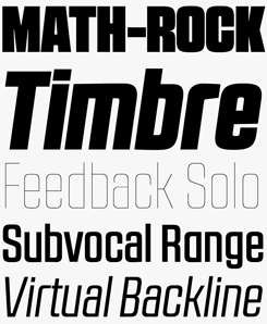
The fourteen styles (seven weights, upright and slanted) of the RB№2.1 family come in two distinct flavours: RB№2.1a has a closed form; RB№2.1b is more open. Both are interchangeable and complementary and will be well suited to a range of dramatic display applications that require powerful, expressive typography. In the combination of the two flavours, and with the addition of several alternate characters, the dry technical character of the lettershapes becomes something richer, more subtle and very much a pleasure to work with. |
|
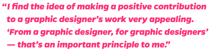
Was your background in advertising a help when you started out as a one-man foundry? My experience in advertising agencies definitely had a strong impact on me. But when it came to promoting my typography work, it didn’t play a big role. MyFonts was, and still is, doing a great job, so I was able to completely focus on the design. The only “promotional work” I did was putting together a showcase on the Behance network. But even the showcase for my first family RB№3.1 was quite basic. I was focusing more on learning about typography than using the time to promote my work. Later on I started thinking a bit more about what potential customers would like to know about a typeface that just hit the market. But it was still different to what I was doing for my agency clients. Lately I’ve seen some foundries launching microsites for their families. That’s pretty cool. I’m sure it helps to increases sales and builds up a broader visibility. But as I already mentioned, I like to concentrate on the design first. While I understand a lot about development and programming, jumping into code was never appealing to me. Additionally, much of the effort in advertising goes into making a product desirable and sexy, and you try to wrap it into a story that the target group can relate to. Translating that into the type business can be quite difficult. A font can often be used in multiple ways and situations, it always depends on what the designer wants to communicate. That means you can’t hide behind a clever marketing story. The font is the story already! Pure, plain shapes and Bézier curves can tell a lot more than a marketing campaign. The first typefaces you published had similar, strictly geometrical aesthetics. Who or what inspired them? I love clean and lucid design. I am also a big fan of grid systems and recurrent modules and patterns — regardless of whether they are complex or simple. When designing logos, it has always been important to me that the logo looks as compact and uncomplicated as possible. Obviously, all these preferences have been incorporated into my type designs. My two first typefaces, RB№3.1 and 2.1, originated around the same time. I simply went ahead, to see what would come out. At the time I still thought the easiest thing would be to make a sans-serif font. It was only in the course of the process that I was caught up by the complexities of font styles and type families and font production. As you said, you’ve introduced your typefaces via social networks, notably Behance. Has this helped you increase your visibility, and do you think it has helped sales? I’m not sure if it helped to increase sales but it definitely helped to increase my visibility as a type designer. I think my current showcases on the Behance Network are rather detailed in comparison to others. That’s because I like to show the process and all the different aspects that lead to the final design. In addition, that’s the part of designing a typeface where you get the chance to actually work with the font in a graphic design environment. This is the last and ultimate check before selling it. And I love it! It is the best compensation after tedious weeks of kerning and spacing, and of course: finding a name! Did you feel under big pressure to come up with original and stunning work after the success of Quadon and RB№2.1? Maybe a bit, but I just focused on what I liked most and what I found beautiful. There were still so many genres I wanted to explore and learn from that I preferred experimenting with glyphs — either on paper or in font editors — rather than thinking about what could be the next big hit. In addition, maybe my interest in the kind of typefaces that can be used both as display fonts and in longer texts is attractive to a wider group of users. My main concern, however, is to create fonts that I like. Plus I find the idea of making a positive contribution to a graphic designer’s work very appealing. “From a graphic designer for graphic designers” — that’s an important principle to me and I would be very pleased if my next releases meet a positive response like Quadon or RB№2.1. |
Gentona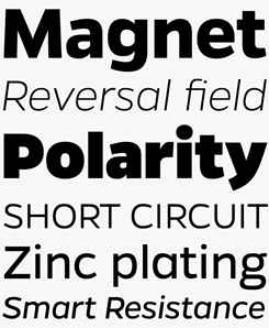
With the release of Gentona, Bieder departed from the rigid formalism of his geometric interests and started to play with a more fluid and sophisticated approach, especially with the curves. An overall impression of efficiency and neutrality, this nine-weight family offers plenty of possibilities for smart typographic design: the middle weights build lucid body texts; the sharp-cut light weights and the muscle-bound heavy styles make for confident headlines. Recommended for assertive and forward-looking corporate publications and tech-flavored screen applications alike. Canaro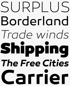
While very minimalist and clean, Canaro is nevertheless rather expressive and feels very contemporary. Originally it was an exploration of early twentieth-century geometric type, but by removing the spurs of many of the lowercase letters Bieder created something with a much more contemporary edge. Like much of his library, Canaro will find itself at home in both display setting and in the smaller grades, thanks to a tall x-height and open shapes. The family comes in nine weights plus matching italics, with typographic features such as alternative lettershapes, ligatures, oldstyle numbers, arrows, fractions, special characters and more. |
As in Bieder’s early typefaces, geometry is the foundation of the organic-looking logo (and wordmark, not shown here) for Sabienza Technologies. More about the process on Bieder’s Behance page.
|
You are a born and bred Berliner — a rather rare sight in the city, where most “creatives” come from other places. Have you ever lived anywhere else? Does Berlin still inspire you? Yeah, it’s funny that there’s no place where you meet fewer Berliners than in Berlin itself. It’s a great city, of course. But I wouldn’t consider Berlin as a city to be on a par with London, Paris or New York. It is changing and evolving all the time and it is great to see the change happen and to be a part of it. That’s what differentiates it from other cities and I think that’s what most people from other places like about it. You can do whatever you want, and shape your environment. That often leads to being creative and that is where inspiration comes from. In spite of all that, I love the idea of moving to another country and spending some time in completely different surroundings. Especially since as a type designer you don’t need much besides some megabytes on your laptop and some font editing software, do you? Is that an attractive option to you — working while traveling? Yes, of course I would love to do that sooner or later. Maybe I’ll end up finding a new place to live and move there. You never know. When I was working for AKQA, they sent me to Amsterdam a few times and I really enjoyed the different work environment. What’s the main ambition, type-design-wise, you hope to realize in the next year or so? Well, besides training my eyes and learning more about typography, I definitely want to give serifs a try. This is the next big step for me, similar to exploring neutral typefaces. I have already got some drafts waiting for some attention. That’s the great thing about typography: the deeper you dive into it, the more you recognize that there is so much more to discover. Since all of my type design projects are self-initiated, I would love to jump on a corporate font project as well. Let’s see what the future has in store for me. |
RBno3.1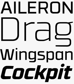
Bieder’s first published font was an instant hit, and with its technical character and geometric construction Bieder was clearly setting out his stall for what was to come. RB№3.1 made our Rising Stars list in August 2012 (RB№2.1 arrived a couple of months later; as yet there’s no RB№1.1), as have each of his subsequent releases which is pretty remarkable for a single-hander foundry. |
MyFonts on Facebook, Tumblr & TwitterYour opinions matter to us! Join the MyFonts community on Facebook, Tumblr and Twitter — feel free to share your thoughts and read other people’s comments. Plus, get tips, news, interesting links, personal favorites and more from MyFonts’ staff. |


|

|
Who would you interview?Creative Characters is the MyFonts newsletter dedicated to people behind the fonts. Each month, we interview a notable personality from the type world. And we would like you, the reader, to have your say. Which creative character would you interview if you had the chance? And what would you ask them? Let us know, and your choice may end up in a future edition of this newsletter! Just send an email with your ideas to [email protected]. In the past, we’ve interviewed the likes of Matthew Carter, Laura Worthington, Jonathan Barnbrook, Ulrike Wilhelm, Bruno Maag, Veronika Burian, and Hannes Von Döhren. If you’re curious to know which other type designers we’ve already interviewed as part of past Creative Characters newsletters, have a look at the archive. |
ColophonThis newsletter was edited by Jan Middendorp and designed using Nick Sherman’s original template, with specimens by Anthony Noel. The Creative Characters nameplate is set in Amplitude and Farnham; the intro image features Quadon Light Italic and Quadon Heavy; the pull-quote is set in Campton Extra Bold Italic; and the large question mark is in Farnham. |
Comments?We’d love to hear from you! Please send any questions or comments about this newsletter to [email protected] |
Subscription info
Had enough? Unsubscribe immediately via this link: Want to get future MyFonts newsletters sent to your inbox? Subscribe at: |
Newsletter archivesKnow someone who would be interested in this? Want to see past issues? All MyFonts newsletters (including this one) are available to view online here. |