10 tips on choosing an accessible typeface

10 tips on choosing an accessible typeface
Stuart de Rozario Type tips
Typography should be your first port-of-call when the brief demands accessibility. If the type isn’t right for all abilities, the design simply isn’t inclusive. So what makes a typeface accessible and what should you look out for when you choose one?
Here are ten things to know about accessible type:
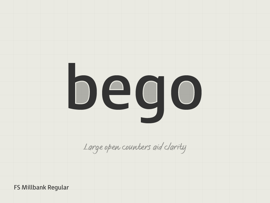
1. A clean modern sans serif with large open counters is considered to be the most suitable type style for signage, sub-headings and captions where there are small amounts of text set at 16pt and above.
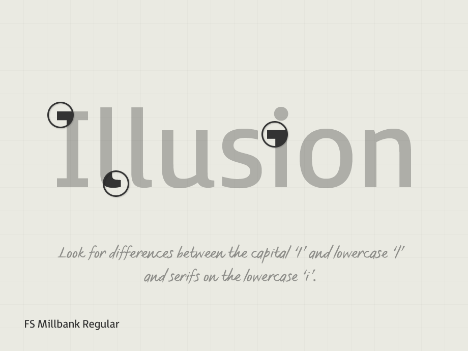
2. Look for a typeface with optimum character recognition to aid legibility where certain characters are deemed confusing. Does the Capital ‘I’ and lowercase ‘l’ appear the same? Or are the ‘B’ and ‘8’ too similar?
3. Take care with the positive and negative space in and around the letterforms (making sure the letter spacing looks evenly balanced).

4. A serif added to the lowercase ‘i’ to enhances character recognition.
5. A character stroke which is approximately 17-20% of the x-height is proven to be the most legible.
6. Pay attention to the letterforms when on a darkened background as the spacing can look visually tighter and the letter shapes appear to ‘glow’.

7. Numerals need to be clear and easily recognizable. The figure 0 (zero) may have a dot to aid legibility and it is preferable that the ‘6’ and ‘9’ have open terminals.
8. Choose a typeface with a large x-height, extended ascenders and descenders as this helps legibility and readability.
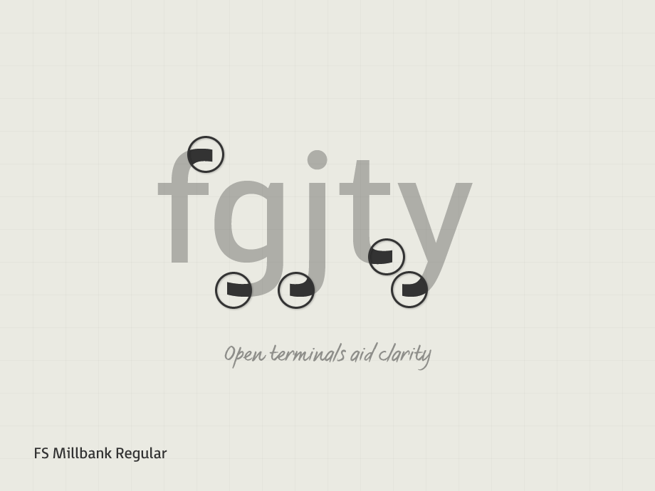
9. Open terminals aid clarity and allow the letterforms to be easily read.

10. People with learning disabilities are often treated as inferior with childlike design. An accessible font shouldn’t mean childlike, there’s no reason to compromise craft for readability. Look for a highly crafted typeface with a considered, clear and elegant design.
These helpful tips are based on original research we did with Mencap, the UK’s leading learning disability charity, to create FS Me®. FS Me was a breakthrough in standards for accessibility in type design; learnings from this project now inform all of Fontsmith type design. Researched extensively, FS Millbank® was created with these design principles in mind and developed for its pure clarity and legibility.