Alphabet Tree - The Letter N

The early form of the N was always closely associated with water.
When the sign was used by the Phoenicians more than three thousand years ago, it was called “nun” (pronounced noon), which meant fish.

Before the Phoenicians, the Egyptian hieroglyph (for the ‘n’ sound was a wavy line representing water.

Around the 10th century B.C., the Greeks began adopting parts of the Phoenician alphabet as their own. In this way, they not only acquired the shape of the Phoenician nun, they also preserved its name – to a point.
Although the Phoenician character’s name was meaningless to the Greeks, its initial sound became the sound that the sign represented. The Phoenician nun thus became the Greek “nu.”
The squiggly nu, doubtlessly, upset the organized and rational Greek minds, thus obliging them to redesign the character slightly to suit their sensibilities. First, they tried to give the angled strokes stability by making the last one a strong vertical support.

But this made the letter asymmetrical. Obviously, this would not do, so the Greeks extended the other vertical stroke and made the two parallel.

The Greek N passed on to the Romans with virtually no change in the basic design. Over time, however, subtle changes were made to all the letters the Romans borrowed from the Greeks, and the N was no exception.
At first, the Romans, like the Greeks, incised their letters directly in stone, or inscribed them in soft clay. These early letters had no variation in stroke thickness and lacked most of the curved strokes we have come to associate with the Roman alphabet.

In the first century A.D., however, stonecutters began to paint the letters on stone prior to cutting them with hammer and chisel. It was this pre-drawing process that gave our current alphabet its variance in stroke weight, rich flowing curves and, ultimately, serifs. During this evolutionary change, the N’s outside strokes became thinner and serifs were added.
Some interesting words also start with the letter N
If you’ve met someone who has the same name as you, they’re your nameling.
Naufragiate means “to cause a shipwreck,” and naufrague is a shipwrecked person.
If you hate the sight of broken glass, then you’re nelophobic. Other N-fears include nyctophobia (fear of the night or darkness), neophobia (a dislike for anything new or unfamiliar), and nephophobia (the fear of clouds)
Neogamist is a newlywed.


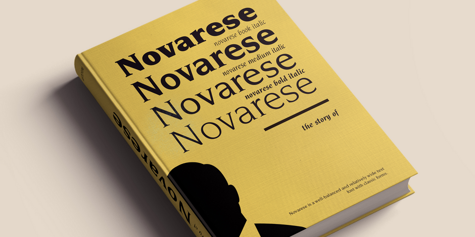
Italian designer Aldo Novarese originally created the typeface that bears his name for Switzerland’s Haas foundry. However, shortly after this initial release, International Typeface Corporation licensed the design and, in 1979, issued it as the ITC Novarese™ family.
Novarese is an elegant blend of old and new. The old can be found in its classic forms and proportions, while the new is seen in its generous x-height and the wide range of weights. Novarese italic is unusual because its cursive lowercase combined with upright capitals, a style that echoes the earliest italic designs. ITC Novarese owes its elegant demeanor to its rich, full-bodied letters, its graceful shapes and fine, almost chiseled, serifs. The contrast between thick and thin strokes is noticeable but not extreme, giving text set in ITC Novarese sparkle and color without sacrificing readability. This is an exceptional typeface that performs equally well in both display and text sizes.
The first italics were designed as single-weight families and only contained lowercase characters. The idea was to use capitals and other characters as they became necessary, from whatever font the printer had available. ITC Novarese, because of its lack of italic capital letters, has caused designer confusion since its release. This is, however, a traditional interpretation of the italic genre.


