Alphabet Tree - The Letter R

The letter R is a more exceptional character than it first appears. It’s not a P with a tail or a B with a broken bowl; when drawn correctly, the R is rich with subtle details and delicate proportions. It can be the most challenging letter for type designers to create, and the most rewarding.
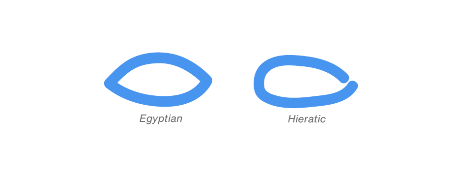
There is an Egyptian hieroglyphic on the Rosetta Stone that represents the consonant sound of R. The symbol is called “ro” and was drawn in the shape of a mouth. In hieratic writing, the symbol was elongated into more of a capsule shape.

The Phoenician sign for the r sound was called “resh,” their word for head. Resh bore no resemblance to the Egyptian ro; it was depicted in the Phoenician alphabet by what we assume to be a simple rendering of a left-facing human profile.

By 900 B.C. the Greeks had adapted the Phoenician letter and called it “rho.” The Greeks reversed the orientation of the head’s left-facing profile, which you might consider a step in the right direction toward creating the R. But they also converted the curve of the face into an angular form. The curve was eventually restored, and the letter ended up looking much like our P.

The Romans borrowed the alphabet from the Greeks via the Etruscans, adding a short, obliqued appendage under the bowl. Seeing the advantage in having a differentiation between the R and P, the Romans further lengthened the stunted stroke into a graceful and delicately curved tail, which remains the trademark feature of our modern R.


The letter R is sometimes referred to as the “littera canina,” or canine letter. In Latin, the way speakers trilled the R sounded like a growling dog. William Shakespeare even gave the letter a shout-out in his play Romeo and Juliet, (Act 2, scene 4) when Juliet’s nurse calls the letter R “the dog’s name,”

The Rockwell® Nova typeface family evokes a feeling of straightforward honesty. Based on the original Rockwell design, It’s a strong, adaptable face that is excellent for branding, headlines and other display uses. The simple shapes and robust serifs of Rockwell Nova also make it a good choice for short blocks of text copy in both print and on-screen environments. With four weights of regular designs, each with a complementary italic, and three condensed designs, two with italics, the family is a powerful and versatile graphic communicator.
Rockwell Nova OpenType® Pro fonts provide for the automatic insertion of ligatures and fractions, and also include an extended character set supporting Greek, Cyrillic, most Central European and many Eastern European languages.


