Alphabet Tree - The Letter F
The stately capital F evolved from a 3,000 B.C. Egyptian hieroglyph representing a desert horned snake, called Cerastes.
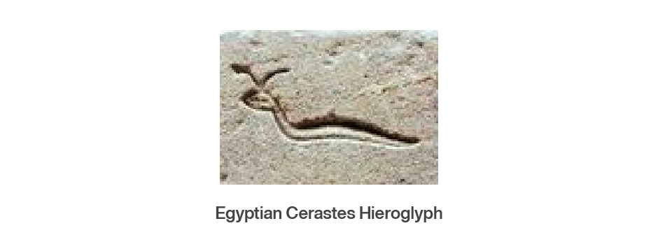
Through the process of simplification over many years, the symbol began to lose its snakelike character, and by the time it emerged as an Egyptian hieratic form, it wasn’t much more than a vertical stroke capped by a small crossbar.

With a slight stretch of the imagination, it could be said to look like a nail. This may be why the Phoenicians called the letter “waw,” a word meaning nail or hook, when they adapted the symbol for their alphabet. In its job as a waw, the character represented a semi-consonant sound, roughly pronounced as the W in the word “know.” However, at various times the waw also represented the v and sometimes even the u sound.

When the Greeks assimilated the Phoenician alphabet, they handled the confusing waw with typically Greek logic: they split it into two characters. One represented the semi-consonant W and the other became the forerunner of our V. (The ‘w’ sound became the Greek digamma, or double gamma, and was constructed by placing one gamma on top of another.)

While the digamma was eventually dropped from the Greek alphabet, it was able to find work in the Etruscan language. Here it did yeoman’s service until the Romans adopted it as a symbol for the softened v or double v sound. Even today, the German language (an important source for English) uses the V as an F in words like “vater,” which means father and is pronounced “fahter.”
Finally, the F found a permanent home as the very geometric sixth letter of the Roman alphabet.


Adrian Frutiger’s classic namesake design earned its serifs. With its roots in Frutiger’s 1957 Meridien®, after a design revitalization, the typeface family was also given a new name: Frutiger® Serif. Meridien was one of Adrian Frutiger’s first – and always his favorite – typeface design.
Fifty-one years after its original release, Linotype’s type director, Akira Kobayashi, with support from Frutiger, adapted and expanded Meridien to create the new type family. Given his special appreciation for the metal version of Meridien, Kobayashi began his work based on detailed study some of the earliest, letterpress specimens. The spirit of Meridien is still present in Frutiger Serif, although there have been many significant changes.
