Creative Characters: Up and coming — Connary Fagen.
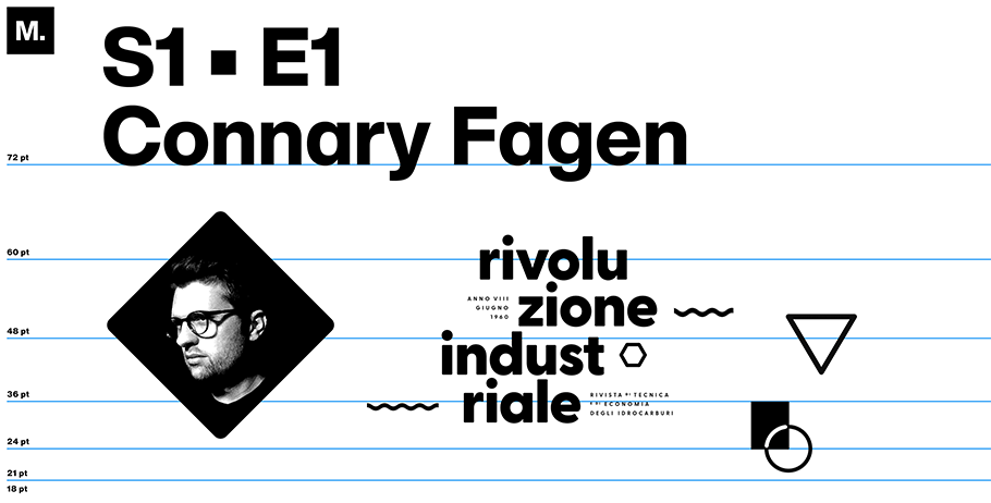
Font designer Connary Fagen, 36, brings an organic perspective to everything he creates. Raised in Colorado, he describes his typefaces as if they grew from the western ground — alongside the wheat fields and mountains surrounding his one-man foundry, Connary Fagen, Inc., based in his current home near Park City, Utah.
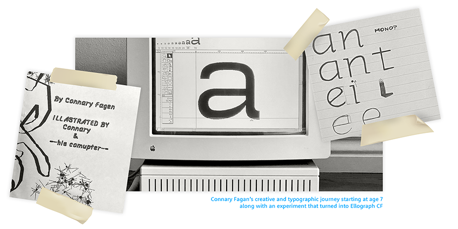
Recently, we discussed how Fagan layers those organic qualities onto his work, what it means to be a naturalist, and what he’s excited to work on next. We spoke by Zoom.
Besides nature, what other experiences from your life have influenced your designs?
My dad brought a Mac into our house when I was little, and I learned how to make art on it. There’s a specific dithering style really common to those early machines that just has a charm. It looks like it’s making grayscale, but it’s actually one-bit, black-and-white, on- or off-color. I think it’s cool. It also supports this abstract notion of nature that I’m trying to evoke, where I’m bringing things down to a simpler set of parameters.
By “simpler parameters,” do you mean an idealized form of nature?
I think nature is already perfect as it exists. It’s not made by people — so it’s right, correct. It’s the default state of the world, and it feels healthy to me. That’s what I’m going for.”
When it comes to designing, what do you find beautiful?
Simplicity: a cliche answer. But true, effective simplicity can be difficult to accomplish, whether in user-interface design or artwork or just general graphic design. So, beyond a minimalist aesthetic, I like the process of taking away what’s not helpful.
A lot of industrial design speaks to me that way, also Japanese calligraphy and interior design. When something’s utilitarian, but done so intentionally and very beautifully, I find that very appeal-ing. So, when I’m working with black-and-white, I’m similarly paring down what I can, while [also] removing unnecessary detail and texture.
Whom do you envision using your fonts?
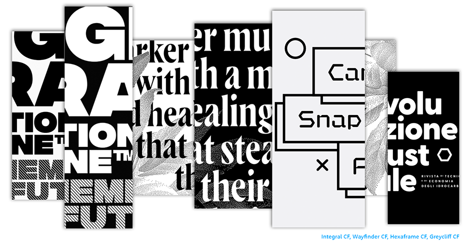
First and foremost? Me! Before I started doing type design, I worked in general client service graphic design. So I was always looking for fonts to use. Eventually, as I got into type design, I wanted to make fonts I could use in my own work. But not in a weird, selfish way. If I could use it, then I think other designers would want to, as well.
What would you most like to share with customers?
That I support my fonts forever. I always go back and update: I add features, I fix bugs, I update curves that don’t look quite right. That happens less and less, because I’m getting better at what I do. [A newer font like] Olivette doesn’t need a version 3.0, but maybe an older font does. So, when you buy one of my typefaces, you’re going to get something that’s actively maintained and supported. I don’t put things out there and then abandon them
Is there a font you recently designed with a specific user in mind?
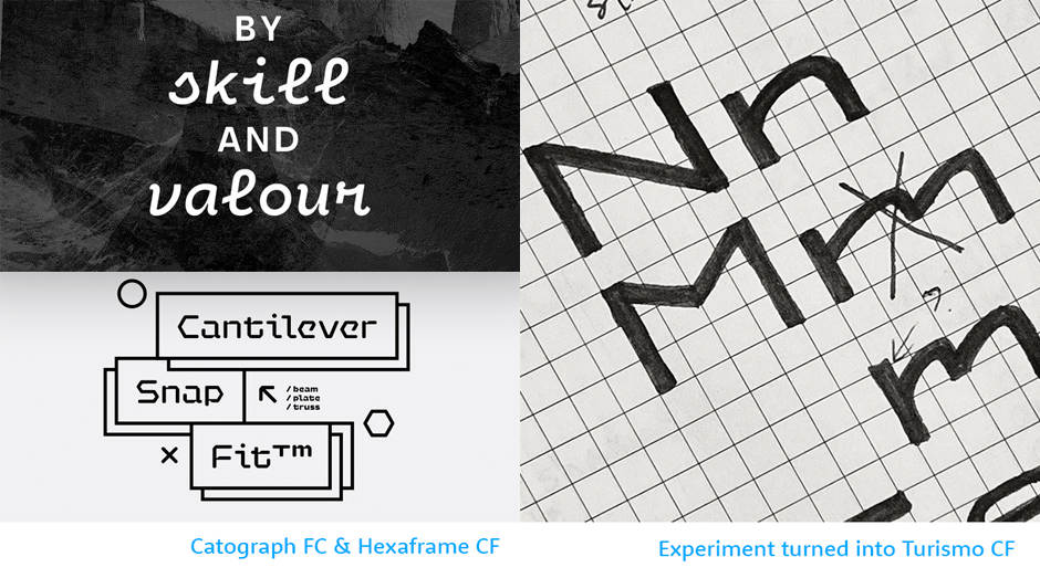
Turismo. It’s a typeface inspired by and geared toward a classic 1960s automotive look. It’s not aggressive, not tough. It’s wide and round and soft, and I picture it as a touring car of some kind. That particular typeface is being used by Harley-Davidson on their Serial 1 e-bicycle. I’m really glad, because that’s the type of user I envisioned.
Are you developing anything now you’re really excited about?
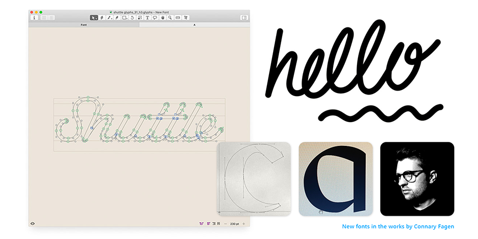
I’m working with handwriting and how that changes the way a letter looks, as opposed to, say, a sans serif, which has a very geometric and pure shape. I’m experimenting with how that can appear in typefaces, in a way that’s less expected.
If you could take any font ever created out for a drink, which font would you choose, and why?
Paul Renner’s Futura, from the 1920s. It’s been around so long; it’s seen so much. Several books have been written about it. So it’s got good stories to tell — definitely!
Take a look at fonts by Connary Fagen.
We hope you enjoyed this interview. Don’t forget to add the interview to your bookmarks. We will add a new one every other month. Check your inbox in April to hear from the next Up and Coming Foundry.


