Creative Characters: Up and coming — Italiantype Foundry
Mario De Libero
What’s in a revival? Respect, for starters, but also the confidence to believe that there’s room to improve on a classic. That’s the case for Italiantype designers Mario De Libero, 23, and Manuel Alvaro, 31. The two design for Italiantype Foundry a spinoff of Florence-based Zetafonts Type Foundry, where they’ve been rediscovering classic typefaces and revising them for current use.
The pair spoke with us separately over Zoom and email. Between them, they discussed design related topics ranging from Italian history to regional identity to cultural shifts, including Italy’s greater openness to diversity, thanks to its growing embrace of social media over the past decade.
Mario De Libero. The art in Florence is massive, in scale and quantity. Not only are the buildings giant, but it’s full of art in little alleys, including sketches. Sometimes, it’s a sketch dating from the 14th century. Sometimes it’s one made more recently and you can see a conversation happening across the centuries.
MyFonts (MF): You grew up largely in Livorno, in Tuscany. Now you’re working in nearby Florence. How has the city impacted your work??
Mario De Libero (MDL): The art in Florence is massive, in scale and quantity. Not only are the buildings giant, but the city’s full of art in little alleys, including sketches. Sometimes, it’s a sketch dating from the 14th century. Sometimes it’s one made more recently, and you can see a conversation happening across the centuries.
MF: How does that affect your designs?
MDL: It’s influenced my design in a classic way. I give a lot of attention to the calligraphic fonts and the Roman style, like Trajan One. It’s important to me, because Trajan was the base of Latin typography, and in Florence, we can see both Trajan and Renaissance typographies and their evolution. It’s a pleasure to have those things near you! I can leave the studio where I work and there’s Santa Croce church, where Hermann Zapf took up his studies to do Optima, for example. It’s really inspired me a lot as a city.
MF: What is Trajan?
MDL: Trajan is a serif typeface inspired by the letterforms of Roman square capitals, used for the inscription of the Trajan’s column, a Roman enormous triumphal column made to commemorating Emperor Traiano’s victory in the Dacian Wars in the early 2nd century.
MF: Seems you deeply respect design from the past, as suggested by your reworking of Cairoli, a font from the 1920s.
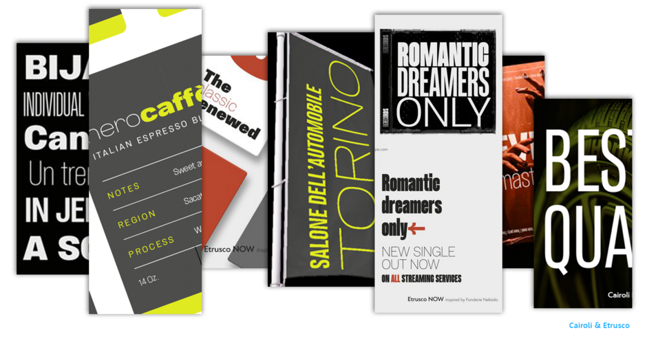
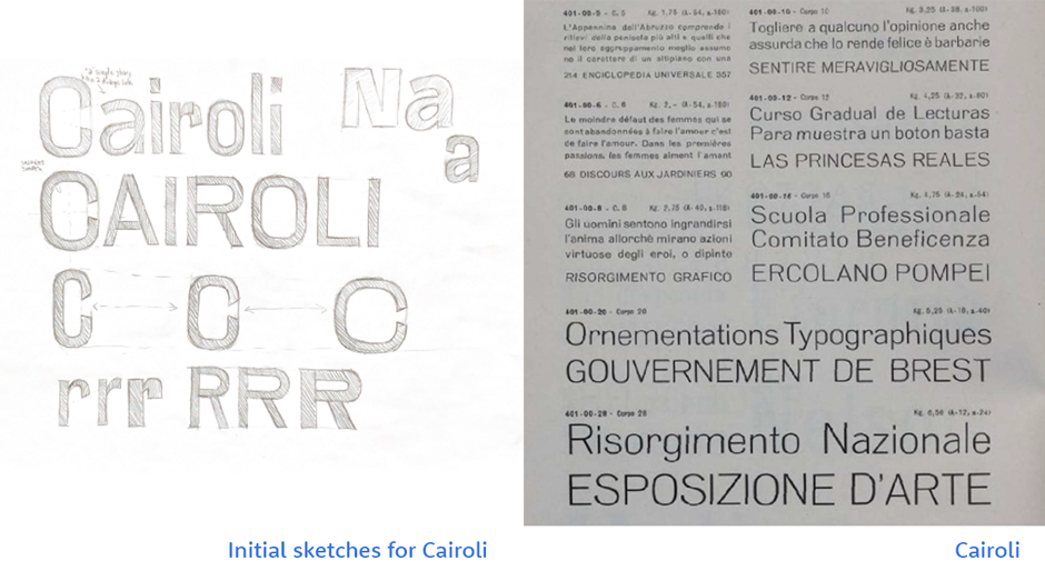
MDL: Absolutely! Our new Cairoli, at Italiantype Foundry, didn’t come from nothing; it’s a revival. The original was drawn by Nebiolo, a type foundry that made characters in plumb to do letterpress. We, at my studio, found this Cairoli on an old piece of paper that Nebiolo used to show the characters to advertising customers. And we fell in love.
MF: What distinguishes your new version from the old one?
MDL: We developed a higher x-height, so the characters are more readable as text. We also softened the punctuation into squared dots with rounded corners. The original Cairoli features squared punctuation, but with sharp corners. This didn’t really match well with the character. So we decided to change it.
MF: What are you working on now?
MDL: I’m working with Italiantype Foundry, and we’re publishing a lot of really good projects. Also, I recently received third place in Olivetti’s international design contest, Type It Now! They asked for a text font and I made one, but it was more like a print font. The whole project was really extensive. They asked for Latin script, but I made Latin, Greek and Cyrillic scripts — to be more inclusive towards multicultural and international words.
MF: Where does Italy stand, in your estimation, on multiculturalism?
MDL: We arrived at valuing multiculturalism a little later than other nations. But many here have come to it, and I think it’s the right path. Since roughly 2010, Italy’s begun a period of openness.
MF: What happened in 2010?
MDL: Social media took off in our society. People started to use the Internet a lot more, and with that comes contact with every part of the world. Plus, you can find many people from different parts of the world in Italy.
MF: What are your ambitions for the future?
MDL: I’d like to be well-known all over the world of type design, but I also hope people will find a bit of themselves in my work. With type design, you can talk to many people, even if you don’t speak their language. It’s universal. I don’t know Greek, I don’t know Cyrillic, I don’t know the other 200 languages that I render in fonts — but I do them for someone who knows that language. It’s a kind of communication, and that’s a really good thing.
Several days later, we spoke with Alvaro, who’s been working individually on the next font in his pipeline. Responses have again been condensed for space and clarity.
MF: You grew up in Reggio Calabria and now live and work in Florence, Tuscany. How would you compare the two, aesthetically?
Manuel Alvaro: They’re complete opposites! Florence is the capital of the Renaissance. It’s marked by ancient buildings, narrow streets, colossal monuments, and stone buildings. Meanwhile, Calabria, as a region, is largely surrounded by the sea, making it much more panoramic.
Also, from a cultural point of view, Calabria’s economy is based on sheep farming and fishing, while historically, Florence has been the destination of patrons, poets and writers. Plus, Calabria’s got a distinctive landscape. It’s arid and beautiful.
MF: How has this influenced you as a typeface designer and in your creation of your debut font, Jonio?
MA: I chose the name Jonio for my first font, because I wanted it to reflect me as a Calabrian designer. I’m very attached to my region, and since Jonio — what we call the Ionian Sea — bathes my land, I decided to name my font after it.
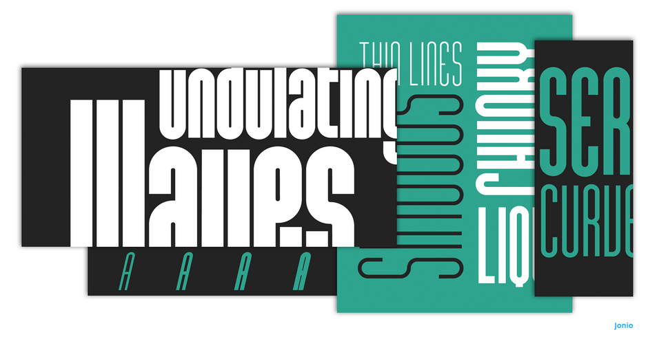
MF: Can you talk about the elongation of Jonio? It looks like a tall, long and lean athlete’s body — or even a funhouse mirror that stretches the human form. What was the inspiration behind it?
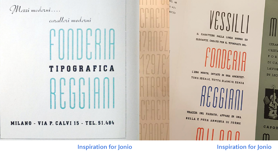
MA: I love condensed fonts. These tall and narrow typefaces, with little space between the letters, are probably the ones I use most. In the case of Jonio, I was influenced by a sales card I wanted to redesign: the Mezzi Moderni card from Tipografia Reggiani, Italy, a company designing graphic art for packaging and print. But, obviously, Jonio’s design was also driven by economics, because condensed sans serifs are in great demand.
MF: Talk a bit about demand. What do you see as Jonio’s market?
MA: As a condensed font, it’s best suited to display. So I imagine it’ll have a lot of uses — in the corporate, logo design, and other fields — into the future.
MF: Sounds very practical. Can you talk a bit about Mezzi Moderni? What does it mean?
MA: Mezzi Moderni means modern vehicles. But what does it mean to me? “Modern” means something that’s both accessible and currently in use, but I think of “contemporary” as something with the potential to remain commercially relevant for some time. For me, “contemporary” and “modern” are like children of the same family: related, but still very different from one another. In type design, though, it’s essential to be contemporary, so your work can live on into the future.
Take a look at fonts by the Italiantype Foundry.
We hope you enjoyed this interview. Don’t forget to add the interview to your bookmarks. Check your inbox to hear from the next Up and Coming Foundry.
Manuel Alvaro

