DIN® Next Font Field Guide

Best Practices
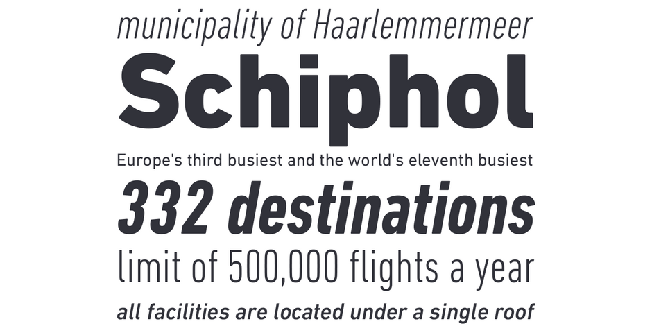
DIN Next makes a statement. It does not fade into the background. It’s character shapes are distinctive and can be distracting in long blocks of text copy. In hardcopy, it’s best used above 14-point. It’s relatively straight verticals and open counters made it an excellent typeface for on-screen uses.

Family
DIN Next family contains 32 designs: 7 weights plus italics for the regular, 7 roman plus obliques for the condensed versions and 4 roman weights of DIN Next Rounded
Font Facts
- The corners are rounded because many of the signs set in the original DIN fonts were cut with routers
- In 1923, Stempel was the first type foundry that produced printing types according to a DIN Standard.
- In 2011, the Museum of Modern Art in New York added the DIN design to its Architecture and Design Collection of digital typefaces.
Roots
Dating back to the late 19th century, DIN is the original “industrial strength” sans. Its name is an acronym for the German Deutsches Institut für Normung (German Institute for Standardization), and it was first used to identify railroad cars. Although DIN was the standard typeface for highway signage, house numbers and engineering applications for decades, it was not used much by graphic designers until the late 1980s.
Akira Kobayashi, Linotype’s type director, gave this venerable sans new life in the form of the DIN Next typeface family

Legibility
DIN Next is highly legible below 6-point in print and, at text sizes, on screen. Not ideal, however, for long form textual content.
How to spot DIN® Next

Alternate Choices
Perfect Pairing
Download a pdf version of the Neue Haas Unica font field guide and view the DIN® Next font family.
More Font Field Guides

Neue Haas Unica™ Font Field Guide
There are few applications outside the range of Neue Haas Unica. It is an excellent choice for text and display content – in hard copy or on screen. Learn more

Mont™ Font Field Guide
Mont is a versatile family that can be used at both large and small sizes. When used in headlines the typeface can be set in thin or heavy weights that displays the refined geometric forms at their extremes. Learn more


