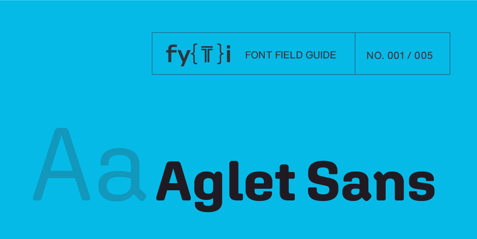
Aglet Sans Font Field Guide

Best Practices
Aglet Sans is intended for text to display sizes, both in print and on screen. It is spaced more towards display use, so very small point sizes will need a touch of tracking to read best.

Family
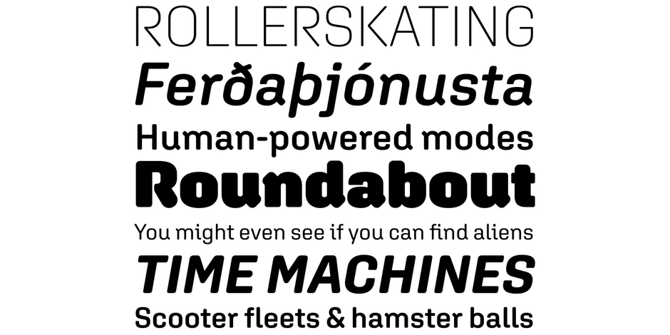
Seven weights ranging from Extra Light to Ultra, each with a complementary italic, for 14 typefaces.
Font Facts
- Aglet Sans is adapted from its precursor Aglet Slab, also by Jesse Ragan.
- The fonts have a large assortment of arrows, stars, check-boxes, and hearts for UI design.
- After getting a bunch of client requests for a rounded slab serif design for tech companies, Jesse Ragan decided to start the Aglet super-family (Aglet Slab, Aglet Sans, Aglet Mono).
Roots
Aglet Sans is an exploration what it means to be a rounded typeface and the ways in which a system can be implemented and strategically broken. The design has a mix of corner radiuses, not just a cookie cutter application of a round corner to every stroke. Each stroke ending was considered independently to make a rounded grotesque sans serif that felt natural. The interlocking entrance and exit strokes create spirited counter forms that urge the eye forward. These unorthodox details generate interest when set large, yet provide a crisp but unobtrusive voice for paragraphs and captions, both in print and on screen.

Legibility
Rectangular counters with a large x-height, along with a lowercase l with a tail helps Aglet Sans be easily read at small sizes.
How to spot Aglet Sans

Alternate Choices
Perfect Pairing
Download a pdf version of the Aglet Sans Font Field Guide and view the Aglet Sans font family.
More Font Field Guides

Artifex Hand CF Font Field Guide
Artifex Hand CF is built for use at small to medium sizes, in print and digital environments. Its Book weight is designed for use in longform text, articles, books, footnotes, and documents, while the thicker weights can double as headlines, subheadlines, and captions. Learn more

Guzzo™ Font Field Guide
Guzzo is a left of center design, that performs well in a wide range of sizes and application. It is not, however, a design that you would bring home to your mother. Well, maybe for a quirky Mother’s Day Card. Learn more


