Akzidenz-Grotesk® Next Font Field Guide

FOUNDRY: Berthold
DESIGNER: Bernd Möllenstädt & Dieter Hofrichter
CLASSIFICATION: Sans Serif Grotesque
Best Practices
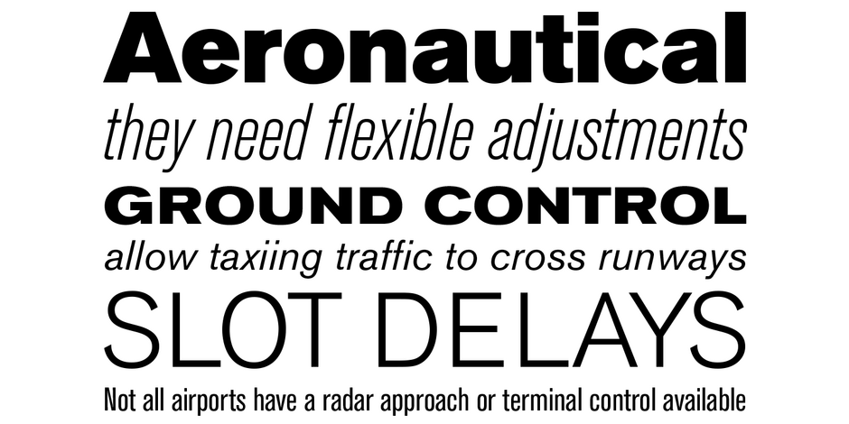
Akzidenz-Grotesk Next x-height was readjusted and additional designs were created to obtain a more consistent design than the original family. It’s many weights and range of proportions make the family ideal for a wide range of uses.

Family
Akzidenz-Grotesk Next contains 84 styles, from extra light to black, in regular condensed and expanded proportions.
Font Facts
- Some believe that Akzidenz-Grotesk was derived from Walbaum or Didot, because they have similar proportions and font metrics when the serifs are removed
- Akzidenz-Grotesk, loosely translated into English is “jobbing sans-serif” – as in, font used for simple, usually one sheet, jobs.
Roots
The first fonts of the Akzidenz-Grotesk family were released in 1898. By 1911, the family had grown to six styles. In 1958, the number had grown to thirteen. By 1968, there were twenty-one.
Akzidenz-Grotesk became available in the United States around 1957. The fonts were not marketed as “Akzidenz-Grotesk,” however, because it is difficult for English speakers to pronounce. It was called it “Standard” instead.

Legibility
Modest stroke width variations, letters with a distinct personality and simple character shapes make for a highly legible design in a wide range of sizes.
How to spot Akzidenz-Grotesk Next

Alternate Choices
Perfect Pairing
Download a PDF version of the Akzidenz-Grotesk Next Font Field Guide and view the Akzidenz-Grotesk Next font family.
More Font Field Guides

The design of Avenir Next is clean, straightforward and performs with confidence in long blocks of text copy and headlines. It also pairs well with well with so many contemporary serif text typefaces.

The Macklin family is a strong, adaptable family that is excellent for branding, headlines and other display uses. The simple shapes, open counters and apertures are wide and clear make it a good choice for short blocks of text copy in both print and on-screen environments.


