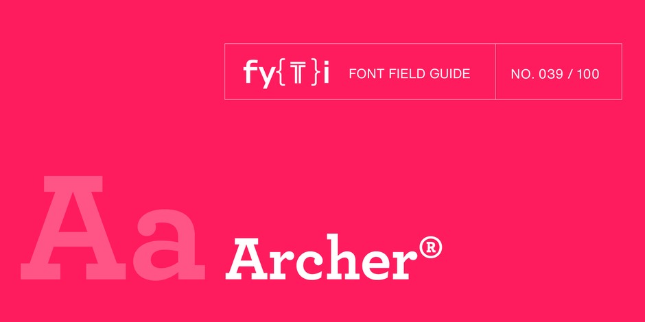
Archer® Font Field Guide

FOUNDRY: Hoefler & Co.
DESIGNER: Jonathan Hoefler & Tobias Frere-Jones
CLASSIFICATION: Slab Serif
Best Practices
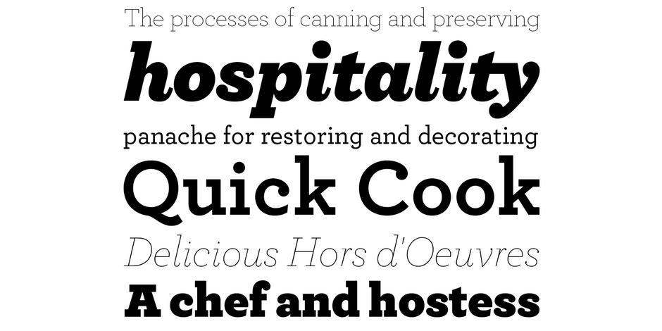
Although the lighter weights can be used for short blocks of textual content, captions and subheads, Archer is primarily a display typeface. It’s bold weights bring a commanding, but friendly, vibe to headlines and other large-size copy

Family
Eleven Roman weights, from Hairline to Ultra – each with a corresponding italic.
Font Facts
- Originally designed for Martha Stewart Magazine.
- Early in the design process, Martha Stewart showed an interest in the Courier typeface. Aspects of the design are echoed in Archer.
Roots
A somewhat arcane typeface, Landi, from the Nebiolo Type Foundry had an underlying influence on Archer. Landi was Nebiolo’s version of an older design, Welt-Antiqua from the type foundry Ludwig & Mayer. Nebiolo’s italic for Landi was a starting point for Archer’s italic.

Legibility
Although apertures can be small, Archer’s generous x-height, open counters and sturdy serifs, rank it high on the legibility scale.
How to spot Archer

Alternate Choices
Perfect Pairing
More Font Field Guides

This is not a “crystal goblet” kind of design. Knockout is at its best in large sizes. Use it for headlines, branding, and packaging.

Akzidenz-Grotesk® Next Font Field Guide
Akzidenz-Grotesk Next x-height was readjusted and additional designs were created to obtain a more consistent design than the original family. It’s many weights and range of proportions make the family ideal for a wide range of uses.


