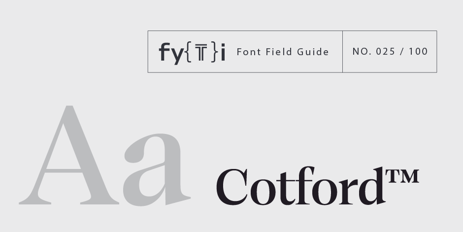
Cotford Font Field Guide

Foundry: Monotype Designers: Tom Foley Classification: Transitional serif
Best Practices
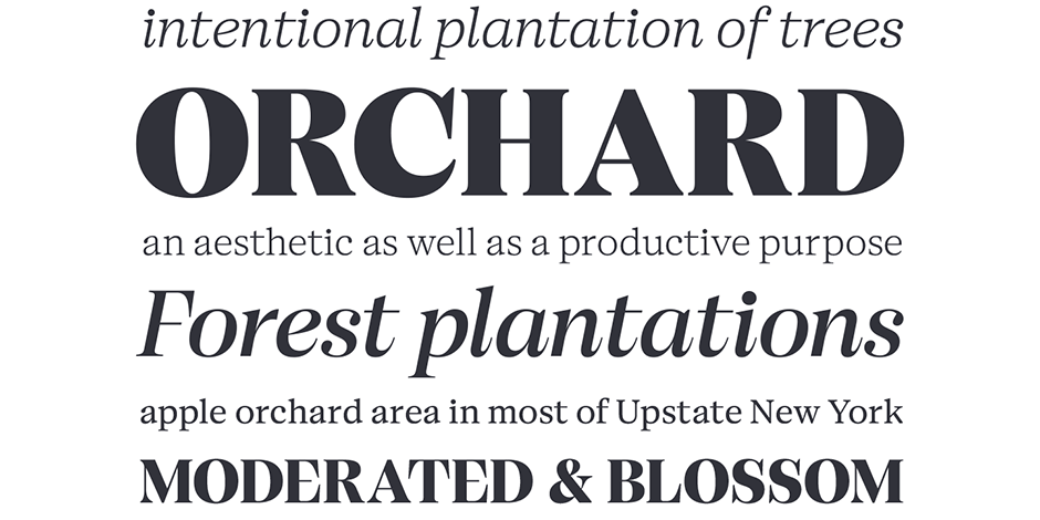
Cotford is a versatile serif family of elegant display and robust text styles. This range makes Cotford suitable for a variety of print and digital applications. Display weights are great for branding, editorial displays, and logotypes – while Cotfords text weights are efficient and robust, great for editorial text setting, user interfaces, websites and app design. Combied, Cotfords display and text styles can handle complex typographic systems and layouts.

Family
Three text roman weights, and five display roman weights, each with an italic counterpart. Also available as a Variable font with weight axis from Thin to Black and optical size axis from Micro to Display.
Font Facts
- Foley has extensive experience designing custom fonts for global brands, but Cotford is his first retail typeface release.
- Cotford was 8 years in the makeing, and started life as a set of broad nib hand sketches dating back to 2014.
- The name ‘Cotford’ comes from a Victorian style parade of shops close to where Tom Foley lives
Roots
The design process of Cotford was heavily influenced by the need for this new familiy to work seamlessly as a variable font. This required a lot of design exploration to determine what serif shapes and terminals can adapty from hairline to black weights, across micro, text and display optical sizes. Cotford’s design roots are informed as much by this process of designing for variable functionality as by the desire to create a unique and identifiable font family.

Legibility
Cotford ranges from micro to display optical size, across Thin to Black weights, providing legible and stylish type at all sizes.
How to spot Cotford

- Distinctive lowercase terminals
- C has a hanging terminal contrasted with a hooking baseline terminal
- Cap E and F have a serif-less crossbar
- Drop shaped terminals change from smooth internal connections in upright, to sharp connections in italic
Alternate Choices
Perfect Pairing
Download a pdf version of the Cotford font field guide and view the Cotford font family.
More Font Field Guides

ITC Legacy® Sans Font Field Guide
An excellent design for both hardcopy and interactive applications. The standard weights are full-bodied, while the condensed designs provide economy of space with little loss of legibility. Learn more

ITC Stone® Sans II Font Field Guide
There is virtually no limit to ITC Stone Sans II range of applications. Fine books, annual reports, restaurant menus, business correspondence, corporate identity programs, movie credits and advertising campaigns have all been set using this design. Learn more


