Futura® Font Field Guide

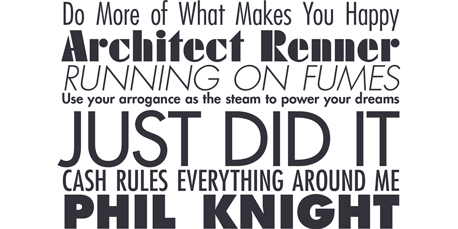
FOUNDRY: Linotype, DESIGNERS: Paul Renner and Bauer type designers & CLASSIFICATION: Sans Serif and Geometric Sans
Best Practices
An exceptionally versatile family, the Futura Bold and Condensed designs are powerful display typefaces. The Futura family is also a good choice for space-sensitive environments. Its simple letterforms allow it to be set at surprisingly small sizes with little drop in legibility. While the design works well for short blocks of text copy, captions and pull-quotes, it is not the best choice for lengthy text blocks.

FAMILY
Six weights of regular proportions and four of condensed, each with matching italics in addition to a “Display” and “Black” design specifically for headlines.
Font Facts
- Many assume that Futura was developed at the Bauhaus. The reality is, however, that Paul Renner had no Bauhaus affiliation.
- The design was rarely used by Bauhaus designers.
- The forms of Futura’s capital letters can be traced back to ancient Greek lapidary letters.
Roots
Paul Renner’s original 1927 drawings, which served as the basis for the Futura design, embodied the ideologies of the Bauhaus movement. The capital letters were patterned after Roman character shapes while the lowercase was a design experiment that took the “form follows function” philosophy to extremes. The end result was a set of glyphs that may have reflected Bauhaus teaching, but were typographically virtually useless.
Renner submitted his new design to the Bauer Typefoundry of Frankfurt, which accepted the work under the condition that its staff designers could make modifications. While Bauer’s designers left Renner’s caps relatively untouched, they reworked most of the lowercase. In doing so, they melded Renner’s philosophy with proven typeface design precepts.

Legibility
Except for the potentially confusing design of the a, j and l, the characters of the Futura family are quite legible. Its relatively small x-height and monotone strokes, however, hamper readability in continuous text.
How To Spot Futura

Alternate Choices
Perfect Pairing
More Font Field Guides

Felbridge™ Font Field Guide
The Felbridge typeface is a straightforward sans serif design with strong, clear letterforms that do not degrade in low resolution or on-screen environments. Learn more

Dante® Font Field Guide
Mardersteig designed his typefaces for letterpress printing. The ultimate triumph of the Dante design is that it now serves the diverse needs of digital text typography. Designed as a “book face,” Dante can be ideal for long blocks of text copy. Learn more


