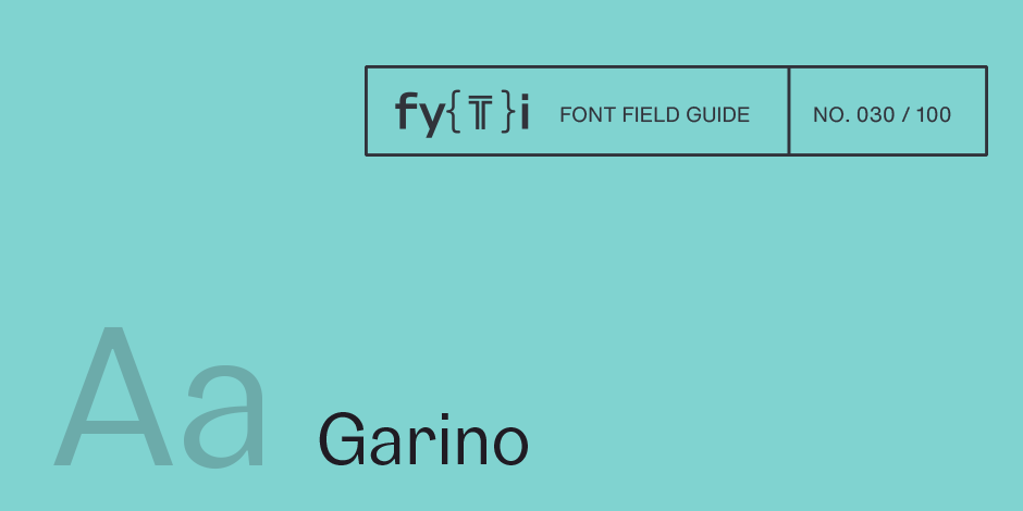
Garino Font Field Guide

Best Practices
Garino can be used in both a restrained and expressive way. The wide selection of styles makes it suitable for strong headlines and extensive body text. Completed with an extensive character collection, it becomes a real workhorse. A versatile allrounder that is up to all challenges – for corporate identity, editorial, branding, orientation and guidance systems and much more.

Family
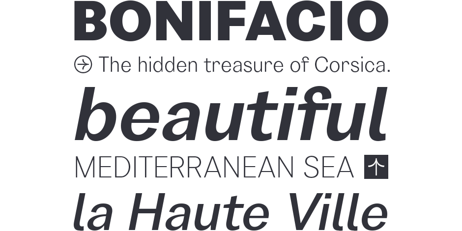
Garino is a modern sans-serif typeface family and has a total of 20 styles, from thin to heavy and matching italics. It gains its expressive character from a dynamic sweep in the curves and high-contrast transitions.
Font Facts
- The Garino family has a total of 1165 glyphs per font, including a whole range of features like 200+ languages, small caps, numbers, arrows, symbols, alternates and many more.
- Garino has an extensive range of circled and squared numbers. Thanks to Open Type Features and an easy system, the various designs can also be simply “written” without first having to select them in a glyph palette.
Roots
During the initial sketching phase of Ardena, the previous typeface before Garino, two different versions emerged where Julien Fincker felt greater potential. One was a more neutral and the other was a more expressive and characterful sans-serif, with closed forms. He decided to go with the neutral Ardena first, knowing very well that the more characterful design would not end up in the drawer. Garino was given a more expressive character by a higher stroke width contrast, more dynamic curves and more contrasty transitions – especially in the thicker grades, where the contrast comes out nicely. The closed forms gain further individuality and expressiveness through tapered terminals.

Legibility
The thinner and thicker weights are particularly suitable for strong headlines, while the middle weights can be used for typographic challenges and body text. A large x-heigt and slight contrast provide a high level of typographic legibility.
How to spot Garino

Alternate Choices
Perfect Pairing
More Font Field Guides

Royalis Font Field Guide
Royalis is an expressive and extravagant serif typeface family. It is characterized by a high contrast and dynamic features in the details, such as long terminals or deep inktraps. Royalis is available in three versions: a display version in six weights, a corresponding condensed version also for display applications, and a text version for body text in four weights. Learn more

Spitzkant Font Field Guide
Spitzkant is a serif typeface family characterized by strong contrasts. Pointed, sharp serifs and edges contrast with round and fine forms, making it very individual and expressive. Spitzkant is particularly suitable for branding, editorial, packaging and advertising. Learn more


