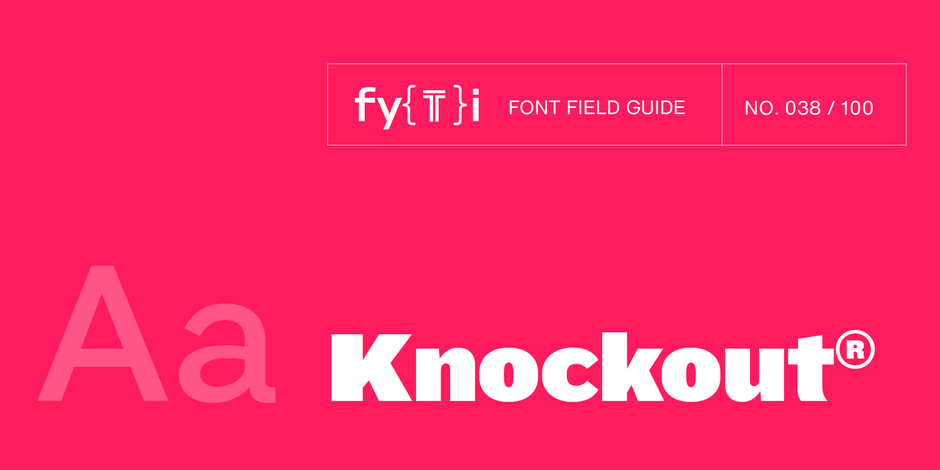
Knockout® Font Field Guide

FOUNDRY: Hoefler & Co.
DESIGNER: Jonathan Hoefler
CLASSIFICATION: Grotesque Sans
Best Practices
This is not a “crystal goblet” kind of design. Knockout is at its best in large sizes. Use it for headlines, branding, and packaging.

Family
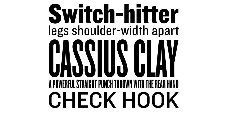
Knockout’s nine-width, four-weight family offers a range of typographic voices.
Font Facts
- Knockout is a reimagining of Hoefler’s earlier Champion Gothic headline series, released in 1991.
- Champion Gothic is a collection of bold display faces inspired by American wood type. Organized not by weight but width, its unusual family tree aided designers resolve the challenge of fitting unruly headlines.
Roots
Knockout is an interpretation of the sans serif typefaces that supplied American job printers in the late nineteenth century. Its thirty-two styles reference the tall, condensed wood types used for posters and advertising. It is an important preservation of American vernacular typography.

Legibility
Knockout is essentially a display design. While it does not rank high on the text legibility scale, its distinctive letter forms are eye-catching and make a powerful statement.
How to spot Knockout

Alternate Choices
Perfect Pairing
More Font Field Guides

Finador Slab is a soft slab-serif family. It has a strong character and can be used for many applications, especially for editorial, branding, packaging and logos. The family supports almost every of your needs. It has all the requirements to become your next favorite workhorse family.

Akzidenz-Grotesk® Next Font Field Guide
Akzidenz-Grotesk Next x-height was readjusted and additional designs were created to obtain a more consistent design than the original family. It’s many weights and range of proportions make the family ideal for a wide range of uses.


