Neue Swift® Font Field Guide

Best Practices
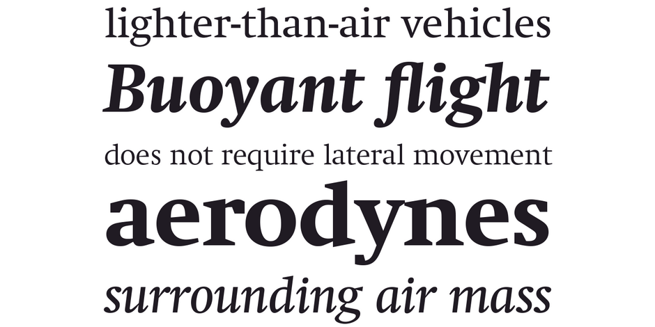
Neue Swift was designed for use in text sizes in publications. It can be used just about anywhere maximum legibility is a requirement. It’s also a striking design, making it both distinctive and easy on the eyes.

Family
The Neue Swift family includes six weights‚ ranging from light to bold‚ each with a cursive Italic companion.
Font Facts
- Swift’s round forms are relatively flat on the and bottom. This combined with long strong serifs produces a strong horizontal stress that guides the eye along a line of copy
Roots
Designed in the early 1980s, Swift’s design traits help it survive on rough paper printed on fast rotary presses of the newspapers of the time. Today, it is used in both print and digital publications. Neue Swift was drawn as an improvement on the original design – both technically and aesthetically.

Legibility
Swift was specifically designed for newspaper composition. It stands out on the page (be it digital or hardcopy), while remaining exceptionally legible.
How to spot Neue Swift

Alternate Choices
Perfect Pairing
Download a PDF version of the Neue Swift Font Field Guide and view the Neue Swift font family.
More Font Field Guides

Neue Kabel® Font Field Guide
Neue Kabel has a strong personality that limits its use in long form text. It can be, however, an excellent choice for advertising copy, promotional material, catalogs and brochures in print and on screen. Learn more

Neue Haas Unica™ Font Field Guide
There are few applications outside the range of Neue Haas Unica. It is an excellent choice for text and display content – in hard copy or on screen. Learn more


