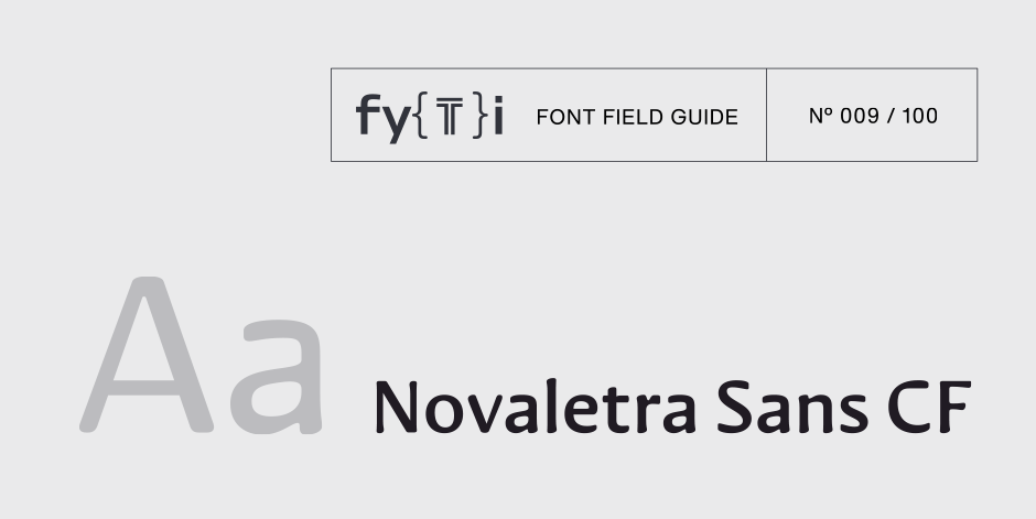
Novaletra Sans CF Font Field Guide

Best Practices
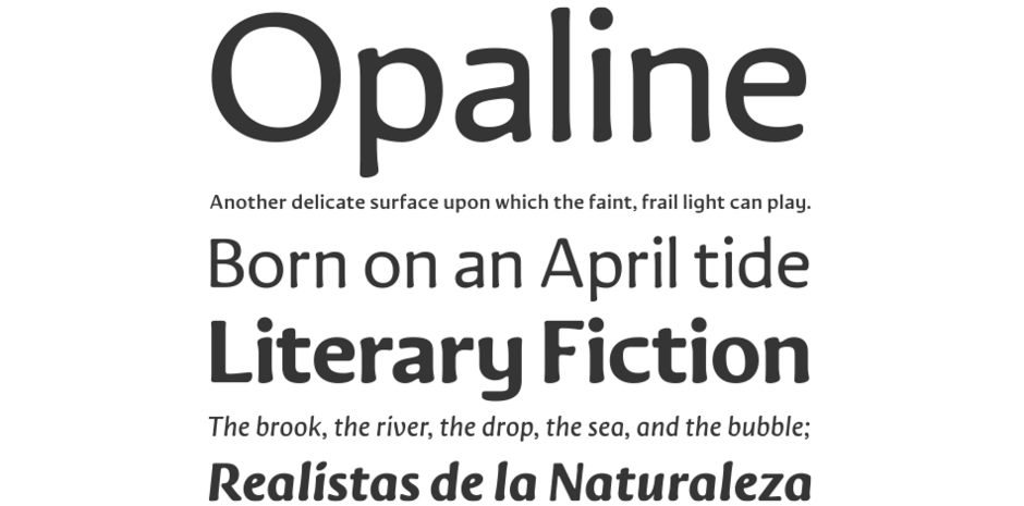
Novaletra Sans CF is built to excel at small to medium sizes, in print and digital environments. Perfect for text, captions, books, and documents, Novaletra’s elegant construction helps text flow and is easy to read, even at very small sizes. Its medium weights are ideal for long blocks of text, with lighter and bolder weights available to ensure maximum versatility. True italics, slightly condensed and calligraphic, read as distinct yet related to the upright roman set.

Family
Eight weights of roman designs, each with a complementary oblique, for a total of 16 styles.
Font Facts
- Novaletra Sans CF was based on Novaletra Serif CF and, as the two share a base design, they can be interchanged or used together with minimal fuss.
- As its name suggests, Novaletra was created with the intent of creating a new approach to body copy design in a sans serif format.
Roots
Novaletra Sans CF is an original design by Connary Fagen, designed in 2023 as a companion to Novaletra Serif CF, a serif designed for text and body copy. Elements from Novaletra Serif, such as its old-style characteristics, have been filed down to create a warm, smooth sans that offers wonderful readability not commonly found in sans serif typefaces. Subtle calligraphic touches and soft corners are implemented to lend visual interest, while the simple construction and medium x-height maximize legibility at small sizes.

Legibility
Novaletra Sans CF has been designed expressly for text use, and reads well at small to medium sizes. Though full of character and warmth, Novaletra never sacrifices legibility. Its low contrast design ensures easy reading.
How to spot Novaletra Sans CF

Alternate Choices
Perfect Pairing
Download a pdf version of the Novaletra Sans CF Font Field Guide and view the Novaletra Sans CF font family.
More Font Field Guides

Cygnet CF Font Field Guide
Cygnet CF is best when used in large to medium sizes. Though it reads well at smaller sizes, its unique flourishes and cheerful character are more evident when given space. Learn more

Artifex CF Font Field Guide
Artifex CF is built for use at small to medium sizes, in print and digital environments. Its Book weight is designed for use in longform text, articles, books, footnotes, and documents, while the thicker weights can double as headlines, subheadlines, and captions. Learn more


