Olivette CF Font Field Guide

Best Practices
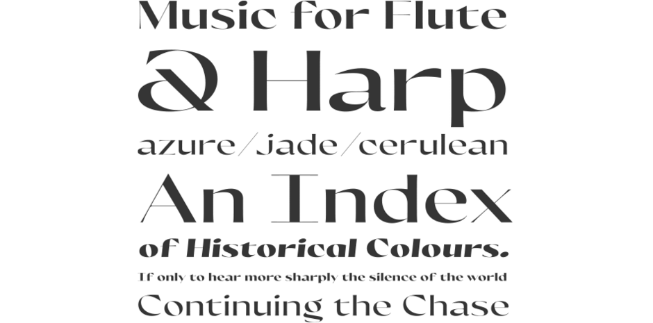
Olivette CF is a display typeface with fine details and high stroke contrast, and is best used at large sizes in print, digital, and film. Ideal usage includes magazines, posters, headlines, film and game title cards, logos, album artwork, fine art, and more. Given its extreme contrast, the bigger point size, the better. Olivette has a wide span and shines when given luxurious amounts of horizontal space — a cinematic, widescreen typeface.

Family
Six weights of roman designs, each with a complementary italic, for a total of 12 typefaces.
Font Facts
- The name Olivette is an homage to Olivetti, a legendary Italian typewriter manufacturer whose peak design was in the 1960s.
- Though italics are used less in display type than in body copy, a full set is included to offer more versatility and expression.
Roots
Olivette CF was designed in 2020 with the aim of conveying disparate fields like music, art, and fashion into a typeface design. Unusually, legibility was not the primary goal; rather, expression, experimentation, and movement were the ideals behind the design. Movement and fine lines guided the aesthetics, creating a stunning and refined look meant to feel at home on cafe menus, wedding invitations, film titles, and high fashion.

Legibility
Olivette is an extremely high-contrast display typeface. For best legibility, use it at large sizes where the font can take center stage with room to breathe.
How to spot Olivette CF

Alternate Choices
Perfect Pairing
Download a PDF version of the Olivette CF Font Field Guide and view the Olivette CF font family.
More Font Field Guides

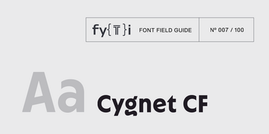
Cygnet CF Font Field Guide
Cygnet CF is best when used in large to medium sizes. Though it reads well at smaller sizes, its unique flourishes and cheerful character are more evident when given space. Learn more

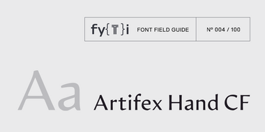
Artifex Hand CF Font Field Guide
Artifex Hand CF is built for use at small to medium sizes, in print and digital environments. Its Book weight is designed for use in longform text, articles, books, footnotes, and documents, while the thicker weights can double as headlines, subheadlines, and captions. Learn more


