Plantin Font Field Guide

Foundry: Monotype Designers:Frank Hinman Pierpontn Classification: Serif/Old Style
Best Practices
The Plantin design has a narrow, paper-conserving, width and a large x-height, making it an excellent choice for long-form text copy. It is, however, a heavy face and needs room to breath. The Plantin family also performs best in uncomplicated typographic arrangements.

Family
Four weights of regular proportions, each with an italic, one bold condensed design, two weights of Plantin Infant each with an italic counterpart, a single-weight of Titling and three Headline designs. The four designs of News Plantin were designed specifically for setting text where space is at a premium.
Font Facts
- F.H. Pierpont is often credited with designing Plantin – but he was not a type designer.
- Although classified as a “Dutch Old Style” typeface, Christophe Plantin was a Frenchman and Antwerp, where he worked, is in Belgium. The answer to the apparent miss-naming is that Antwerp was part of the Dutch Republic when Plantin worked there.
Roots
The Monotype Drawing Office Monotype designed the Plantin typeface, in 1913, under the direction of F.H. Pierpont. The design is based on fonts made by Robert Granjon in the 1500s and named after the famous printer, Christophe Plantin.
Over time, a more condensed News Plantin, Plantin Infant for the setting of young reader books, a bold condensed Plantin Headline and Plantin Titling typefaces were added to the family.

Legibility
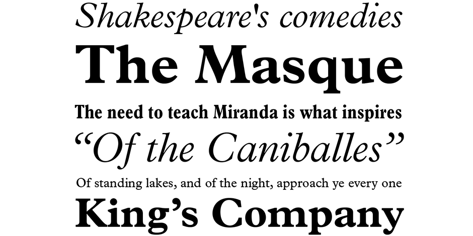
Modest stroke weight change, short sturdy serifs and old style design traits make Plantin a very legible design in print and on screen.
How to spot ITC Stone® Sans II

Alternate Choices
Perfect Pairing
Download a pdf version of the Plantin font field guide and view the Plantin font family.
More Font Field Guides

ITC Legacy® Sans Font Field Guide
An excellent design for both hardcopy and interactive applications. The standard weights are full-bodied, while the condensed designs provide economy of space with little loss of legibility. Learn more

ITC Stone® Sans II Font Field Guide
There is virtually no limit to ITC Stone Sans II range of applications. Fine books, annual reports, restaurant menus, business correspondence, corporate identity programs, movie credits and advertising campaigns have all been set using this design. Learn more


