Royalis Font Field Guide

Best Practices
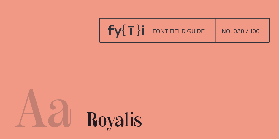
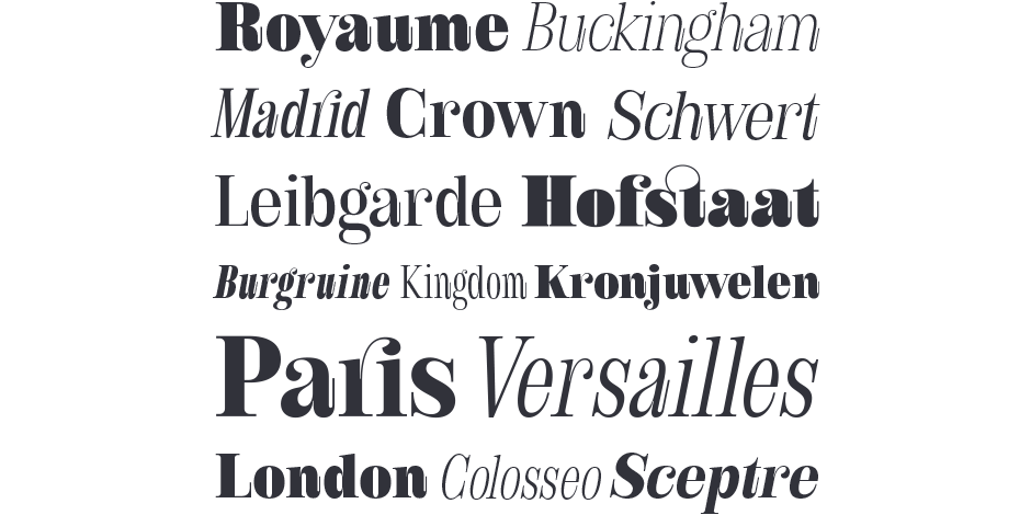
Royalis is an expressive and extravagant serif typeface family. It is characterized by a high contrast and dynamic features in the details, such as long terminals or deep inktraps. Royalis is available in three versions: a display version in six weights, a corresponding condensed version also for display applications, and a text version for body text in four weights. It also comes with all the corresponding italics. This makes Royalis versatile, especially for editorial, packaging, branding and advertising.

Family
Royalis is an expressive and extravagant serif typeface family in three versions with a total of 32 styles.
Font Facts
- The Royalis family has a total of 1027 glyphs per font, including over 200+ latin based languages and whole range of features like small caps, symbols, alternates and many more.
- Royalis has an extensive range of circled and squared numbers. Thanks to Open Type Features and an easy system, the various designs can also be simply keyboarded without first having to select them in a glyph palette.
Roots
Already in the final strokes of the previous typeface Garino, the idea grew to draw a serif typeface with a strong character as the next project. Since Julien Fincker always likes to try something different with every new typeface, he pushed the extremes as far as possible. The idea was to give the thickest width a very narrow counter and from there see how to go into the thin widths without losing too much characteristic. During the first trials, playful elements were also added directly, such as the long terminals and cut ball serifs, which give the appearance a more unique character. Likewise the rather deep inktraps. These character features are particularly evident in the lowercase a.

Legibility
The high-contrast display and display condensed versions have been complemented by a lower-contrast text version. This makes Royalis in combination suitable for both strong headlines and extensive body text, especially in the middle weights.
How to spot Royalis

Alternate Choices
Perfect Pairing
More Font Field Guides

Spitzkant Font Field Guide
Spitzkant is a serif typeface family characterized by strong contrasts. Pointed, sharp serifs and edges contrast with round and fine forms, making it very individual and expressive. Spitzkant is particularly suitable for branding, editorial, packaging and advertising. Learn more

Ardena Font Field Guide
Ardena can be used in both a restrained and expressive way. The wide selection of styles makes it suitable for strong headlines and extensive body text. Completed with an extensive character collection, it becomes a real workhorse. Learn more


