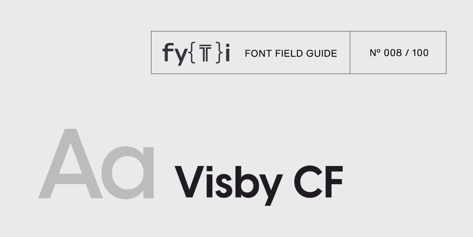
Visby CF Font Field Guide

Best Practices
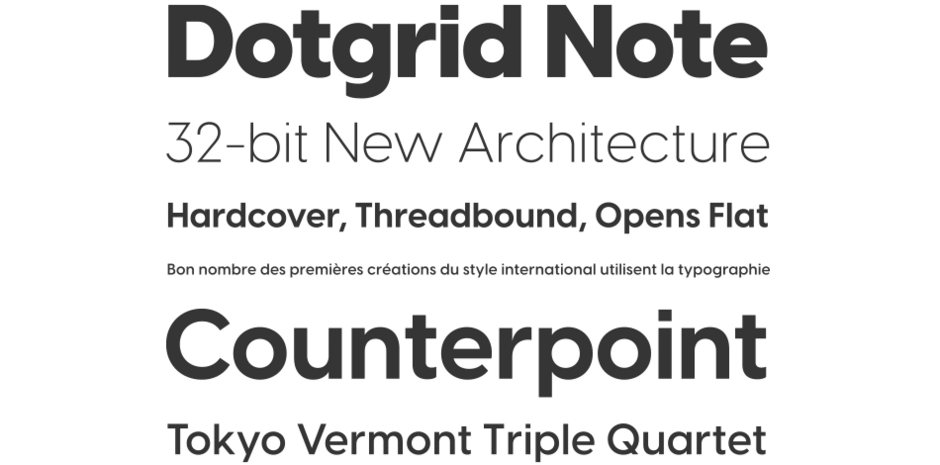
Visby CF is versatile, and its different strengths come into play in different use cases. At large sizes, Visby has been used for headlines and logotypes. Due to its clean design, it also reads well at small sizes, making it an excellent choice for subtitles and captions – just be sure to track it out a bit to improve legibility. This dual purpose approach allows for a body copy font to take center stage, creating a visual rhythm of Visby set large, a medium size body copy, and Visby again, set small.

Family
Eight weights of roman designs, each with a complementary oblique, for a total of 16 styles.
Font Facts
- Visby was inspired by the moodiness of a cold Arctic or Nordic night paired with the warmth and joy of a fire.
- Visby includes wide language support, including Latin and Cyrillic scripts. Many languages from Vietnamese to Ukrainian are covered, with more features like the International Phonetic Alphabet being added.
Roots
Visby CF is among Connary Fagen’s earliest typefaces, with many updates over the years keeping it fresh and adding new features. The motivation driving Visby’s design was an eye towards an airy, geometric look that didn’t skimp on personality. Elements like the short tail on lowercase g and the friendly “overbite” of the lowercase e lend the typeface a voice beyond pure simplicity while staying true to the core minimalist ideal.

Legibility
Visby’s construction is open and airy, with basic circles and straight lines as its core building blocks. This helps the typeface read well in nearly all cases.
How to spot Visby CF

Alternate Choices
Perfect Pairing
Download a pdf version of the Visby CF Font Field Guide and view the Visby CF font family.
More Font Field Guides

Cygnet CF Font Field Guide
Cygnet CF is best when used in large to medium sizes. Though it reads well at smaller sizes, its unique flourishes and cheerful character are more evident when given space. Learn more

Artifex Hand CF Font Field Guide
Artifex Hand CF is built for use at small to medium sizes, in print and digital environments. Its Book weight is designed for use in longform text, articles, books, footnotes, and documents, while the thicker weights can double as headlines, subheadlines, and captions. Learn more


