Fontsmith’s new luxurious typeface 25 years in the making: FS Siena
Fontsmith’s new luxurious typeface 25 years in the making: FS Siena
Tamasin Handley New typefaces
You can’t hurry a good typeface. All that sketching, drawing, honing, editing, balancing… Then there are the uppercase and italics to perfect, and different weights. Sometimes, it can take years. Few typefaces, though, would have been in gestation for quite as long as FS Siena®, the new contrasted sans serif face from boutique type foundry, Fontsmith.
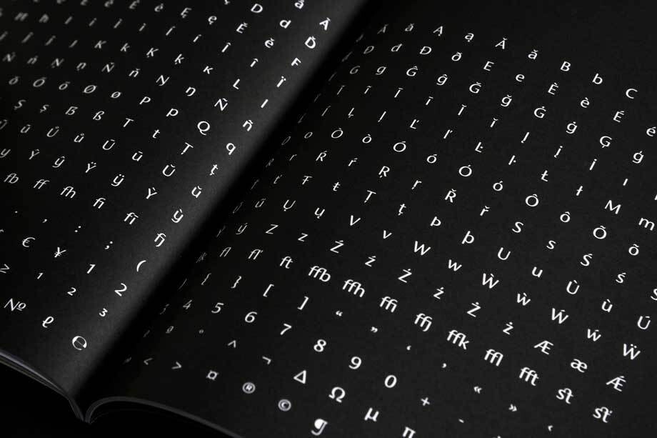
With its strong, upright stance, contrasting strokes and blend of generous, classical proportions with modern, economical lines, FS Siena is tailor-made for the kind of high-end brands for whom heritage and modernity go hand-in-hand. And like many of those brands in the worlds of fashion, cosmetics and hospitality, FS Siena is all the better for its extended evolution.
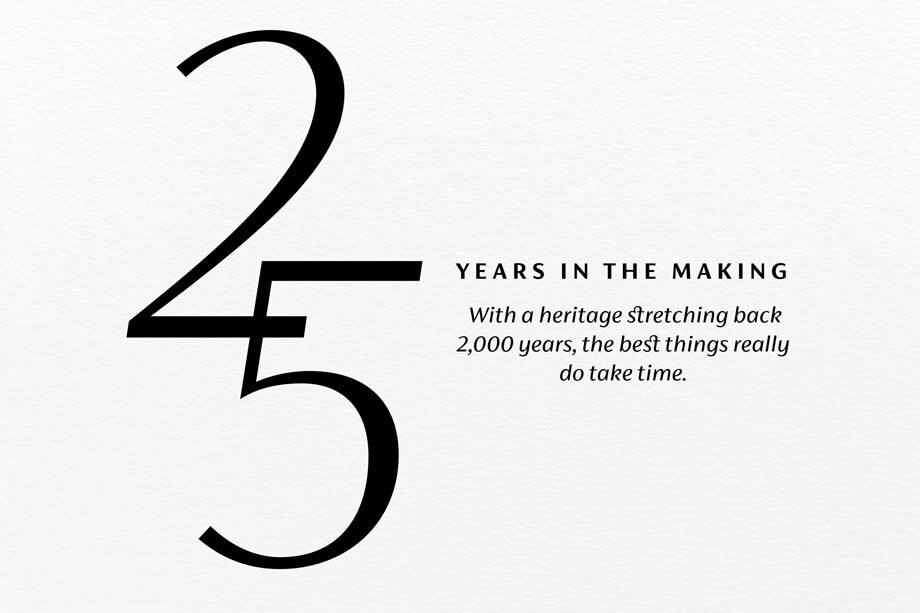
The typeface first saw the light of day some 25 years ago, when, at the tender age of 18, Fontsmith founder Jason Smith drew out the raw letterforms with a Rotring pen while still at art college. After his diploma show, the typeface was filed away on Jason’s computer. Until 18 months ago. ‘I’ve always wanted to do something with it,’ says Jason. ‘Phil Garnham (Jason’s co-director), has always rolled his eyes whenever I’ve mentioned it. But we see so much today that is samey. I wanted to bring some elegance back and develop a full set of weights that brands can use across a range of media, design and advertising.’
FS Siena is a contrasted sans serif typeface, blending classical elegance and modern simplicity. Contrasted sans faces first appeared in Roman inscriptions and can be seen in lettering from the Art Deco and Art Nouveau periods. They gained more prominent popularity in the 1950s, when designers such as Hermann Zapf, Jose Mendoza y Almeida and Enric Crous-Vidal started exploring the idea of sans serifs influenced by Roman inscriptional lettering. Their typefaces were all interpretations of classical models re-rendered with a modernist, sans serif sensibility.
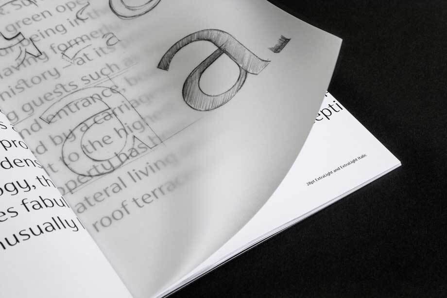
When student Smith first committed his typeface to tracing paper, his starting points were Roman stonecarved lettering and the contrasted sans face designed by Hermann Zapf in the 1950s, Optima. Jason drew his own alphabet, instinctively adjusting the letterforms according to ‘what felt right’. When this became the basis for a new contrasted sans, he and Fontsmith designer Krista Radoeva were determined to preserve its subtly nonconformist and eclectic character.
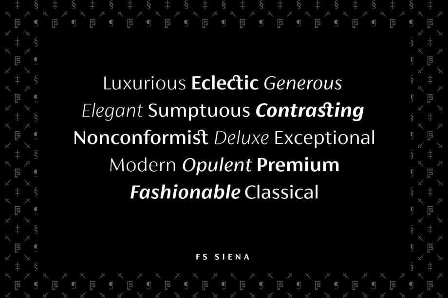

The kind of contrasting thick and thin strokes once cut into stone have been honed and modernised, and given a Fontsmith twist. ‘With a contrasted sans,’ says Krista, ‘it’s about choosing the right balance of the letters together, rather than having all the letterforms following exactly the same pattern.’
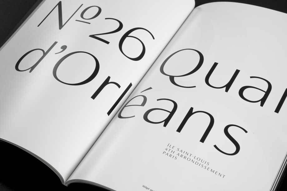
There are individual components throughout the character set that all add flavour, and need to be balanced in order to work together, as in any great dish. The smooth connection of the ‘h’ ‘m’ ‘n’ and ‘r’ contrasts with the corners of the ‘b’ and ‘p’. The instantly recognisable double-storey ‘a’ – the starting point of the design – contrasts with the single-storey ‘g’ and the more cursive ‘y’. And only certain characters – ‘k’, ‘w’, ‘v’, ‘x’ in the lowercase and ‘K’ ‘V’ ‘W’ ‘X’ ‘Y’ in the uppercase – have curved strokes.
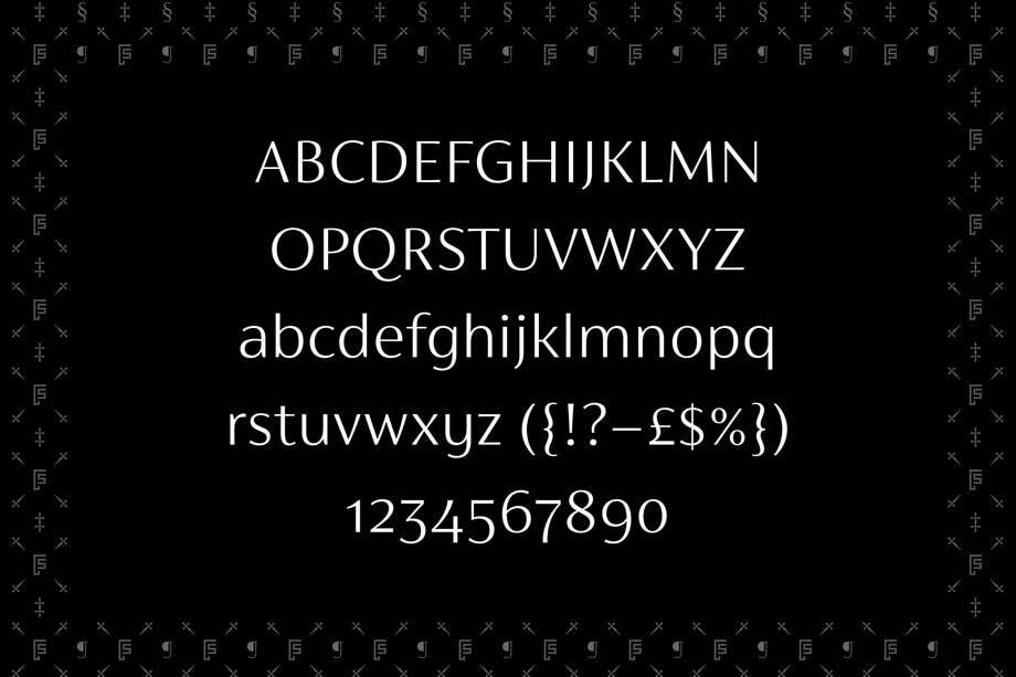
‘The contrasted sans is a very unusual style,’ says Krista. ‘The eye expects to see a serif at the end of the thin stems so you need to compensate with the subtle curves and flares found in some letters and a little extra weight in the stroke endings of others. It’s something of an optical illusion.’
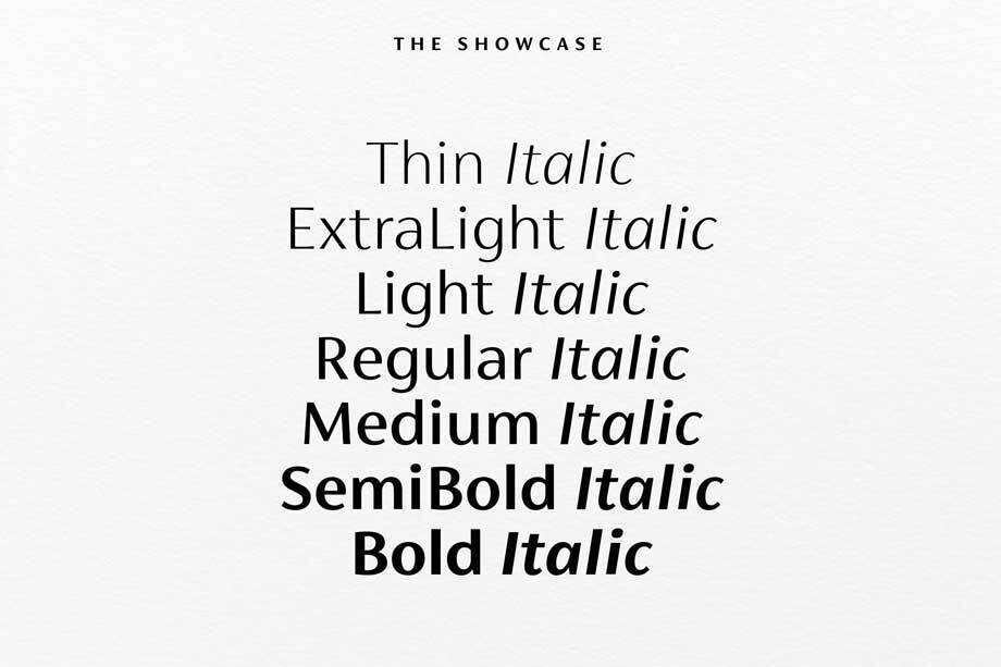
The seven weights and italics for FS Siena were developed by Krista and Jason to complement his original roman upper and lower-case alphabets. The lighter weights, from Thin to Light, are ideal for headline and display. The range from Regular to Bold can also be used at smaller sizes as the contrast of thick and thin is low. For all weights to be usable across the full range of media and sizes, it was important to make sure that that none of the strokes were too thin.
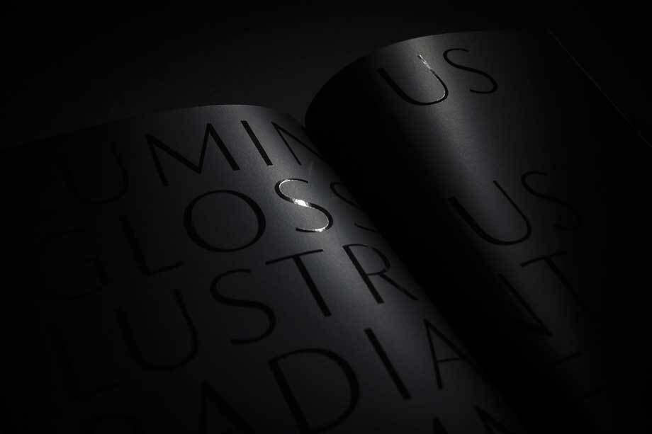
Many of the italic letterforms are built differently to their roman counterparts: there’s a single-tier ‘a’, a looped ‘k’ and connections more towards the middle of stems, such as in the ‘m’, ‘n’ and ‘u’. These distinctions, along with generally much narrower forms than the roman, give the italics extra emphasis within body copy, where the two are side-by-side. In editorial, especially, the combination can be powerful.
It’s been a long time coming, but with its heady mix of elegance and quirky charm, FS Siena is worth the wait.