For the beauty of writing
For the beauty of writing
Pedro Arilla Knowledge share
The right symbols in the right place: basics of orthotypography or how to use fonts to typeset texts beautifully
We savour the silent sonority of words, the intimate rhythm of a sentence, the vibrant materialisation of language in black and white, and the stimulating arrangement of plumb soldiers. We both (you and me) are devoted lovers of the written word; and between us (you — the reader, and me — the writer) there is a vital link called typography which exists, as Robert Bringhurst states, ‘to honor content’.
Broadly speaking, typography covers aspects such the layout setup, the choice of a typeface, the arrangement of the text within a document, and the right usage of typographic signs. In this text, we are focusing on this last aspect — which can be called orthotypography — one of the elements more commonly ignored. Orthotypography defines a set of particular uses and conventions by which typographic signs govern the writing element. While correct typography looks good, correct orthotypography feels good. This statement affects both the finest poetry book and the last text message that you sent to your secret lover.
There is typography everywhere; every message is a document, no matter how brief it is. Therefore, it is easy to connect the dots and see the progressive degradation of some orthotypography conventions since typography does not belong exclusively to professional typographers. I am not blaming here the typewriter keyboard as the only suspect of this type crime but it might be one of the main accused: the standardisation of straight quotes and the fading of curly apostrophes, the evaporation of the ellipsis, or the disappearance of the lowercase numerals would be just some of the charges. Let this serve as a sample of accepted conventions that should never have existed.
The typewriter should not be considered just a trivial example because, although the QWERTY keyboard was created in 1873, it is still in use in our computers and smartphones, allowing almost everybody to create documents. Luckily, times have changed and, currently, a variety of keystroke combos allow us to access different sets of symbols. Modern software (word processors and professional typesetting apps) automatise certain behaviours, and digital fonts — or at least the quality ones — incorporate a complete character set. The following paragraphs describe some of the main orthotypographic conventions which will allow us to explore tips, misconceptions, and curiosities.
Quotation marks
There is a series of punctuation marks used to indicate quotation or direct speech, titles of items within publications (chapters in a book, episodes in a TV show, articles in periodicals, and so on), and irony or ambiguity (the so-denominated ‘scare quotes’ among friends). These marks are called quotation marks and they are, without a doubt, the most frequently perverted. I know, I know: you think that you use them pretty well; however, let me just check a couple of things before you jump to the next section.
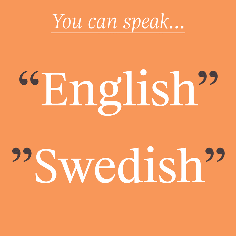
With the aim of simplifying this issue, we will only consider the Latin script. Still, each language within the same script follows its own convention and marks — e.g. “English” and ”Swedish” use superior marks but in a different way; „Dutch” and „German“, low and up quotes; and «Spanish» and »Danish«, guillemets. Even within the same language, conventions can change as in ‘British’ and “American” English. The use of quotation marks gets even more complicated when we have to switch to a different set of marks within a quoted sentence in the so called secondary use. As you might suspect, each language follows, again, its own rules — e.g. Carlos dijo: «No me puedo creer que me llamara “idiota” delante de sus padres.» [Carlos said: ‘I cannot believe that he called me “idiot” in front of her parents.’]
Once we know what type of quotation marks we must use, it is time to actually use the right ones and not a different set. Straight quotes (or dumb quotes) are frequently typed instead of curly quotes (or smart quotes) and the apostrophe. Don’t do that, please. Why does it happen? Well, just because they are right there on the keyboard. Fair enough, but let’s dig a bit more.
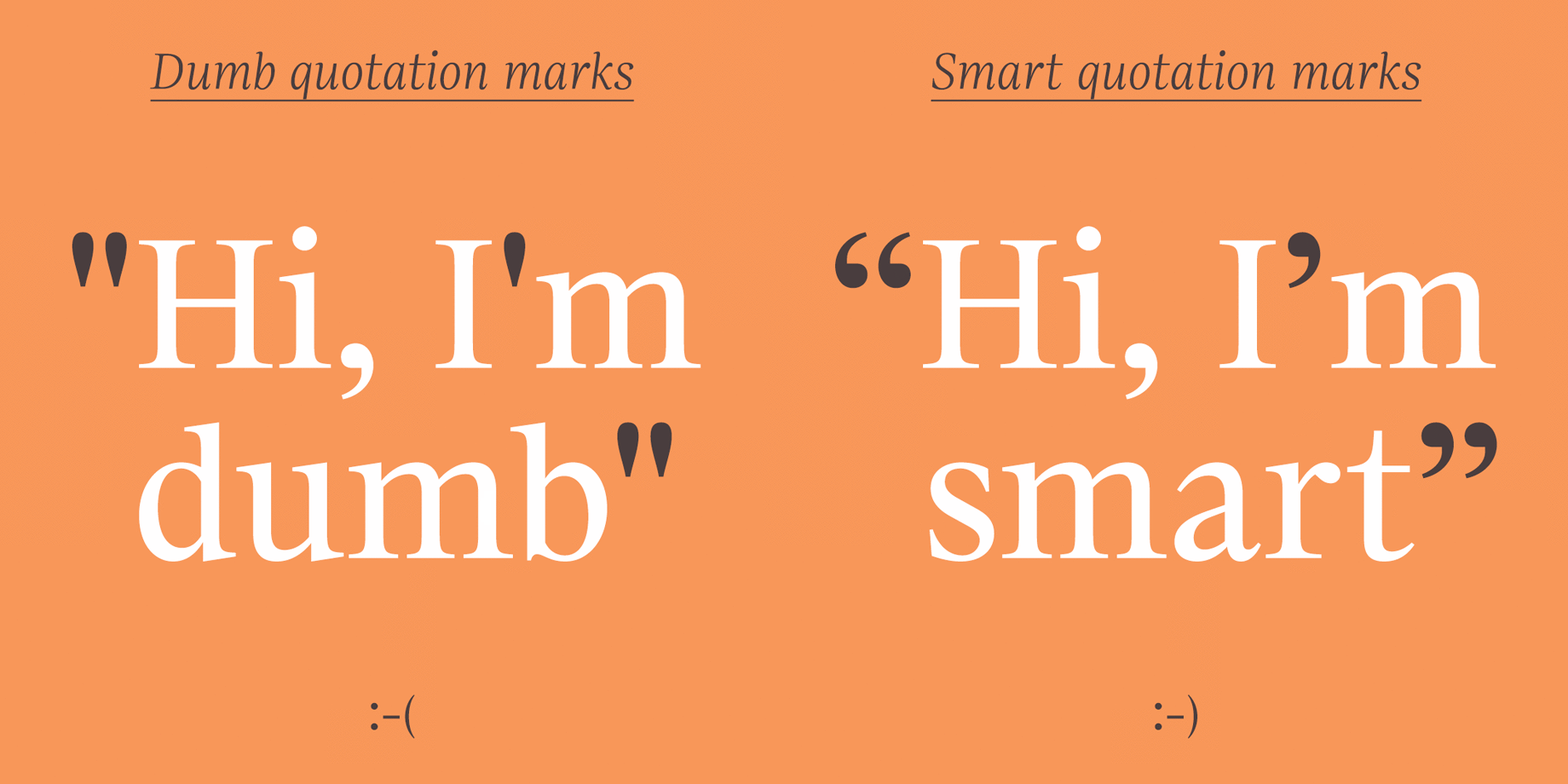
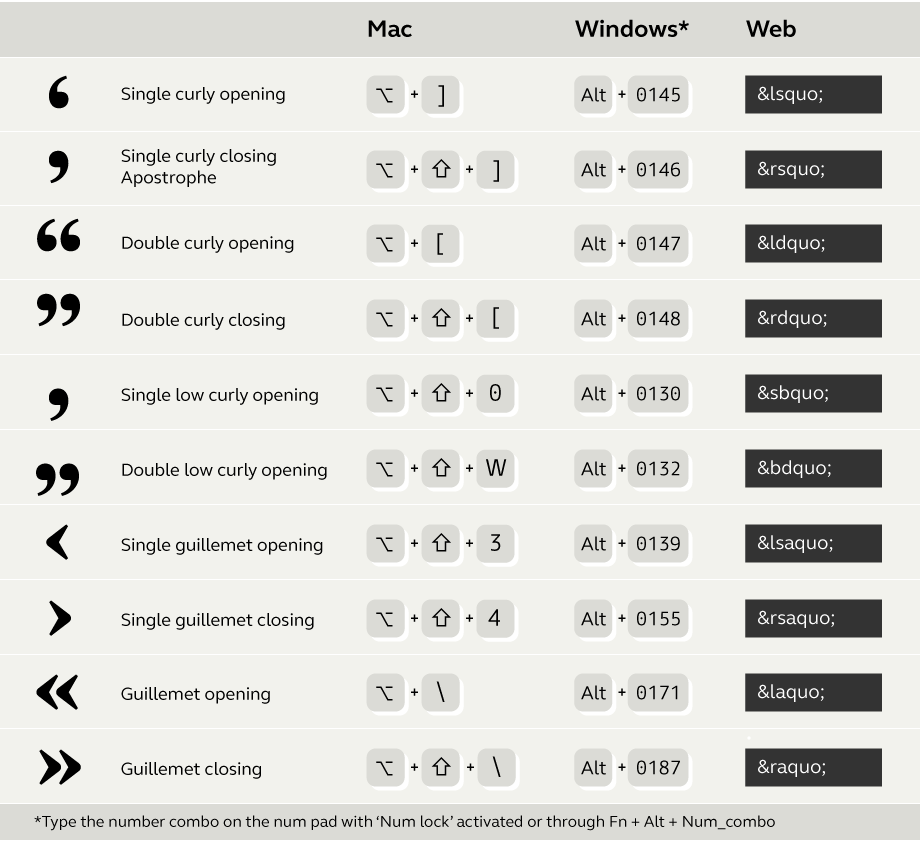
Straight quotes come from the typewriter keyboard and, strictly speaking, they have no typographic function. They were artificially created for space-saving reasons: with only two keys (simple and double straight quotes) they could avoid including six keys (single curly opening, single curly closing/apostrophe, single prime — used for marking feet and minutes, double curly opening, double curly closing, and double prime — used for marking inches and seconds). These days straight quotes are widely used for feet and inches (in the absence of prime and double prime) but many people get them confused with curly quotes which are used more frequently. The question is, if they are used less than curly quotes why are they still the ones included on keyboards? Some word processors automatically convert dumb quotes to smart quotes; but perhaps the keyboard makes it easier to be a bad typer. Another common mistake when typesetting in a language that uses guillemets as quotation marks, is to use the greater/less-than signs. With so many of the symbols we need hidden away from the main keyboard we’re using it can be hard to know how to access them. So here are the shortcuts via a British keyboard:
Dashes
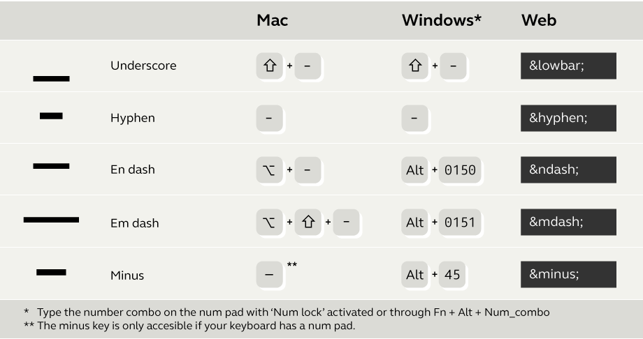
Among the horizontal marks, the dashes subgroup is the one which can present the most difficulty. After all, they are nothing but little lines, aren’t they? Well, yes and no. If you want to be a orthotypography nerd — and you should, you need to understand the particularities of the different symbols. Let’s start with the easy one: the underscore, that dash below the baseline. Its story is related to the typewriter but, at least, this time the outcome was beneficial. It was introduced as a way to underline words by moving the carriage back to the beginning of the word and overtyping the low dash. Nowadays, it has a residual usage as a visual space creator when actual spaces are not allowed — especially in informatic environments: computer file names, server URLs, email addresses, and so on.
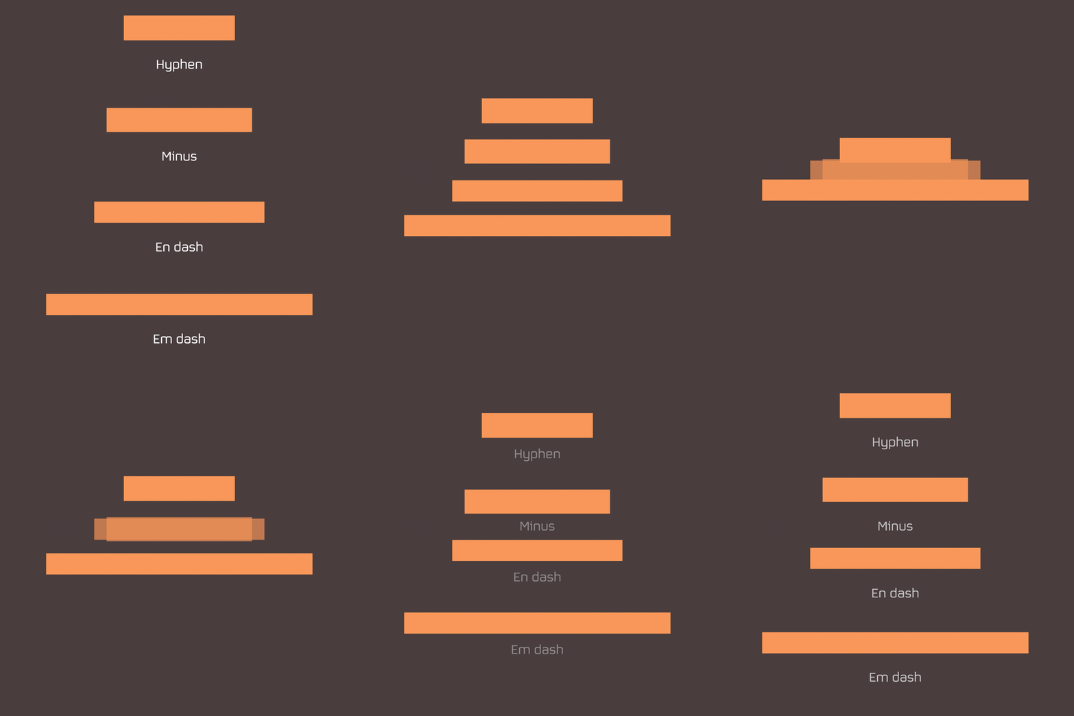
Roughly centered in the x-height we find the hyphen, en dash, em dash, and the minus. They vary in length and, usually, also in weight. In classical Latin typography, their lengths were related to the body size — e.g. an em is 12 pt in 12 pt type and an en would be 6 pt because it is half of an em. This tongue-twister triggered typographers to start calling muttons to ems and nuts to ens with the aim of avoiding misunderstanding. In any case, the hyphen is the heaviest and shortest (around quarter of an em). It is used as a link for compound words (e.g. anti-nuclear), or to split words that do not fit into the current line. The en dash size is about an en (surprise!) and is used to concatenate sequences (e.g. 1984–2018). The em dash length, as you might guess, is around an em and it is used as a parenthesis — like this one — or an introduction to an aside. The minus sign is the mathematical subtraction operator and its length is about an en. It must be used in maths settings rather than the hyphen.
Dots
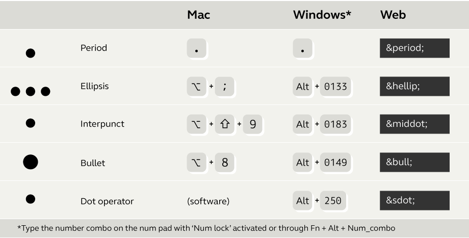
The period or full stop is, without a doubt, the rock star of the punctuation marks. It is the first one that we learn to use and the first one that we master; everybody knows how to use it — to mark the end of a sentence, after abbreviations, or in email and website addresses. Advice for anyone born before the digital revolution: in digital chat, a full stop ending can infer an aggressive tone to your sentence; and, by the way, two spaces after a full point is wrong practise. Always.
When we want to mark omission, rhetorical pause, or to show that a sequence continues in the same logic, we can concatenate three dots. But in actual fact there is a punctuation mark with its own entity called an ellipsis that we should use in those scenarios. From a design point of view, it is usually spaced wider than a series of three full points.
Over the baseline, but not seated on it, there are some dot glyphs that are worth knowing about: interpunct, bullet, and dot operator. The interpunct or midpoint can be used to separate items in a horizontal arrangement; however, its stellar use is in the Catalan language as part of the geminate L. The bullet is the fat cousin of the middle dot and is used as a typographical flag. It is commonly seen heading items on a list. The last one of this group is the dot operator, a symbol to indicate product in mathematics or to denote the ‘AND’ relationship in formal logic. It has to follow the design of the rest of the maths symbols. By the way, none of these dot-symbols necessarily have to be rounded.
Figures and relatives
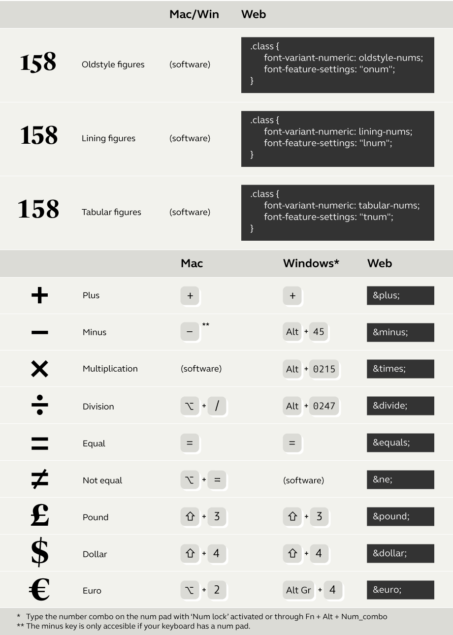
On a personal note, I find the standardisation of lining figures a little sad. I have my reasons. But let’s start from the beginning: there are three main sets of numerals and each one has a specific function. Oldstyle figures (or lowercase figures) are designed to match the lowercase letters in size and colour. They should be used in body text. If we use lining figures (or uppercase figures) they will stand taller because they are designed to match the uppercase letters — unless it is actually a text typeset in all caps, of course. The third group is tabular figures, similar to the lining ones but with an even width. That makes them perfect for typesetting tables. Nowadays readers are used to seeing lining figures, simply because they are the ones most easily typed out using a keyboard, but Oldstyle figures work better in lowercase text. As I mentioned beforehand its sad for me and other type designers that Oldstyle figures are available but rarely used. Check the character set of your favourite fonts; if they are high-quality, they will also include superior and fraction figures.
A common companion to figures are maths and currency symbols. These are specifically designed to match numbers and include: plus, minus (not the hyphen), multiply (not the letter x), divide, equal, not equal, and so on. Regarding currency symbols, you can access to the most common through your keyboard; however, you have to be careful how you typeset them. While in English a beer can cost £4.99, in Spanish we would say 4,99 £ — notice the position of the currency symbol, the decimal separator, and the thin space between the number and the pound sign.

Spaces
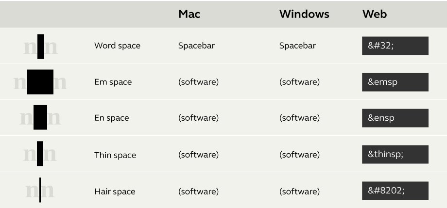
Last but not least: typographic whites are as important as the rest of the character set. It is reasonably easy to use them on professional typesetting or design software such as InDesign, but they are not that accessible in other platforms like MS Word. The most common ones are: word space (the space between words), em space (about an em), en space (about an en), thin space (about an em/5), hair space (a very thin space: between an em/16 and an em/24). Typographers use the widest spaces on things like paragraph indentation and in tables. And the thinnest to separate elements but not too much. For example: number [thin space] currency. Or hair spaces around em dashes so dashes don’t touch the following word. It’s just a way to be subtly elegant.
To conclude
We have seen some of the possibilities that modern fonts offer to occasional and professional typographers and how to use them. However, as in every aspect of life, context matters. That means that these conventions are not rules. In other words, what set of quotation marks should I use? It is a convention that varies for every language. Should I put a space before and after an em dash? It depends of you are writing either in British or American English. Is it right to add a fourth dot after an ellipsis when it is the end of a sentence? That would be designated by the editorial style of the publication.
The art of orthotypography is intricate but delightful. The good news is that this is only the beginning of the road! There are waiting for you: vertical signs, brackets, question marks, asterisks, ampersands, semicolons, arrows, and so on; plus italics, small caps, etcetera. If you are interested, check out our punctuation series to discover a story behind every typographic corner. The edge between typography and literature can be marinated using all the potential that fonts offer. Let your texts feel good. Do it for the beauty of writing.