FS Kim: The Exuberant Type
FS Kim: The Exuberant Type
Krista Radoeva New typefaces
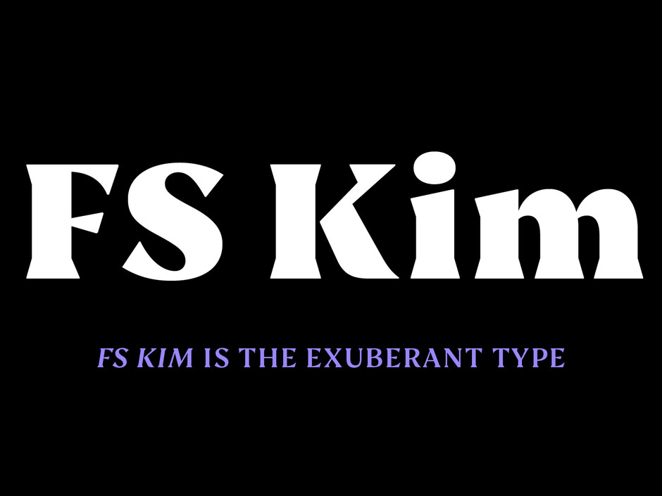
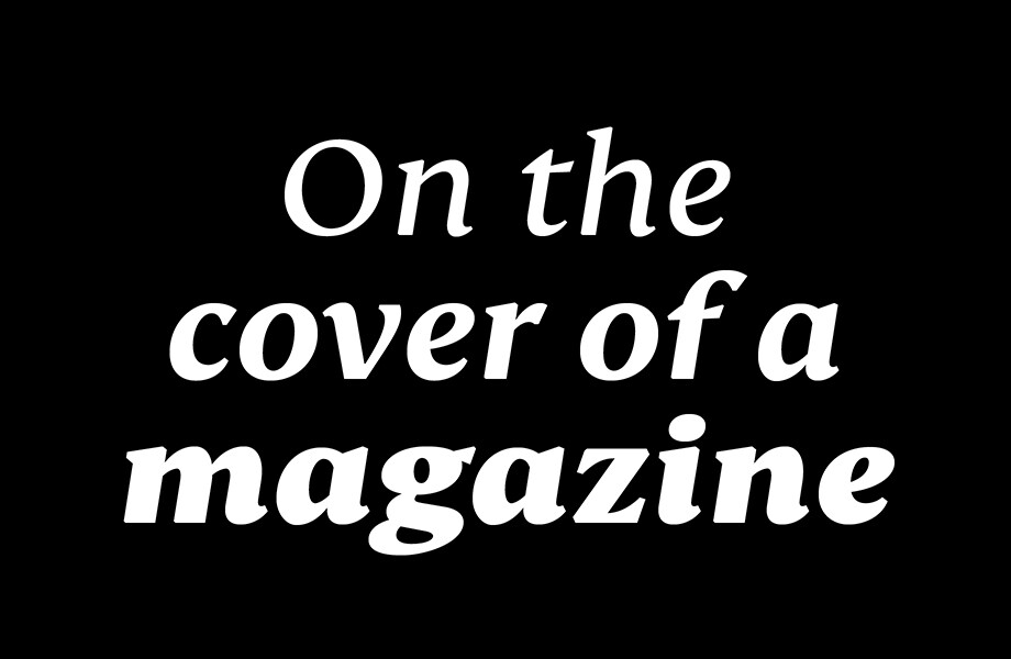
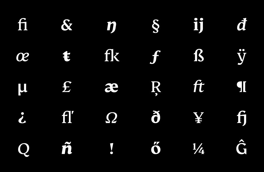
FS Kim shines brightest as a display font, and is perfect for applications across fashion, theatre, cultural projects and pretty much any brand that wants to make a statement. While this font is dramatic, it’s incredibly versatile, too, and works to showcase content in a stylish, striking way.


Serif typefaces are usually associated with text, and designing them traditionally comes with certain limitations: sticking to elegant traditional forms, keeping legibility and readability in mind, being careful and afraid to add character. And in making a display serif, that usually just means a higher contrast version of the classical shapes.
With FS Kim, though, I decided to disregard this fear of “character”, and what’s expected of serifs. I wanted instead to reverse the usual process, beginning by creating a serif typeface designed for use at larger sizes only. The starting point was writing with a broad-nib pen, but not following a strict, traditional model. I wanted something a bit more aggressive—angular, sharp, exaggerated—a riposte to serif fonts that tend to stick to a subtle softness.
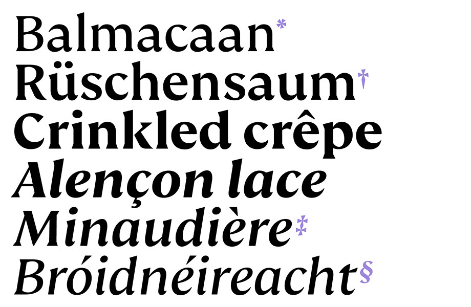
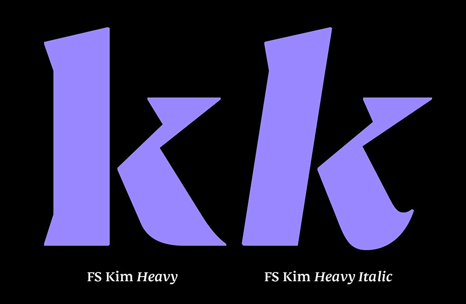
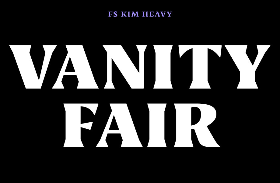
The challenge in creating FS Kim was in using a process that delighted in breaking from tradition, while still creating elegance and consistency in the letterforms. The calligraphic starting point helped to create familiar forms, while a contemporary display feel is achieved through Kim’s short wedge serifs, with playfulness added through the font’s exaggerated forms and details. The narrow proportions, short ascenders and descenders, and tighter spacing make the font suitably compact for display use. The overall aesthetic feels bold and sharp, but closer inspection reveals that all the corners are softened: one of many twists in this sassy typeface.

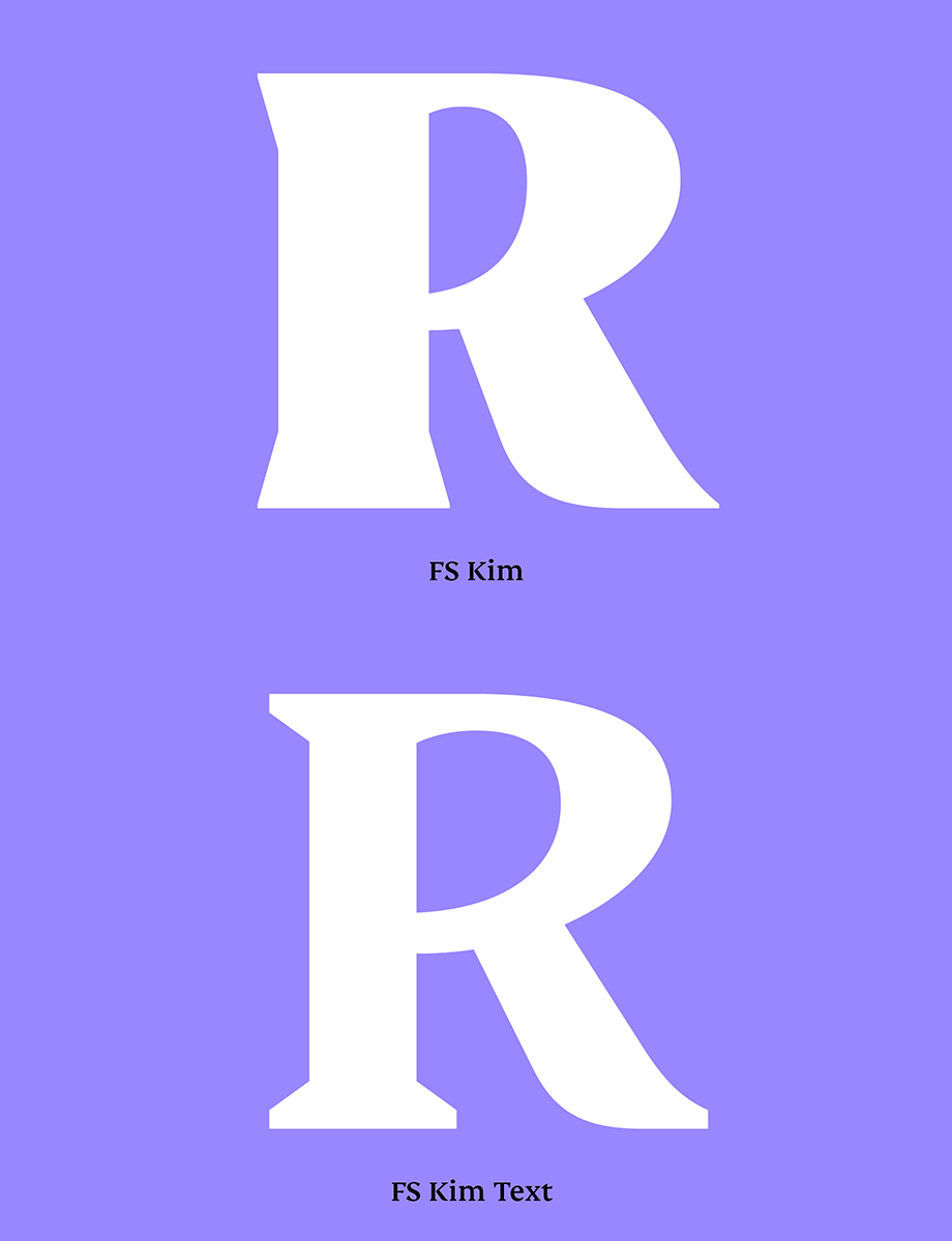
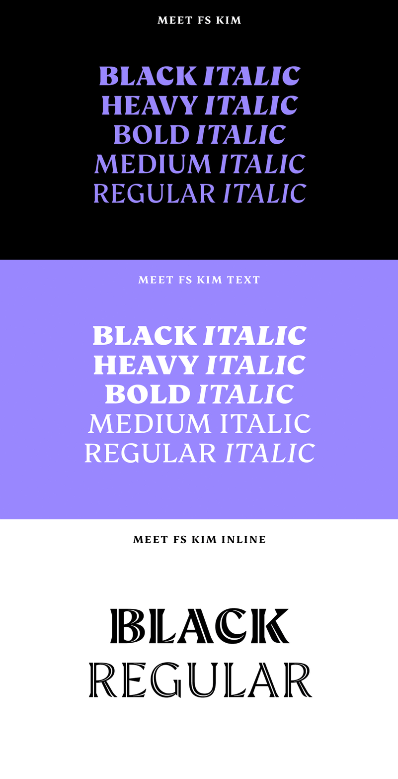
Once the display typeface was created, I went on to make the text version. Modifications included larger x-heights, longer ascenders and descenders, wider spacing, longer and more defined serifs and a lower contrast. The serifs are the biggest changes between text and display: while they’re tiny in the latter, they’re longer and more strongly defined in the former for readability at smaller sizes.
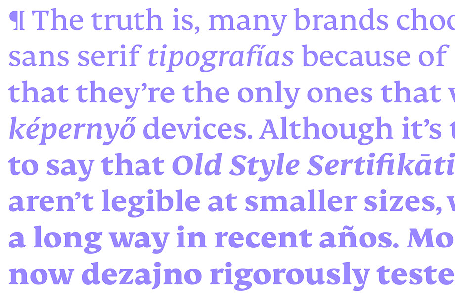
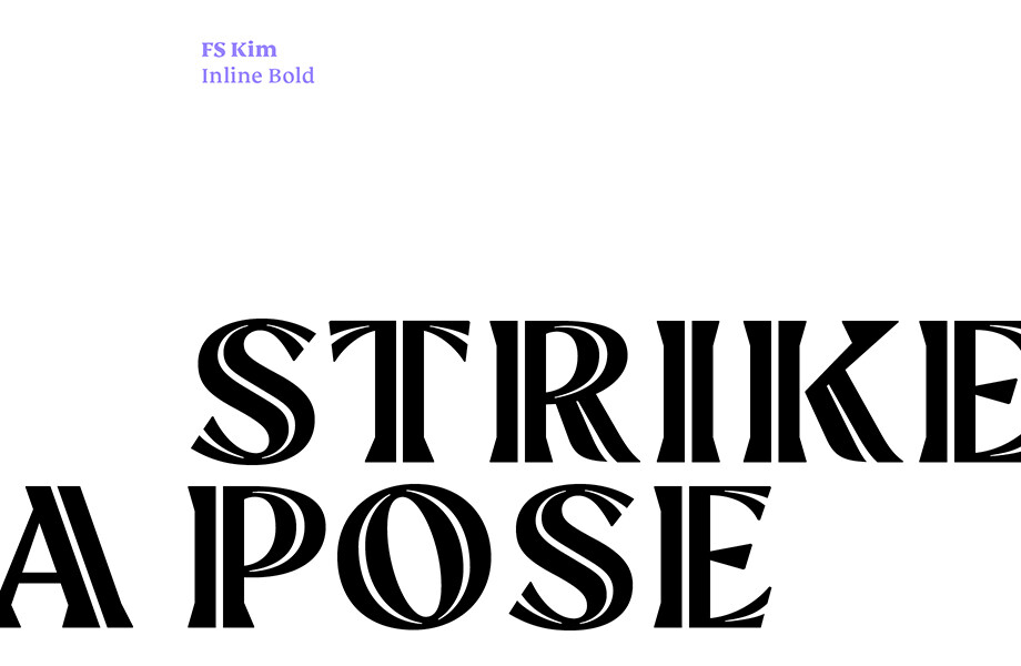
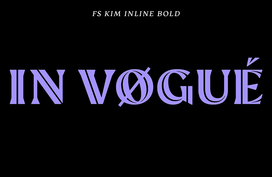
The overall idea is that it’s not an optical size: while FS Kim’s text version is more constrained than the display, the strength and playfulness remain so that display and text maintain a strong connection and can be used together without compromising character for consistency. There are also two additional styles, based on the Regular and Black with inlines—uppercase, figures, symbols, but no lowercase. The inline brings an extra option for an even stronger, more decorative display use.
The beauty of FS Kim lies partly in its contradictions: it’s sharp but soft; inspired by traditional tools but using a process that deliberately breaks conventions. It’s flamboyant, complex and dramatic: FS Kim makes you look, and makes you curious—a perfect font for publishing, branding and making a statement through unconventional beauty. FS Kim is available to;test drive and buy now.