How to space a typeface
How to space a typeface
Fernando Mello Knowledge share
The adjustment of space between letters in typeface design is correctly considered by many as being as important as the design of the shape of the letters. English typographer Walter Tracy stated in Letters of Credit that “the ‘fitting’ of letters – the allocating of the correct amount of space to each side of them, so that they are associated into words they have a balanced relationship, without unsightly gaps or congestion – is a process fundamental to the success of a type design.”
Indeed, it’s impossible to create a coherent set of characters without studying them in combination. And frustratingly, it seems that there is no absolute formula to fit all the characters perfectly in every typeface: correct spacing is the result of a combination of reasonable judgement of the eye, and the individual designs of each glyph.
The objective is to make all the glyphs equally distant to each other inside a word through optical adjustments and creating comfortable textures in texts. However, personal reading habits relating to certain styles of typefaces or ways of setting text may also play an important part in defining what is more or less readable to an individual.
In his 1970 essay Letterforms in photo-typography Adrian Frutiger explained that in the practice of designing typefaces “each letter must conform to a basic form embedded in the subconscious mind of a large mass of readers.” So, the readability proposed by text typefaces is related to the presence of a group of standard shapes in their design. Since these common characteristics in letterforms exist in text typefaces, it seems convenient to imagine simple steps or systems of attributing standard amounts of white space accordingly to these common shapes.
Below, I’ll explain some important optical concepts which are crucial to the correct spacing of letters, then give some tips on how to start the spacing of a typeface in a logical manner.
Spacing a sequence of different shapes
The first thing to bear in mind when attributing amounts of white space laterally to some different shapes in an equally distributed manner is that eye judgements are more important than any arithmetic parameter. If we consider a random sequence of squares, circles and triangles and try to balance the white spaces between them visually, the results are better than spacing these shapes by a fixed amount. [Fig. 1]
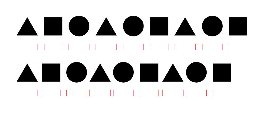
[Fig. 1]: In the first example, a fixed amount of space was attributed between the shapes. Above the shapes are spaced visually. It is possible to notice in the second example that the spaces follow standards according to the different combination of shapes.
That means that depending on the shape to the sides of a letterform, we have to attribute different amounts of white space to them accordingly.
Balancing internal and external white spaces in letterforms
As we’re all aware, some letters have internal white spaces and serifs. These may also have an influence on the correct space to attribute to the sides of each of them, and so adjustments in letter widths and shapes during the spacing process are possible.
In order to achieve an even colour in the text, the amount of white spaces inside and outside glyphs that have counters should be balanced. Dutch graphic, type designer and writer Fred Smeijers refers to this equilibrium of black and white in his book Counterpunch when he says that the spaces between the letters “have to be in balance with each other and, at the same time, in balance with the spaces within the characters.”
Smeijers also explains that characters with open counters are more difficult to space because “there is no clear border between the space that belongs to the inner area of the character and the space that belongs to the area between the two characters,” and thus “serifs help the designer… to define inner- and outer-space more definitely and more easily.” [Fig. 2]
It is partly because of this that serif typefaces are considered more readable and are still chosen today for most text-based books or in editorial design.
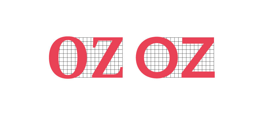
[Fig. 2]: In a serif face like FS Sally® the inner-space of a “z” is more defined by its serifs than in a sans-serif one like FS Elliot®.
The simultaneous contrast issue
The black and white compensations issue is further complicated by human eye mechanisms. Type designer David Kindersey explained in his Essay in Optical Letter-spacing and its Mechanical Application: “White is whiter than white immediately next to black. When spacing is too close, this intensity increase might erode the image.”
That’s why tightly spacing letters should be avoided when used in text. Reducing the spacing of letters was a habit some designers developed when photocomposition and the first computer systems emerged, bringing the opportunities for adjustments that were previously impossible with the fixed widths of metal type and matrixes of hot composition systems. Tracy decries this habit as negatively impacting the texture of the text, emphasising the white spaces when letters have counters and creating dark regions when letters with vertical strokes are set close to each other. [Fig. 3]

[Fig. 3] FS Sally® and FS Hackney® with their spacing set too tight. In both cases you can see the lack of proportion between the interal and external white areas of the letters, and the consequent emphasis on the white space of the counters.
Vertical optical centres
Every glyph must have its sidebearings defined according to its correct vertical optical centre. This has to be discovered by eye, since it is related to glyph shape, the presence of internal white space and the presence of serifs. The mathematical vertical centre of the glyphs is the vertical halfway between the left and right projections of the letter, and will coincide with the vertical optical centre only in exactly symmetric glyphs [Fig. 4]. That’s why when the glyphs “O” and “H” are plainly symmetrical – and thus have a vertical stress, in the case of “O”, or the same serif sizes and lengths at both sides, in the case of a seriffed “H” – they receive the same amount of space at each side.
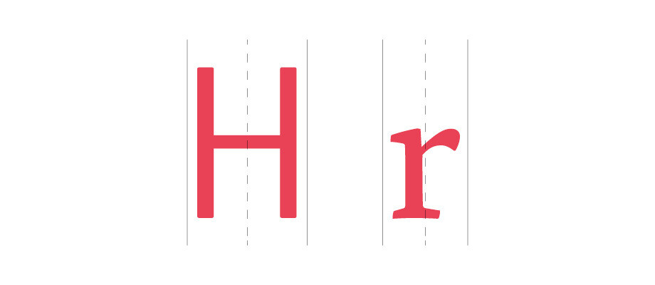
[Fig. 4]: FS Truman®’s “H” can have both optical and mathematical centres at the same vertical position. This isn’t the case in FS Brabo®’s “r”, where the optical centre is slightly to the left of the mathematical one.
The influence of ascenders and descenders
Although ascenders and descenders are known to be fundamental to word shape and letter recognition, it seems that the vertical aspect of the shapes between the x-height and the baseline (or the cap height and the baseline) are more influential in spacing than the length of ascenders and descenders. [Fig. 5]
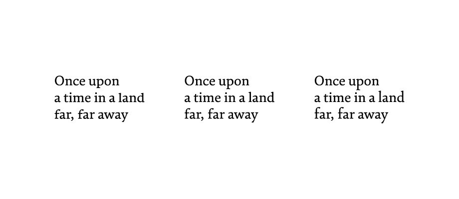
[Fig. 5]: When we experiment with extending or shortening ascenders and decenders in a typeface (shown here is an edited version of FS Brabo), it becomes clear that what matters most is balancing the space in between the baseline and the x-height of lowercase letters against their counters, and not the length of ascenders and descenders.
A typeface just can’t be good if its spacing is bad. Our eyes are the main tool when it comes to the design of fonts, but after a bit of practise, a typographer will find that these initially complex concepts become more natural. They can then be transferred to any kind of other graphic work: typography for posters or books, logotypes, drawings and so on.
How to start spacing a typeface
In digital type design, basic spacing is created by assigning numerical sidebearing values to the left and right sides of every glyph in your font editor. Spacing methods exist and can be considered an aid in applying all the optical concepts presented here to a group of glyphs with similar shapes to their left or to their right – in other words, using similar numerical values for similar sidebearings. But as discussed earlier, these methods are not miraculous formulae that resolve spacing for every typeface, though they certainly work well as starting points to achieve a correct fitting of the characters.
I will now outline a simple starting procedure we use in designing our FS fonts, which can also be expanded and used for spacing typefaces in different scripts other than the Latin, too.
Uppercase Spacing
There are three main standard capital spaces which are often repeated in both serif and sans serif designs. [Fig. 6]
- a) Straight stems with straight stems (bigger space)
- b) Straight stems with round stems (intermediary space)
- c) Round stems with round stems (smaller space)

- [Fig 6:] Spacing intervals: (left) straight stems with straight stems, (centre) straight stems with round stems, (right) round stems with round stems.
Start with the “H” and “O”, as they contain the straight and round standards to both of their sides respectively. We then need to create the sidebearing spaces around them harmonically by typing a sequence, which covers the three intervals described above, a, b and c:
HHHOOHHH
OOOHHOOO
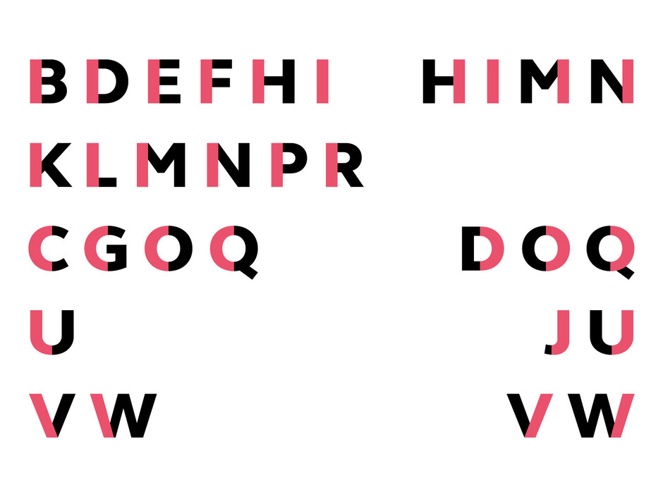
We can then group all of the capital letters by the similarities of their shapes to their left and right sides (and sidebearings) as shown below [Fig. 7].
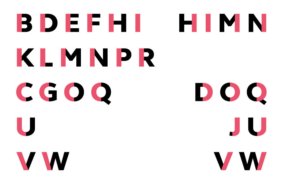
[Fig.7] Example of grouping standard shapes (uppercase) in FS Elliot
We then place each of the capital letters in between three “H”s and three “O”s in separate lines, as follows:
HHHAHHH
OOOAOOO
HHHBHHH
OOOBOOO
…and so on until the “Z.” Now your caps are spaced.
Lowercase spacing
Following a similar rationale to the caps standard spaces, we first define “n” and “o” as our main letters. The lowercase, for commonly having smaller shapes than the capitals and so smaller counters and inner white spaces, must have smaller sidebearing values than the capital ones. We must start then by spacing correctly these two sequences:
nnnoonnn
ooonnooo
We can then again group all of the lowercase letters by the similarities of their shapes to their left and right sides as shown below. [Fig. 8]
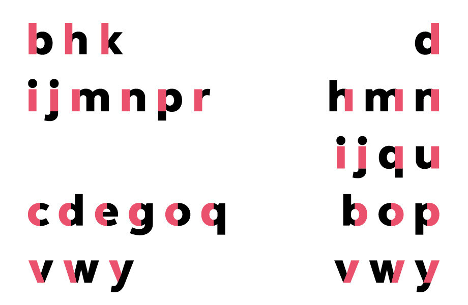
[Fig. 8] Example of grouping standard shapes (lowercase) in FS Elliot
Then we place each of the lowercase letters in between three “n”s and three “o”s, remembering that shapes of letters which are in the same group must receive a similar amount of space to their sides:
nnnannn / oooaooo
nnnbnnn / ooobooo
… and so on until the “z”. Now the lowercase letters are also spaced.
Kerning
The creation of refinements between certain letter pairs – or kerning – comes next. It’s good to test every possible combination of letters in your character set to judge if you’ll need to add a positive or negative kerning value. A consistent and balanced basic spacing considerably reduces the number of kerning pairs needed. That’s why it’s so important to get your design to a good point, with all of your glyphs very well spaced, before adding any final kerning.