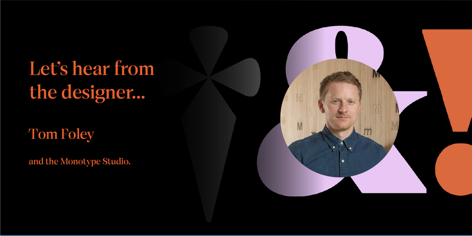
#8 Cotford™ by Monotype

Q1: Where did the idea for the typeface come from? Did you set out to address a specific use or suite of the application? Was this a design you’d had in mind for a while?
Ans: I identified the need for a design like Cotford about four years ago, but the design itself is something I had been toying with for many more years. I work a lot with creative agencies and designers, and I’ve seen digital branding mature and evolve with changes in technology. I realized that designers and companies are ready to embrace typefaces that are more unique, human, and personal—but users still expect reliability and versatility. Cotford was designed in response to this. The ambition was to design a soulful contemporary serif typeface with the flexibility and robustness that today’s designers expect.
Q2: What is the one or two most important things graphic communicators should know about the typeface, or how will the family of fonts help them create better design?
Ans: Cotford is a useful and attractive serif typeface family. With 16 static weights and 2 variable font styles, designers and brands can explore a wide range of typographic opportunities with this typeface. Cotford’s text range are workhorse styles, ideal for hardcore micro type and UI design, but are equally useful at large sizes when a softer voice is needed.
Cotford’s display range is a celebration of typographic forms, with a diverse range of expressions from thin to black weights. Use these display styles to elevate your branding, packaging, advertising, TV and movie titles, websites, and editorial layouts.