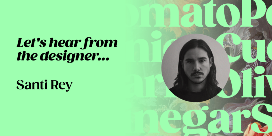
#2 Gazpacho by Santi Rey

Q1: Where did the idea for the typeface come from? Did you set out to address a specific use or suite of the application? Was this a design you’d had in mind for a while?
Ans: The initial idea was to create a chunky serif with a soft and friendly look: something between Caslon and Cooper Black. I wanted it to feel neat and compact when used in big headlines. Which is why I created Gazpacho with a big x-height. The thinner designs and italic styles came later. Some of the characters, like the bold C with the big fat terminals, had been in my mind for a long time. It was the first character I drew for this typeface.
Q2: What is the one or two most important things graphic communicators should know about the typeface, or how will the family of fonts help them create better design?
Ans: Gazpacho was created to be used in big, tightly fitted headlines. Don’t be afraid of using tight line spacing when using this typeface. This creates a strong graphic statement.