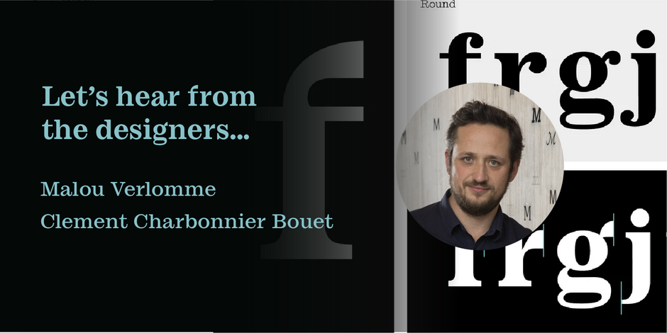
#14 Ionic No 5™ by Monotype

Q1: Where did the idea for the typeface come from? Did you set out to address a specific use or suite of the application? Was this a design you’d had in mind for a while?
Ans: Clément Charbonnier and I were both fans of the original Ionic No 5, designed by Linotype, in 1925. We thought it was a worthy design for revival, so we set out to make our own. Designing a typeface in a collaborative manner was fun, we confronted ideas and challenged each other. As Clément is a graphic designer, we tested the typeface in real-life projects during the design process, which was immensely helpful. Ionic No 5 is initially a press typeface. But because we made some radical design decisions, the new revival lends itself to large sizes, identity projects, luxury brands, and much more.
Q2: What is the one or two most important things graphic communicators should know about the typeface, or how will the family of fonts help them create better design?
Ans: Ionic No 5 is a relatively small family, but each weight has its own purpose. The Regular and Bold weights work very well at text sizes. The extremes of the family can be used on their own. The Black weight offers striking contrast and shapes for maximum impact. The Lightweight can be used on its own for its typewriter aura. The italics are cursive in construction and have a very distinct demeanor from the Romans. Ionic No 5 offers a very broad palette of expression for graphic communicators.