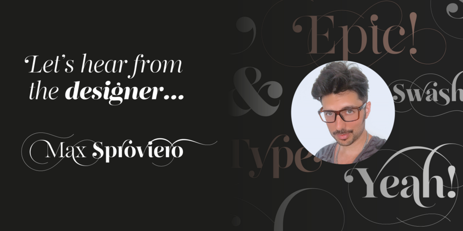
#20 Reina Neue by Lián Types

Q1: Where did the idea for the typeface come from? Did you set out to address a specific use or suite of the application? Was this a design you’d had in mind for a while?
Ans: When I designed the first Reina (2010), the Society of Typographic Aficionados, described it as “A complex display typeface incorporating hairline flourishes to a nicely heavy romantic letterform.” And that’s what I was pursuing in designing the typeface. I was very passionate about ornaments and Spencerian calligraphy. I felt that the typographic community needed more of these kinds of designs. Subtle flourishes breathe life into letters.
Reina Neue, is not just an update of the original Reina, the typeface is entirely re-designed: its structure is cleaner and purer. The range of uses for Reina Neue is wider because of the family’s many weights, italic designs, small caps and layered styles. There are even variable fonts.
Q2: What is the one or two most important things graphic communicators should know about the typeface, or how will the family of fonts help them create better design?
Ans: Reina Neue is packed with so many flourished alternates that it may be tempting to use several of them at the same time. I suggest, however, that the designers play with the alternate characters until a graceful combination is found. Usually, one or two flourishes per-word is enough.
It’s also a good idea to choose the optimum optical size for certain uses. If there are plans to print it very small, Reina Neue Small would be the choice. On the other hand, if the typeface is used on screen or printed very large, Reina Neue Display would be the best choice.