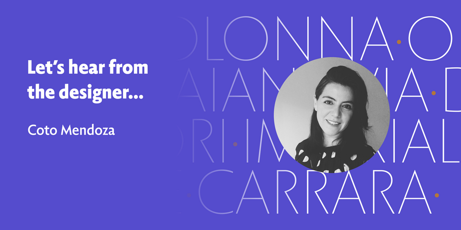
#12 Fontanella by Latinotype

Q1: What should graphic communicators look for when choosing a typeface family for a specific project? What kind of typeface designs are best for pairing with your typeface?
Ans: When choosing a typeface family for a specific project, graphic communicators should look for freshness, contemporaneity and at the same time, elements of functionality, legibility and support. The nature of the project will define a particular type of reading. Fontanella is perfect to match with serif display typefaces like Juana or Recoleta thanks to its versatility, allowing to create balance in the composition. If you need a Fontanella custom version, just let me know!
Q2: What were your goals when designing the typeface? What is the one or two most important things graphic communicators should know about the typeface, or how will the family of fonts help them create better design?
Ans: When I started designing Fontanella, my goals were to create a typeface taking the structure from calligraphy and bringing it to the present with a current language. For this I resorted to the calligraphic bases that I later adjusted by slightly increasing the x-height, among other design decisions. Fontanella captures the essence of some classic calligraphy alphabets and contains a very complete set of characters that you can use in print editorial projects and at the same time in short text compositions for the screen.