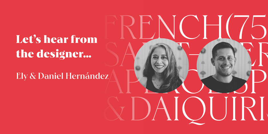
#6 Hernandez Bros by Latinotype

Q1: What should graphic communicators look for when choosing a typeface family for a specific project? What kind of typeface designs are best for pairing with your typeface?
Ans: The first thing is to know and understand why we need a font. Know if it’ll be a printed or digital project, if it will be used in a large or small size, if we need it for a continuous text or for short sentences, or even perhaps a word. This will help us decide what type of fonts we need, text or display, serif or non-serif, etc. Last but not least, we need to know what type of licenses will be necessary for our project, in order to be able to pay correctly. Being a very expressive font, in any case it must be accompanied by neutral fonts, hopefully sans serif, which allows the Hernández Bros font to shine and give it prominence.
Q2: What were your goals when designing the typeface? What is the one or two most important things graphic communicators should know about the typeface, or how will the family of fonts help them create better design?
Ans: The main objective of Hernández Bros was to create an elegant and modern font that followed the aesthetic aspects of current trends. Its drawings are based on the Bulfinch font found in the 1912 ATF catalog and combine classic features with geometric features in the case of alternative characters, allowing for a large number of possibilities when composing a word and even a paragraph.