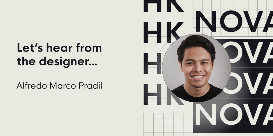
#24 HK Nova by Hanken Design Co.

Q1: What should graphic communicators look for when choosing a typeface family for a specific project? What kind of typeface designs are best for pairing with your typeface?
Ans: I think graphic designers should take into account a variety of factors when choosing type for a project, including legibility, branding, functionality, context, personality, flexibility, and technical considerations (e.g. OpenType features). I created HK Nova to bridge the gap between Futura and Century Gothic. It has a clean, modern, aesthetic pattern that works well in a variety of design contexts. Pairing my design to those typefaces with similar design characteristics (e.g. Cerebri Sans, Futura, or Avenir) can create a cohesive and harmonious look. However, considering contrasting serif fonts (e.g. Ouido or Garamond) can also create visual interests and balance to the design.
Q2: What were your goals when designing the typeface? What is the one or two most important things graphic communicators should know about the typeface, or how will the family of fonts help them create better design?
Ans: As a typeface designer, my primary goal when developing a design is to create a tool that other designers can use to evoke a range of emotions in their work. To achieve this, I strive to create a typeface that is visually appealing with a subtle character, consistent in its features, versatile, and unique compared to other designs.
Some key points to consider when using HK Nova in design projects include: its modern and geometric appearance, which makes it suitable for headlines and titles; its range of weights, which allows for versatility in different design contexts; and its extensive character set, which allows for flexibility in its use.