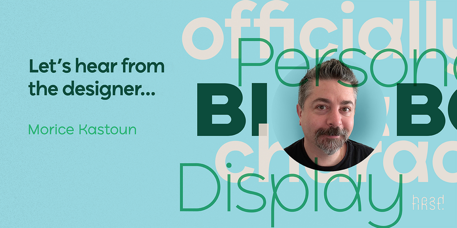
#9 Ryker by HeadFirst

Q1: What should graphic communicators look for when choosing a typeface family for a specific project? What kind of typeface designs are best for pairing with your typeface?
Ans: From one designer to another, I think the best thing we can offer is a point of difference — a unique voice, idea, or style that allows a business or brand, etc to stand out and be remembered. Ryker is available in both Text & Display styles, so the best pairing is to use both styles together.
Q2: What were your goals when designing the typeface? What is the one or two most important things graphic communicators should know about the typeface, or how will the family of fonts help them create better design?
Ans: I’m passionate about experimenting and exploring new ways to create fonts that are both original yet functional. In my opinion, Ryker is one of those fonts that cleverly conforms what we understand as legible letterforms, yet at the same time is unique and offers a point of difference. The font family is available in both Text & Display styles allowing designers the flexibility and creativity to amplify or downplay this when required.