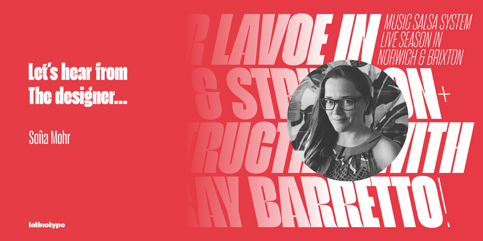
#3 Seriguela by Latinotype

Q1: What should graphic communicators look for when choosing a typeface family for a specific project? What kind of typeface designs are best for pairing with your typeface?
Ans: Graphic communicators look for fonts that look contemporary and fresh, are easy to use, and effortlessly solve the challenges they face. At the same time, the current design is much more digital, therefore the impact generated by a font can help users stop at the information quickly. Seriguela pairs very well with more neutral grotesque sans serif typefaces, like the ones you can use in small sizes. At the beginning of 2023, I will publish a font that will be perfect to combine with Seriguela, just wait!
Q2: What were your goals when designing the typeface? What is the one or two most important things graphic communicators should know about the typeface, or how will the family of fonts help them create better design?
Ans: Seriguela is a cheerful font inspired by movement, created to draw attention in display uses, that seek for impact and versatility. It stands out for its bold and unusual contrasts as well as for its differentiated italic inclinations. It’s ideal for highlighting large, tight headlines in both print and screen designs. Don’t be afraid to use it in tight spaces as it creates a strong graphic impact. Moreover, Seriguela is a sans-serif that has human warmth and was designed to be used in several languages, including Cyrillic, in order to reach wider audiences in different countries.