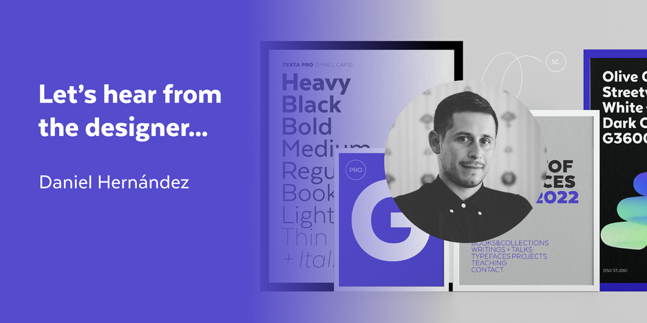
#23 Texta Pro by Latinotype

Q1: What should graphic communicators look for when choosing a typeface family for a specific project? What kind of typeface designs are best for pairing with your typeface?
Ans: The first thing is to know and understand why we need a font. Know if it’ll be a printed or digital project, if it will be used in a large or small size, if we need it for a continuous text or for short sentences, or even perhaps a word. This will help us decide what type of fonts we need, text or display, serif or non-serif, etc. Last but not least, we need to know what type of licenses will be necessary for our project, in order to be able to pay correctly. Texta Pro, being a neutral font, is ideal to accompany more striking typefaces, where the text invisibly complements long texts but with a modern and contemporary spirit. It can be seen very well with serif fonts, since they generate an interesting contrast when composing a text and marking hierarchies.
Q2: What were your goals when designing the typeface? What is the one or two most important things graphic communicators should know about the typeface, or how will the family of fonts help them create better design?
Ans: The main objective of Texta pro was to develop a workhorse for Latinotype, a font that was very versatile, neutral, but at the same time had the necessary personality to compete with other sans fonts. One of the most important aspects of Texta Pro is its 983 glyph character set, which covers a myriad of Latin script languages, as well as Cyrillic, which is a plus. Another important point of Texta Pro is its versatility in its use, you can cover projects of a different nature, be it branding or editorial projects, since it is a font that reminds you of classics, but with a new and modern air. Texta Pro will undoubtedly be your workhorse for many projects.