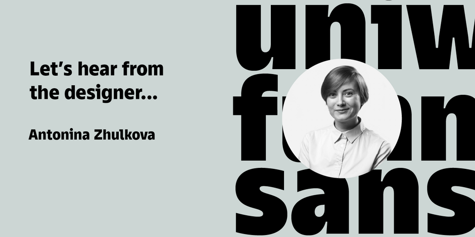
#5 TT Fellows by TypeType

Q1: What should graphic communicators look for when choosing a typeface family for a specific project? What kind of typeface designs are best for pairing with your typeface?
Ans: To properly communicate with a font, in my opinion, you need to understand the goals of the project. What message do you want to convey with the design? Pay attention to the details in the font, the overall impression, your emotional response. And if you need a friendly character to solve the task, then with the help of the TT Fellows font family you can do it. I recommend using neutral sans serif fonts with it to emphasize the character of the font, or choosing one that is opposite in character, for example, you can use a display serif for the accentuated part, or a wide sans serif to show the difference in proportions.
Q2: What were your goals when designing the typeface? What is the one or two most important things graphic communicators should know about the typeface, or how will the family of fonts help them create better design?
Ans: The main goal for me when developing TT Fellows was the desire to make it easier for designers to work with layouts, and to create a friendly and functional typeface. Thanks to the uniform width of the font, you don’t have to worry about your design: changing the weight of the font won’t change the layout. And at the same time, different styles will help to achieve the desired emotion. Bright and humanist forms in Black and ExtraBold weights will add the necessary emphasis to visual communication, while neutral Bold, Regular and lighter styles will add functionality and friendliness.