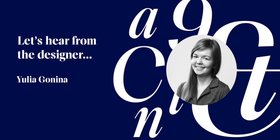
#4 TT Livret by TypeType

Q1: What should graphic communicators look for when choosing a typeface family for a specific project? What kind of typeface designs are best for pairing with your typeface?
Ans: In the TT Livret family, it is worth paying attention to the possibility of choosing different optical sizes and the fact that they are not exact copies of each other with different contrasts. In addition, despite the fact that TT Livret is a serif, you should not be afraid that it will give an overly conservative look to the project. Thanks to the modern interpretation of graphics and low contrast in text styles, the font is also suitable for projects that mainly use sans serifs. As for a pair, a neo-grotesque sans serif with slightly narrowed proportions will look good with TT Livret.
Q2: What were your goals when designing the typeface? What is the one or two most important things graphic communicators should know about the typeface, or how will the family of fonts help them create better design?
Ans: We are used to seeing sans serifs in modern design. This is the type of font that is easy to pick up without thinking whether it will suit the project or not. When I drew TT Livret, I wanted to create a serif that would be just as convenient and not scary to use. In terms of readability and conciseness, the text subfamily can replace the sans and at the same time add depth to the project. In addition, this family immediately provides a font pair and even a trio. The Text, Subhead and Display subfamilies each have their own distinctive features. Display is bright and bold, Text is serious and modern, and Subhead combines their best features and can be used as a more sophisticated text style or a more relaxed headline style.