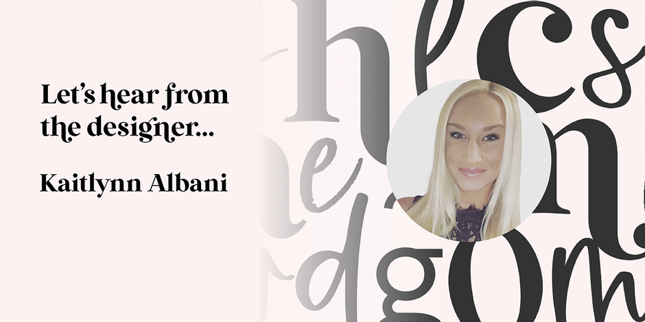
#21 Wild Mango by KA Designs

Q1: What should graphic communicators look for when choosing a typeface family for a specific project? What kind of typeface designs are best for pairing with your typeface?
Ans: When choosing a typeface for a specific project, there are a lot of factors that should be considered. Some of the most important being the mood, functionality, read-ability and performance of the typeface. The typeface will need to match the project‘s goal and appeal to the specific audience.
Wild Mango includes a variety of curvy glyphs. When choosing a font to pair with it, this should be considered. A simple sans serif or a handwritten script font would look best with Wild Mango. If you are choosing a script font, I would look for something that is more modern in letterforms, rather than a classical script typeface.
Q2: What were your goals when designing the typeface? What is the one or two most important things graphic communicators should know about the typeface, or how will the family of fonts help them create better design?
Ans: My goal when designing Wild Mango was to create a font that was modern but still exhibited the characteristics of a traditional serif font. I think that this was a style that a lot of designers were looking for without even realizing it at the time!
One of the most important things about this font would be that it is quite versatile. The letters look clear and crisp at both small and large sizes. This makes Wild Mango the perfect choice for various projects. This is a wonderful font to have in your creative toolbox and I think that you would find yourself using it often!