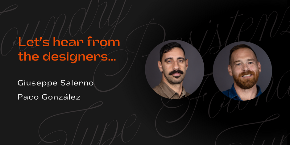
#16 Flipante by Resistenza

Q1: Where did the idea for the typeface come from? Did you set out to address a specific use or suite of the application? Was this a design you’d had in mind for a while?
Ans: The idea for Flipante originated from our desire to create a sophisticated, rounded sans-serif typeface with unique tubular shapes, ink traps, and the seamless ability to vary its width. Our specific objective was to design a font capable of transitioning effortlessly from a condensed form to larger widths, providing a versatile and dynamic typographic solution. The deliberate inclusion of ink traps serves to enhance both the aesthetic appeal and functional aspects of the font, ensuring a harmonious balance between style and practicality.
Q2: What should graphic communicators know about the typeface, or how will the family of fonts help them create better designs?
Ans: Flipante brings a burst of fun to your layout while keeping things classy. Its smooth design ensures a polished look perfect for both print and digital projects, maintaining a consistent vibe across various platforms. This font is a chameleon, adapting seamlessly to branding and packaging designs, giving you room to play creatively. Designers, you’ve got the flexibility to enhance brand identities, and the added touch of ink traps brings that extra flair. Tailored for food packaging, it’s a key asset for designers seeking polished and visually impactful solutions.