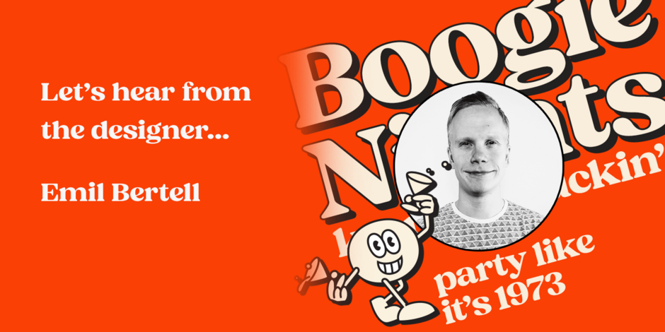
#21 Hello Monday by Fenotype

Q1: Where did the idea for the typeface come from? Did you set out to address a specific use or suite of the application? Was this a design you’d had in mind for a while?
Ans: I started with the vivid memory of a Garfield softcover comic book from my childhood. These comics were characterized by vibrant colors, and the titles were prominently displayed in large white letters using the Cooper Black font, accompanied by black outlines. Inspired by this nostalgic image, I aspired to create a typeface that captured its essence. While I had previously crafted Chunk Black as a direct homage to Cooper Black, this time I wanted to design a more geometric typeface with larger contrast while still preserving the reminiscent charm of those childhood comic book covers.
Q2: What should graphic communicators know about the typeface, or how will the family of fonts help them create better designs?
Ans: Hello Monday strikes with the feeling first. It has the familiarity of typefaces that were popular in the past, from the 60s to the 80s but with modern clean design. In addition, it’s well-equipped with modern OpenType features from Swash Alternates to Discretionary Ligatures and even a set of ornamental shapes. With these features, Hello Monday is effective in creating modern designs with a hint of warm nostalgia.