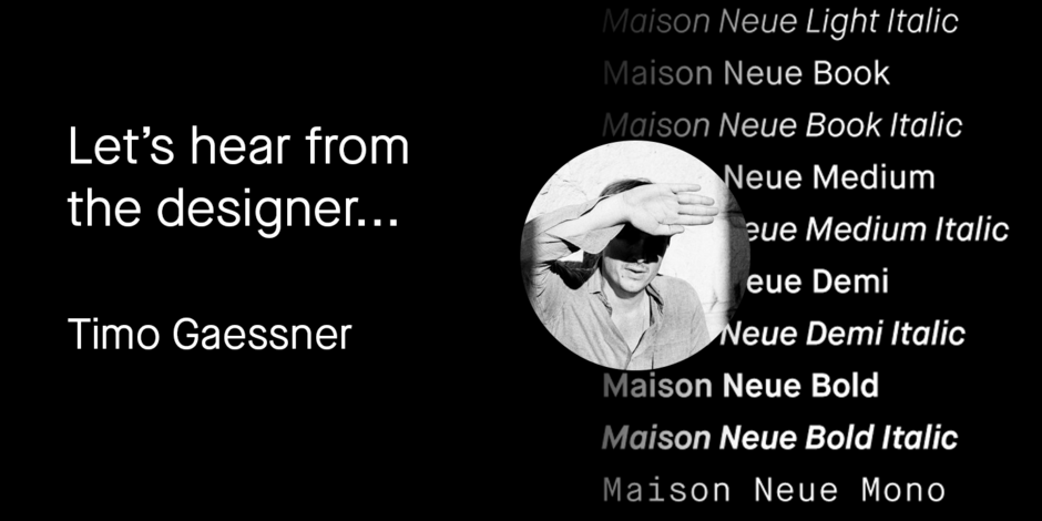
#02 Maison Neue® by Milieu Grotesque

Q1: Where did the idea for the typeface come from? Did you set out to address a specific use or suite of the application? Was this a design you’d had in mind for a while?
Ans: Maison Neue is the completely reworked version of our original Maison typeface family. While the earlier version was constructed using rigid elements, Maison Neue has been meticulously redrawn to be less formulaic and have a stronger focus on optical criteria to create a distinct grotesque – paying greater attention to harmony, rhythm, and flow. In 2017, Maison Neue was further developed and expanded into a superfamily of 40 styles. This includes a subtly condensed original version, an extended counterpart, a mono-spaced alignment, all featuring additional weights within each family.
Maison Neue is an evolution of my earlier typeface Maison, which started as an experiment by simply constructing the glyphs using repetitive, modular shapes. An effective method to achieve fast results, similar to the early modernist architecture principles, from which I drew inspiration from. Maison Neue is an evolution of this concept, focusing on more modern, up-to-date aspects of the same idea.
Q2: What should graphic communicators know about the typeface, or how will the family of fonts help them create better designs?
Ans: Maison Neue is designed to play a vital and prominent role in any kind of environment / communication. Most importantly are they conceived to provide a distinct visual language that (hopefully) inspires it to use the fonts in a bold and innovative way. And finally, the meticulous and up-to-date execution, together with a large range of styles and weights allows a wide range of applications, from analog to digital, large to small etc.