Mahou
Mahou
Emanuela Conidi Custom fonts
Fontsmith have designed a bespoke typeface for Mahou, the largest beer brand in Spain today.
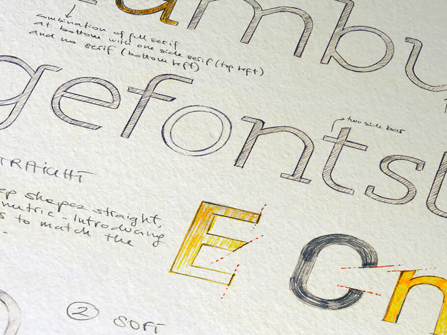
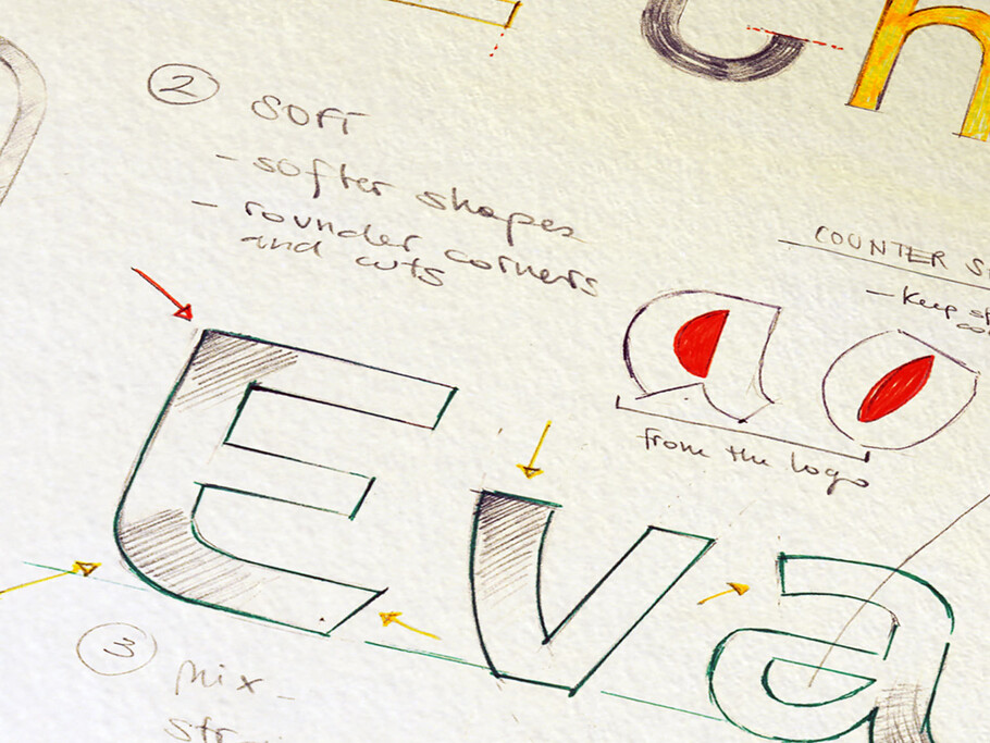
Paul Marshall of Interbrand Madrid asked Fontsmith to explore the possibility of a bespoke typeface to work alongside the Mahou logo ahead of the brand’s launch in the UK in 2012. Fontsmith director Jason Smith, and type designer Emanuela Conidi began the design process on paper by sketching and exploring a new Latin spirited personality before moving on screen and applying the finer touches inherent in today’s modern digital typeface design process.
As Jason explains: “The crafting stage is the part of the process that always takes the longest time. Where we’ll just be painstakingly moving digital points by fractions of a millimetre to get them exactly right. Type designers are like architects: they have a real eye for balance, and notice anything slightly out or not straight.”
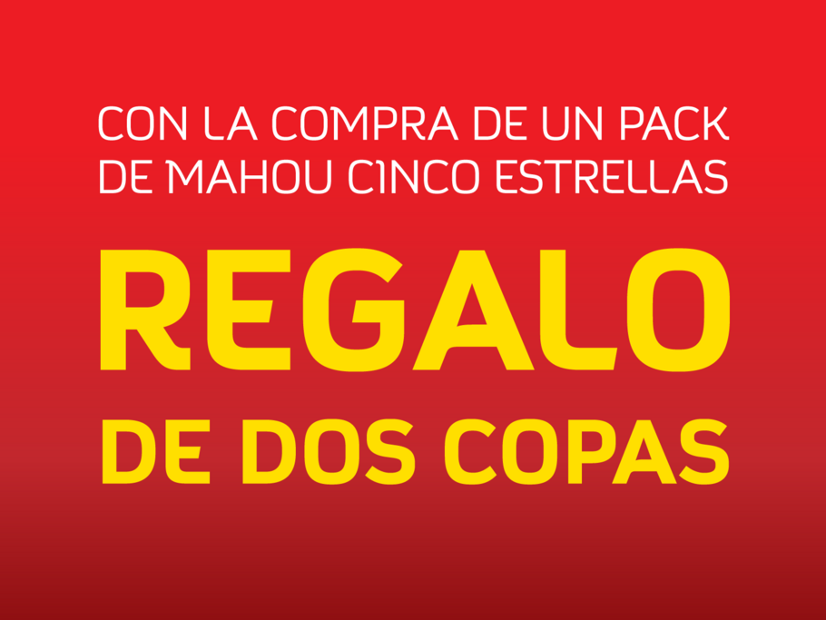
The new design is going to be used as a title font, which meant that it is important to have contrast between the font and the heaviness of the Mahou wordmark, while ensuring that they still visually connect. But one of the main challenges was to retain some of the character of the Mahou logo, which is a big, solid, German-esque mark. It was a challenging process of fine tuning, trying to bring a bit of what happens within the logo to the typeface whilst also creating a difference.
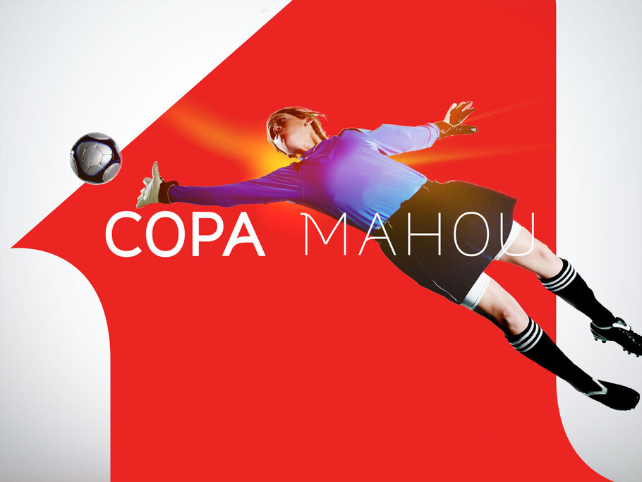
San Miguel and Interbrand, were both very happy with the results. As Paul Mashall explains: “The typeface has enough standalone presence to be recognisable by itself, and it also lives comfortably alongside illustration and photography. A good font will work as part of an overall unit, but equally it will have enough personality to speak for itself.”


