Akzidenz-Grotesk® Next Perfect Font Pairings
FOUNDRY: Berthold AG
DESIGNER: Bernd Möllenstädt & Dieter Hofrichter
CLASSIFICATION: Grotesque Sans
ABOUT THE FAMILY:
The Akzidenz-Grotesk font family debuted in 1898. Over the next 70 years, the family was expanded to over twenty styles. Akzidenz-Grotesk Next was developed as a cohesive family based on the principal shapes and characteristics of the earlier designs. The x-height has been readjusted, as well as the weights, to create a consistent design throughout the family.

WHAT TO LOOK FOR IN FONTS THAT PAIR WELL WITH AKZIDENZ-GROTESK® NEXT:
- Serif typefaces with distinctive design characteristics
- Slab or Clarendon typefaces with subtle to overt humanistic overtones
- Old Style typeface designs like Eloquence™ or ITC Legacy Serif
- Avoid sans serif fonts but, some, like Harmonia Sans™ or Neue Kable™, can pair well with Akzidenz-Grotesk. Just be sure that the weights of the two designs are dramatically different from each other.
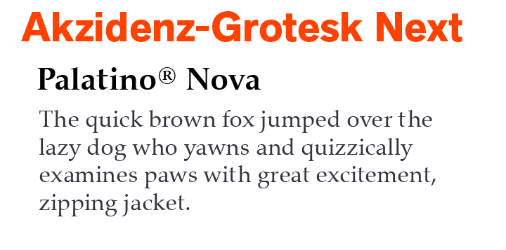
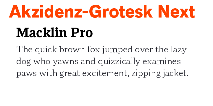
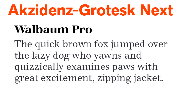
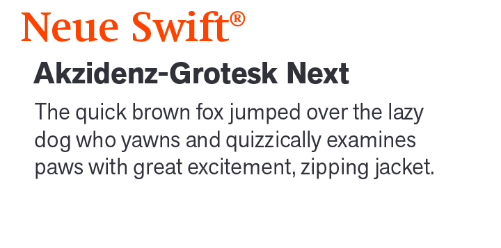
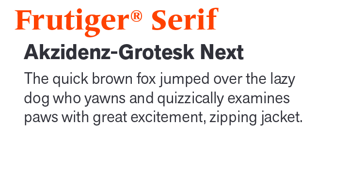
AKZIDENZ-GROTESK NEXT PAIRING WITH TEXT FONTS:
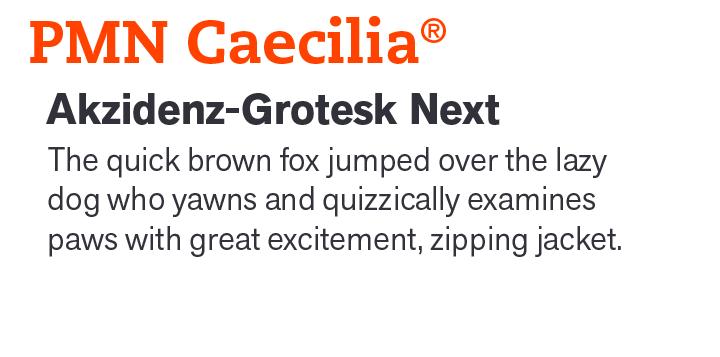
AKZIDENZ-GROTESK NEXT PAIRING WITH DISPLAY FONTS:
Download a PDF version of the Akzidenz-Grotesk Next Perfect Font Pairings and view the Akzidenz-Grotesk® Next font family.
Explore Other Font Pairing Guides
Designed for Fonderie Olive, “Antique” is a European typographic term for gothic or sans serif. Antique Olive is generally considered a display typeface. Because of its exaggerated x-height and tight letter spacing, only the light weight, in large sizes, is recommended for blocks of copy.
“When creating the Avenir® typeface, Adrian Frutiger drew inspiration from the past and the future. His goal was to modernize the geometric sans serif styles of the early 20th century, while embodying the aesthetics of the 21st century. In the process, Frutiger also infused a touch of organic humanism into the design.
