Antique Olive™ Perfect Font Pairings
FOUNDRY: Linotype
DESIGNER: Roger Excoffon
CLASSIFICATION: Humanistic Sans
ABOUT THE FAMILY:
- Designed for Fonderie Olive, “Antique” is a European typographic term for gothic or sans serif.
- A family of six weights, two with italics, plus a condensed and compact design.
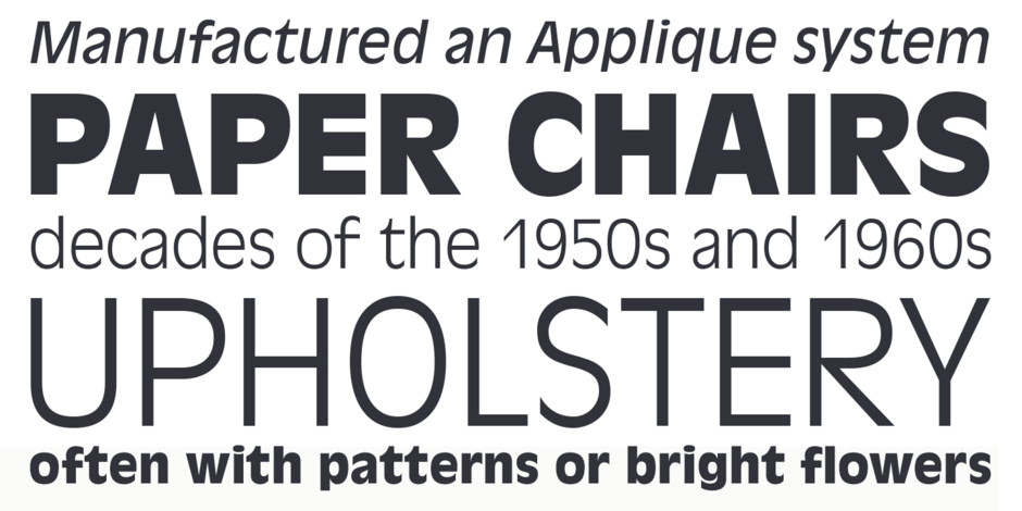
- Antique Olive is generally considered a display typeface. Because of its exaggerated x-height and tight letter spacing, only the light weight, in large sizes, is recommended for blocks of copy.
WHAT TO LOOK FOR IN FONTS THAT PAIR WELL WITH ANTIQUE OLIVE:
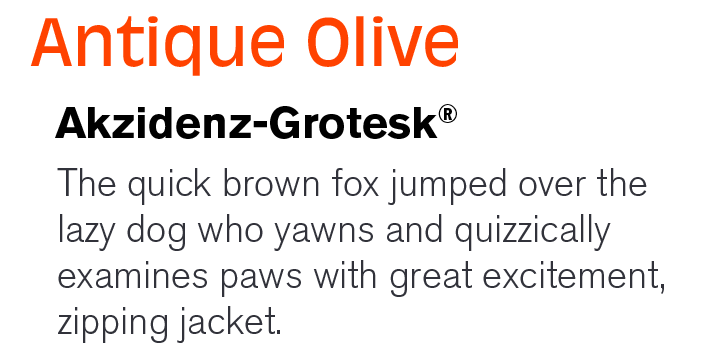
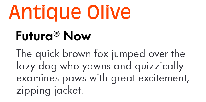
- Because of its distinctive shapes and proportions, Antique Olive can be paired with other sans serif typefaces. It’s Humanistic characteristics serve as a counterpoint to geometric sans, like Futura® Now and Harmonia™ Sans.
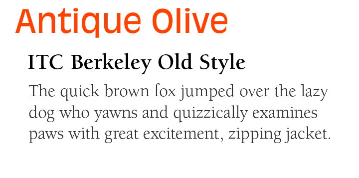
- Classic Oldstyle serif typefaces, like ITC Berkeley Old Style™ and Palatino® Nova – especially the lighter weights – create an inviting typographic contrast with Antique Olive.
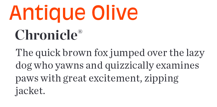
- Serif typeface designs with a wide range of weights also pair well with Antique Olive.
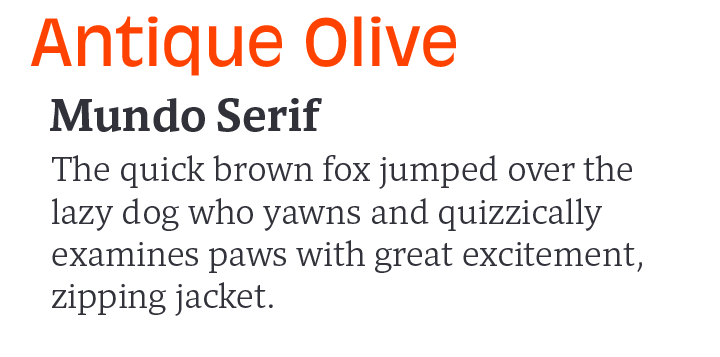
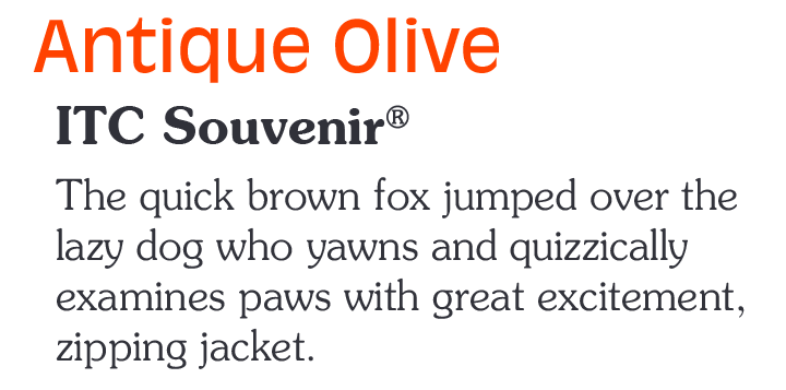
ANTIQUE OLIVE PAIRING WITH TEXT FONTS:
Download a PDF version of the Antique Olive Perfect Font Pairings and view the Antique Olive™ font family.
Explore Other Font Pairing Guides

Perpetua was to be the first original typeface in Stanley Morison’s plan for building the Monotype type library. He wanted the design patterned after epigraphic rather than calligraphic letters, and asked Eric Gill to create the design.
“When creating the Avenir® typeface, Adrian Frutiger drew inspiration from the past and the future. His goal was to modernize the geometric sans serif styles of the early 20th century, while embodying the aesthetics of the 21st century. In the process, Frutiger also infused a touch of organic humanism into the design.
