Eurostile® Next Perfect Font Pairings
FOUNDRY: Linotype
DESIGNER: Akira Kobayashi, Aldo Novarese, Terrance Weinzierl, Linotype Design Studio
CLASSIFICATION: Square Sans
ABOUT THE FAMILY:
- In the early 1950s, Alessandro Butti, with the assistance of Aldo Novarese, created the cap-only typeface known as Microgramma. Fonts were widely used for nearly a decade until Novarese introduced a lowercase version in 1962. The enhanced family was rebranded as “Eurostile.
- The original Eurostile design was revitalized in 2008 by Akira Kobayashi, as “Eurostile Next.”
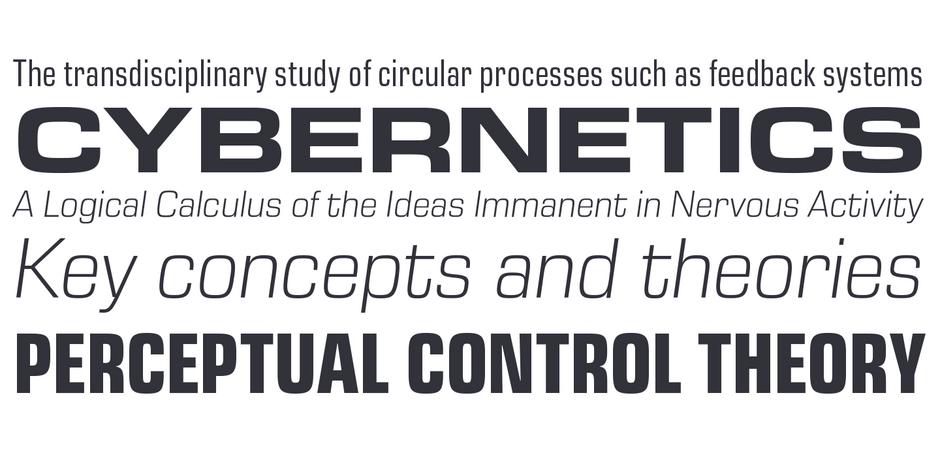
- Eurostile Next is generally considered a display typeface. Only the light weight, in large sizes, is recommended for blocks of copy.
WHAT TO LOOK FOR IN FONTS THAT PAIR WELL WITH EUROSTILE NEXT:
- Glyphic design traits like those in Cartier Book™ or New Veljovic®
- Slab or Clarendon typefaces with subtle to overt humanistic design traits
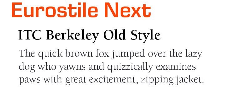
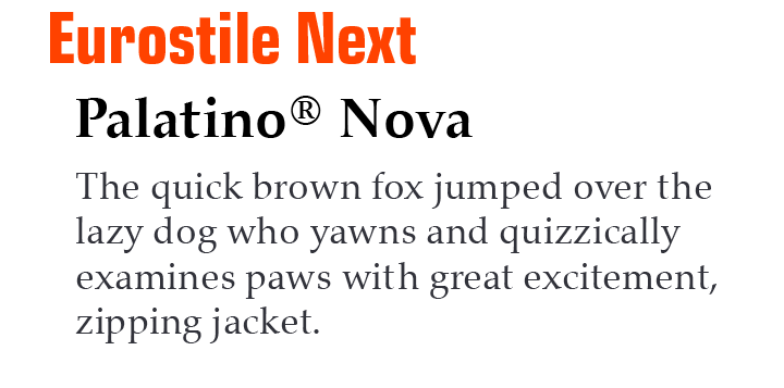
- Old Style typeface designs like Berkeley Old Style or Palatino® Nova
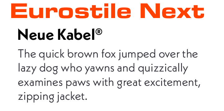
- Avoid sans serif fonts but, some, like Futura® Now or Neue Kable™, can pair well with Eurostile Next. The weights of the two designs, however, should be significantly different from each other.
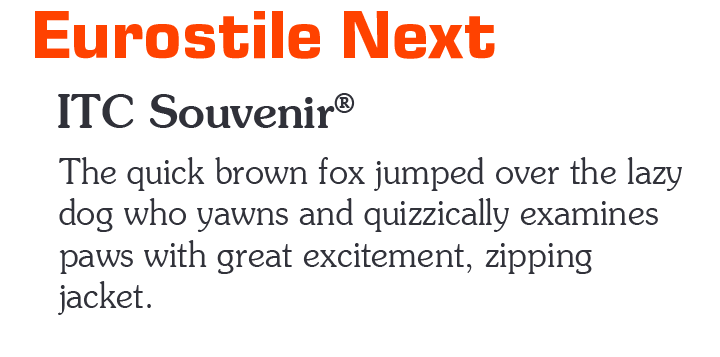
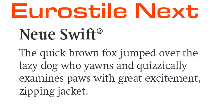
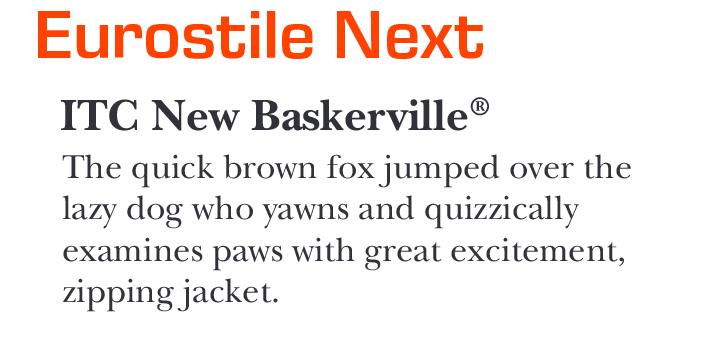
EUROSTILE NEXT PAIRING WITH TEXT FONTS:
Download a PDF version of the Eurostile Next Perfect Font Pairings and view the Eurostile Next font family.
Explore Other Font Pairing Guides
As a Transitional Serif design, the axis of Cotford’s the strokes normally have a vertical stress. Weight contrast is more pronounced in the display designs. Serifs are bracketed and head serifs are oblique. Cotford ranges from micro to display optical size, across Thin to Black weights, providing legible and stylish type at all sizes.
The Akzidenz-Grotesk font family debuted in 1898. Over the next 70 years, the family was expanded to over twenty styles. Akzidenz-Grotesk Next was developed as a cohesive family based on the principal shapes and characteristics of the earlier designs.
