The changing face of type

The changing face of type
Jason Smith Knowledge share
Web fonts/multiscreen
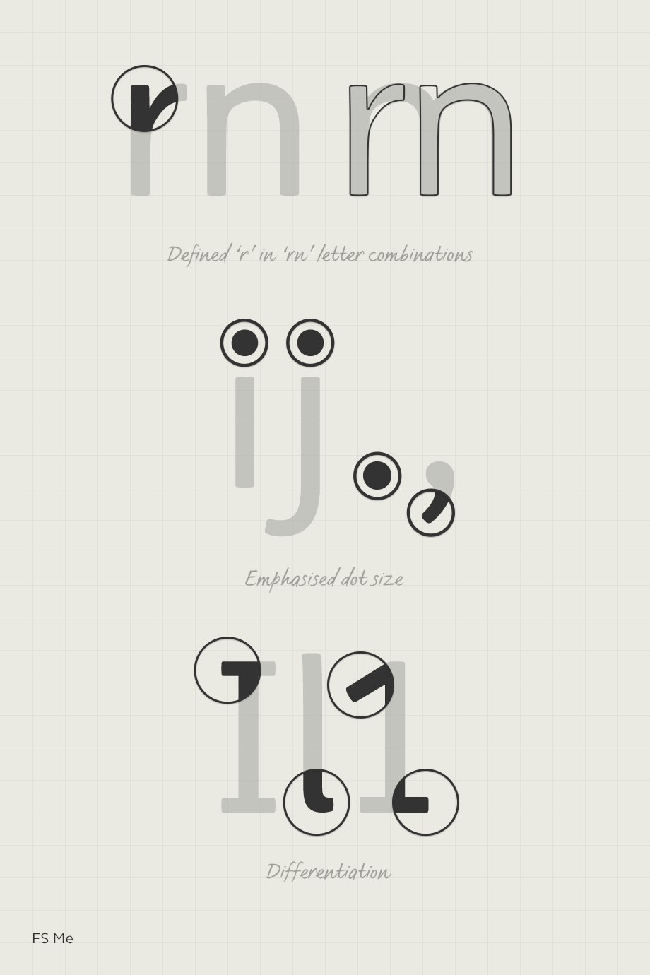
Our typefaces now need to work on a huge range of devices and screens including desktop, mobile, tablet, wearables and virtual reality headsets. With less space on smaller screens and little room for images the font plays a very important role. Readability is key alongside the ability to convey a personality. For us this means extensive testing to make sure our typefaces work no matter what the device. Responsive web design allows different typographic styles to be selected depending on the user’s screen size but brands need to ensure consistency across devices. Sans serif fonts have been popular for web because they’re easier to scale down to smaller sizes and this trend is likely to continue. With improvements in mobile screen resolution we expect to see more experimentation here. Designers will also be looking for a large selection of weights, tall x-heights and low ambiguity between characters (e.g. enough space between the dot of an ‘i’ so it doesn’t look like an ‘I’).
Accessibility
Although not new the need for fonts to be accessible will increase in importance this year, and not just for charities and public sector companies, being inclusive is now a consideration for all brands. Designing for accessibility doesn’t need to mean a compromise on aesthetics, but there are benchmark considerations we now apply to all fonts. The truth is there are hundreds of micro-considerations our designers take into account for accessible design but as a bare minimum we recommend this top 10.

Multi language
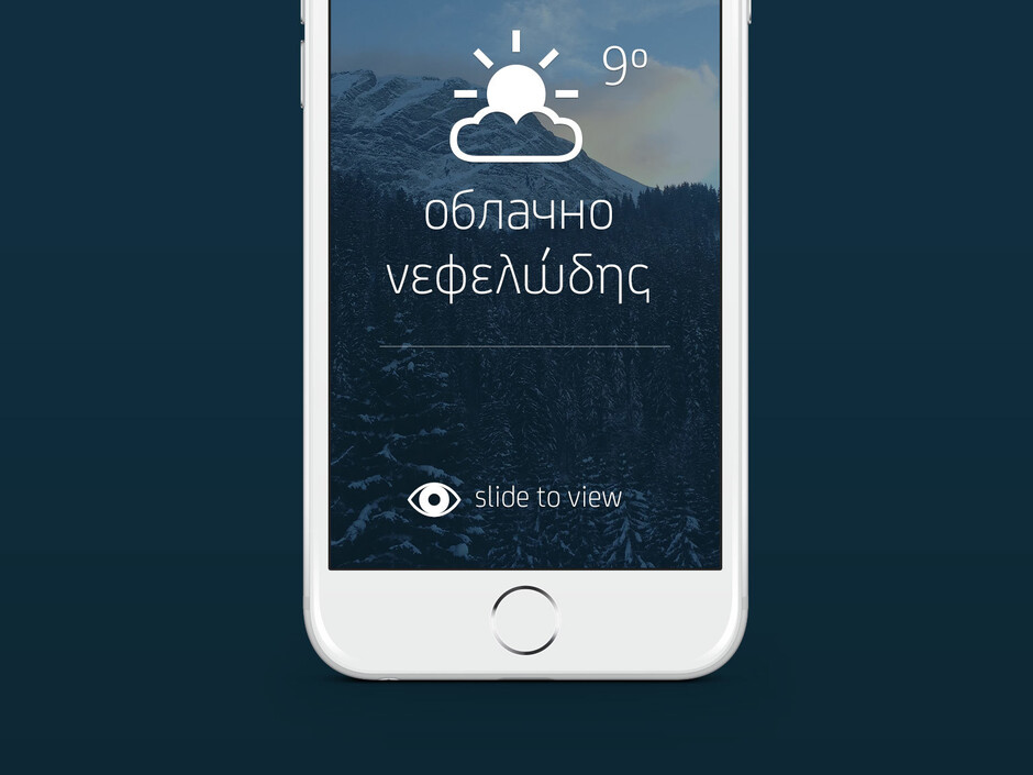
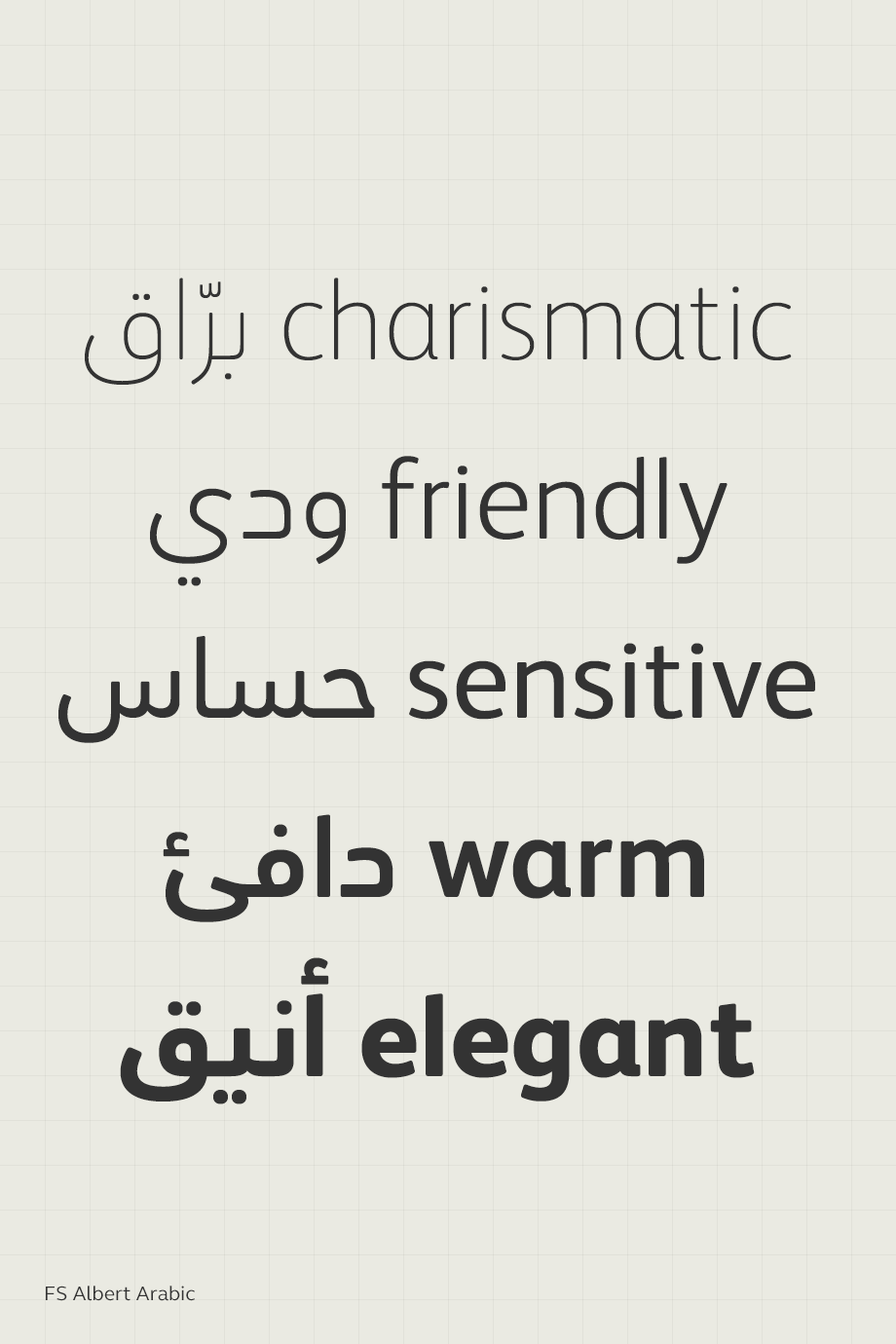
In a time when most large brands are operating on a global scale it’s not surprising that we have seen an increase in demand for Cyrillic, Arabic and Devanagari and other scripts. Brands need to show consistency across continents so the typeface used needs to match, whatever the language. The most important factors here are maintaining geometric proportions, terminal angles, bar terminals and stems. There are two options: choose a typeface that is available in all the languages you require, or match a different font in the required language. Matching is a complicated process which requires an expert eye but can be much more cost effective.

Simplification of font licensing
Font licensing models are notoriously complicated and the advent of web licensing has only added to the confusion. We always advise our customers to think of the font as a piece of software and although this helps there are still endless different options and pricing models. The main problem is that although there are similarities, every font foundry has it’s own set up for costing and this makes it very difficult to compare one with the other. Variables like users, end use and how many people will see it all have a huge impact on the price but in a different way from foundry to foundry. It is also very easy to breach the licence terms if your situation changes e.g. with web licences which are based on the number of visitors to the website. We have attempted to simplify the process with our Brandfont® license which is a flat one off fee with absolutely no hidden extras or restrictions regardless of use or number of visitors. Annual or monthly subscriptions are offered by some foundries and can seem like good value on first glance but often end up costing more over time and could be subject to pricing changes after a brand has committed. We expect to see more new and simplified license models this year as foundries look to improve the experience for their customers.
Differentiation
In a saturated market place the need for brands to differentiate themselves is becoming more and more important. Font choice is a critical consideration for branding projects and we’re starting to see even more brands become aware of the power of customised fonts. Those brands who dare to be a little different and get it right will stand out from the crowd and gain an edge over their competitors. Channel 4 recently rebranded with custom typefaces Horseferry and Chadwick. Love it or hate it the design was a brave move that fits with their remit ‘to be original, alternative, innovative, to be surprising, to be bold’.
Symbols and icons
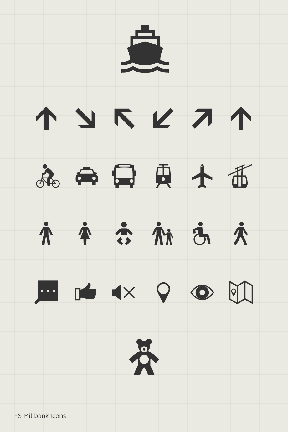
Developing a full range of symbols to go with every typeface may not be commercially viable but we have seen an increase in demand as these icons are used more and more in interface applications. Symbols like the email icon, battery charging sign and wifi symbol are now common place and requests for them have increased. FS Millbank® which was released last year with 172 symbols and they have proven very popular with web and app designers.
