Manual End Marks
Like a drum rim shot after the punch line of a joke, the end mark at the close of an article, chapter, or story lets, you know it’s all over.
An end mark provides a visual cue to the reader, signifying the end of a topic, section or piece. End marks are commonly used in magazines, newsletters, journals, and other publications containing multiple articles whose end point is not necessarily apparent to the reader.
Whether on the web or a printed page, an end mark can be decorative as well as informative. End marks can be as minimal as a circle, square, or other simple geometric shape.
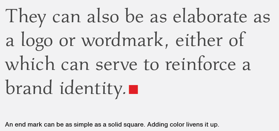
They can also be as elaborate as a logo or wordmark, either of which can serve to reinforce a brand identity.

The dingbats included with most operating systems – such as ITC Zapf Dingbats®, and Wingdings fonts – are a good source of graphics that work well as end marks.
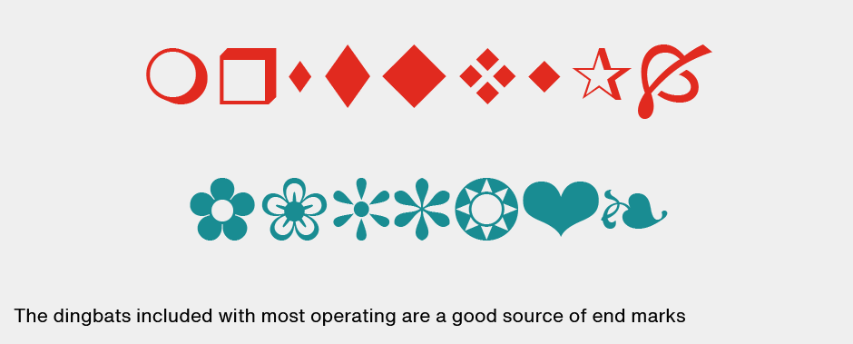
Additional options can be found among the ornaments and other decorative glyphs included in some fonts. Design fonts, stand-alone image files, and even clip art may provide functional and attractive elements. Basically any small graphic that will retain its clarity at the required size and resolution can make an effective end mark.
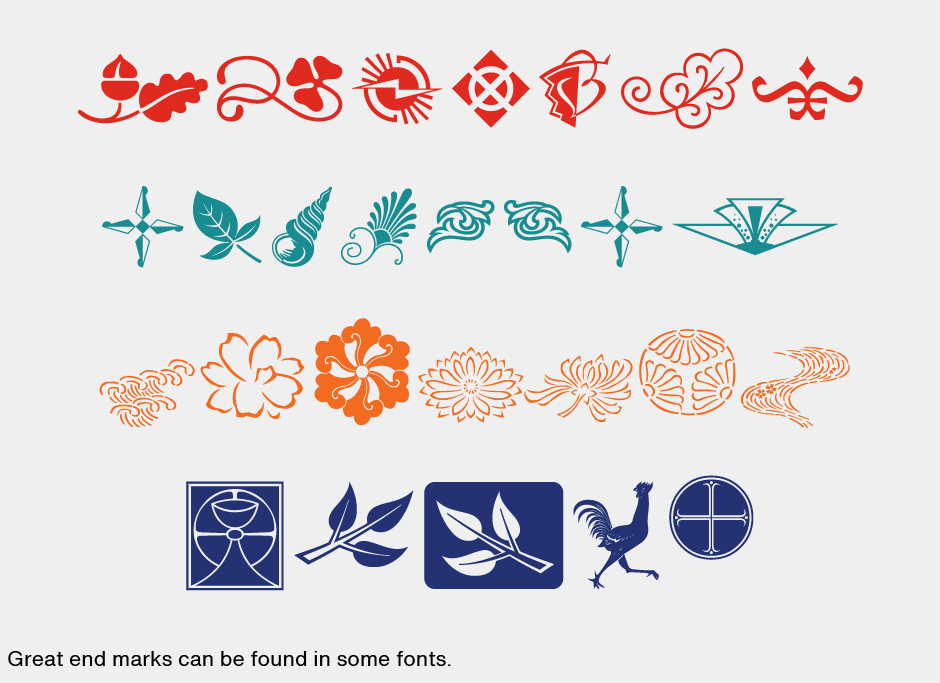
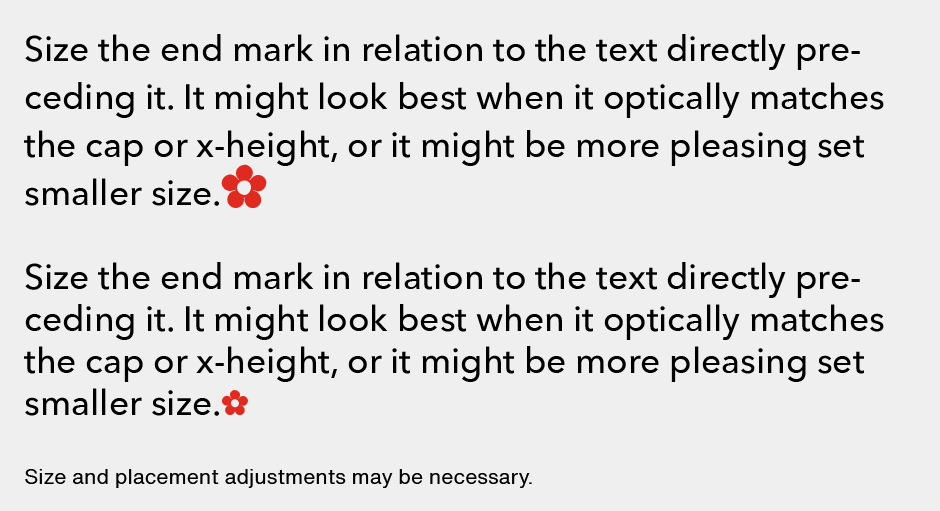
When choosing and using end marks: Select a mark that is uncomplicated in design. Experiment with flipping or rotating a mark to enhance its appearance. Size the end mark in relation to the text directly preceding it. It might look best when it optically matches the cap or x-height, or it might be more pleasing set smaller scale. Consider using color for contrast. Adjust its spacing and alignment (both horizontal and vertical position) to be optically balanced.
End marks, whether playful or sophisticated, are an effective way to cue the reader to the end of an article, as well as to add a bit of visual interest.


