Manual: Four Elements of Display Typography

Display typefaces have four main functions:
- Attract attention
- Create differentiation
- Set a mood
- Build hierarchy
Attract Attention
The first use of display typefaces was to attract attention – to pull a reader into print advertisements, brochures, or posters. Today, digital screens have been added to the mix. The most successful display designs do their job, without being overpowering. They usher the reader into the accompanying text copy without distracting from it.
Look to typefaces like these:

Some typeface families, like Helvetica® Now, Macklin™ and Walbaum®, have fonts especially designed for display applications.

Create Differentiation
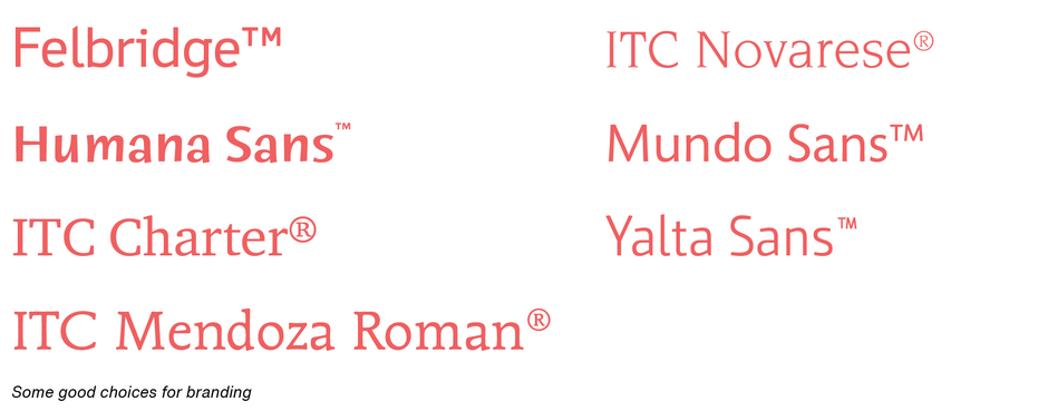
Because many are distinctive in design, display typefaces can create brand and product distinction. Good choices can make products and services stand out in a crowd. The right typeface, used consistently, can create memorability and reflect the personality of a brand.
The key is to use typefaces that have legs. There are tens of thousands of display fonts to choose from. Many will have a short life – and then become about as fashionable as cargo pants. Choose typefaces that will still look fresh years from now.
Look to these typefaces like the following:

Set A Mood
Display typefaces, especially retro designs, can evoke a mood or emotional response. Arnold Boecklin is the quintessential Art Nouveau typestyle while Wanted creates a feeling of the old west. There is, however, a caveat when attempting to set a mood with display typefaces: cliches abound. Using Old English for antique store signage is worse than stale. Scripts do not always say “feminine” – just look at Mistral. And sans serif italics do not always connote speed or quickness.
Retro and decorative faces push the “appropriateness” envelope much sooner than more conventional designs.
Look to these Designs:

Build Hierarchy
Display typefaces can bring order and structure to complicated content. Use display type to divide large documents into manageable sections, highlight important or reoccurring points, and distinguish the body of the information from its infrastructure – headers, footers, and menus. If the display type does not distract from the main text, the document feels shorter because it is broken into small, bite-sized segments.
The safest bet is to take advantage of other typefaces within the family. Bolder, or condensed designs are often the best choices. In some cases, small capitals can also be good choices. Variable fonts can allow you to fine-tune designs to create hierarchy.

Display typefaces can be some of your most powerful communications tools. They should be chosen carefully, and be aware that some display typefaces work well in some applications but pair like chocolate and tuna in others.


