Gray Is Color Manual

Creating visual interest is a balancing act. Bland pages with no contrast or focal point has nothing to interest, or pull the reader into the content. The only thing worse than a bland page, however, is one that is overly busy and distracting to the reader. The most common contrast is light and dark. When you expand your range of value contrast by introducing shades of gray into an otherwise black and white document, you gain the benefit of more “color.”
In addition to giving you an additional color, gray does something else. Gray mutes. It makes bold type a little less bold and big type not quite so imposing.
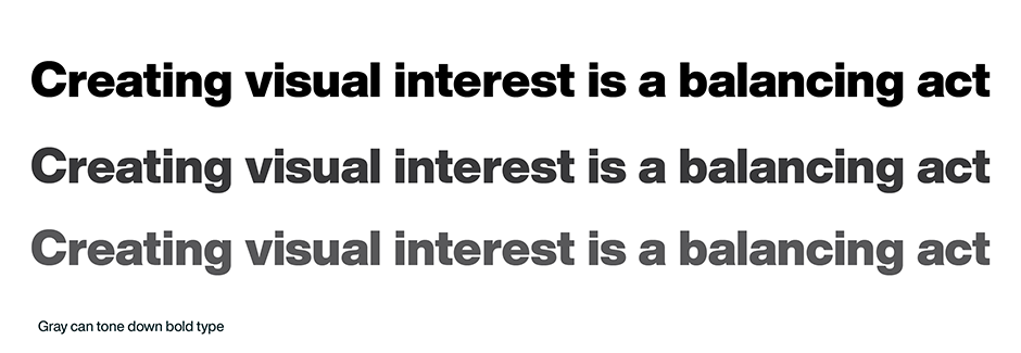
There may be times when the bold face you are using is just slightly too bold. It may jump out of the page too much, distracting the reader and even disrupting the reading process. If switching to the next lighter weight of type does not provide enough emphasis, try setting the bold type in gray. This will give you a large range of “color” that can tone down the bold to just the right degree of importance.

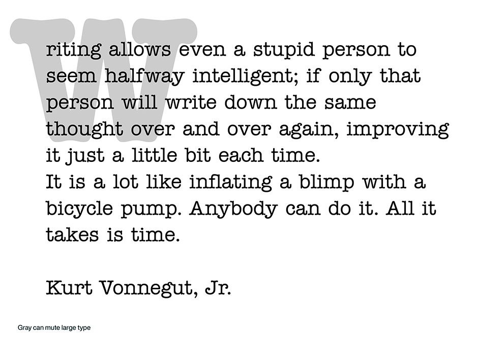
Large type, whether for initial letters, headlines, sub-heads or titles, can also be visually toned down with the use of gray. The job of large type, in most documents, is to introduce the reader to the text content. It can vary in size from only slightly larger than the text to something that is the dominant element on the page. Setting it in a gray tone can provide another dimension to large type. Display type can be muted to the perfect contrast – or very large initials can become subtle introductions to text copy.

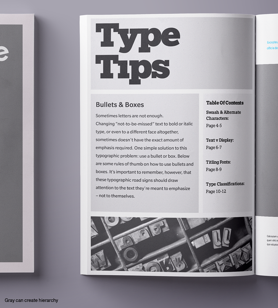
Multiple grays can also create hierarchy and order within complicated graphics. The trick to using gray is maintaining contrast. Although an infinite number of gray tones exist between black and white, it best to limit your choices to at least 10% increments. And while it is easy to create a document with four or five different gray tones, the net effect can be a lack of visual cohesion. It is much more effective to use just one or two shades of gray. Contrast is key to readability.

Finally, like any other color, use gray strategically – not randomly – to achieve a desired effect.
Typefaces used in this article
Helvetica® Now, ITC American Typewriter, Slate, Egyptian Slate
Download a pdf version of the Gray Is Color Manual.


