Justified and Rag Right Typography Manual.

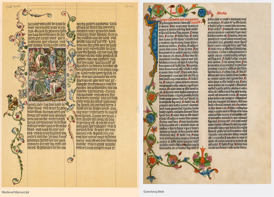
Medieval manuscripts were meticulously constructed. They had gridlines that defined where all the various parts (initial letters, illuminations, text, etc.) were to be placed. Scribes would draw two lines to delineate where a column of text would go, and then would fill the space between the lines with words. When Gutenberg produced his Bible, he copied the format established by the scribes – and justified typography was born.

The Standard Was Set
Over the years, justified typography (also called “quad left and right” and “blocked type”) became the standard for most text typesetting. Like most standards, however, somewhere along the line, the practice was challenged. Designers argued that justified typography was not only dated, but that the style caused serious readability problems. Their take was that unjustified (or rag-right) typesetting was much more attractive and easier to read.
Truth is, justified and unjustified composition can be good – or poor – typography depending on how they are handled.
Justified Typography
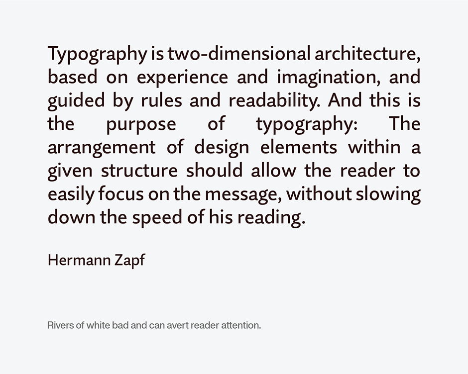
The major problem with setting justified copy is the risk of creating excessive inter-word spacing. Word processing, or design software, often has to contend with remaining space on a line, but not enough to set the next word, or a hyphenation of it. The word ends up on the next line causing the previous line to be filled out with additional white space. In some cases, the result can be excessive.
This can cause two problems. The first is cosmetic. Many times, especially when a short line measure is used, the result is “rivers” of white running through the copy. This looks bad and can avert readers’ attention. The other problem is one of readability. The eye does not read individual words, one at a time, but scans the line pausing momentarily to record groups of three or four words, then jumps to another set of words. Too much inter word spacing forces the eye to read individual words – slowing down the reading process, inhibiting reader comprehension and retention.

Unjustified Typography
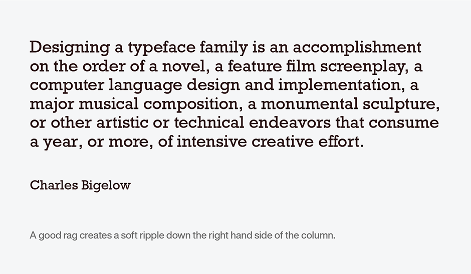
The potential downside of unjustified typesetting is that uneven line-breaks can create distracting column silhouettes. Very long lines followed by very short ones can cause awkward shapes that can be distracting to the reader. Ideally, unjustified composition should produce a soft ripple down the right-hand side of the column. Word processing and design software, also provide for control to ensure that line length is sufficiently wide to ensure good word spacing.

A Few Hints
There are a couple of guidelines to help set-up optimum columns of type. One is that the column length in picas should be about twice the point size of the type: if you are using 12-point type, the minimum line length you should try to justify is 24 picas. Another is that you shouldn’t try to justify when less than nine words fit in the column width.
Word processing, and design applications, enable you to define the minimum and maximum amounts of space to be removed or inserted between words when justifying the text. For the best typography, experiment a little. Minimums and maximums that work for one column width, or typeface, may not be the best for another.
Typeface proportions also have an influence on word spacing. Typefaces with condensed proportions or a small x-height, for example, generally need tighter word spacing than designs with normal proportions. Conversely, expanded or bold designs might call for a little additional word spacing.
Bottom line: trust your eyes. There is no formula that works for every typeface at every size. Just keep in mind that professional-level typography tends to have tighter rather than looser word spacing.
The scribes justified their copy because they were told to. Base your decision on what looks – and works – best.
Download a pdf version of the Justified & Rag Right Typography manual.


